Image-text-background
Spacing from top
Click on the “pixel” dropdown to choose how much space you want in the padding. You can select from 0px – 100px
Spacing from bottom
Spacing from the bottom is also like spacing from top — you can customize the padding space below the banner from 0px to 100px, based on your design requirements and visual aesthetics.
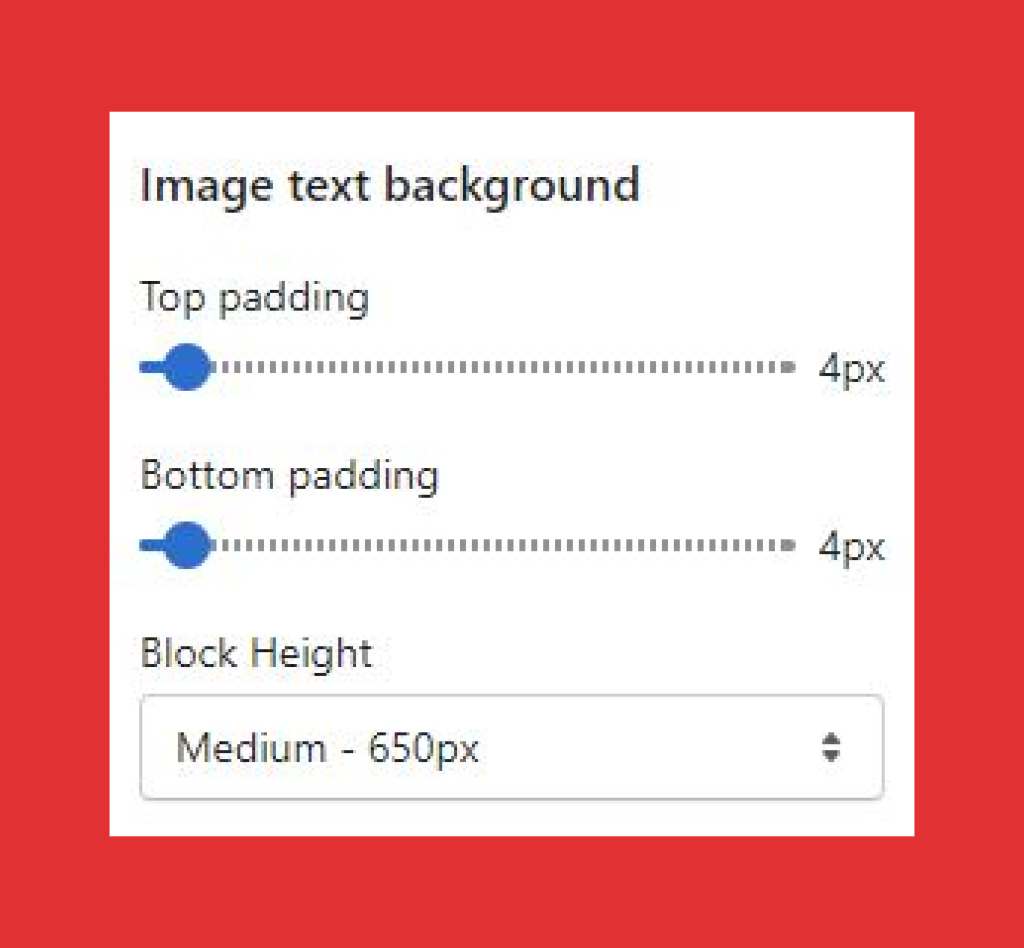
Block height
You can change the height of the block by choosing from three block height options:
- Small – 500px
- Medium – 650px
- Large – 750px
By selecting either of the sizes, you can change the height of the block to configure with the background image.
To upload an image, you need to click on “upload image”
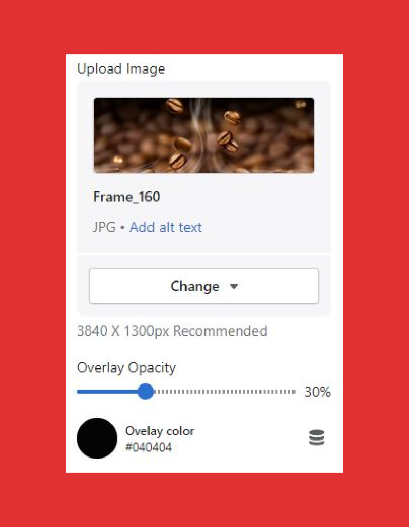
You can upload an image from your system or “free images” and click on select to complete the upload.
ClickEdit alt text to add a brief description of the image you’ve chosen to meet the search engine optimization (SEO) and user accessibility requirements. The description will describe visually impaired customers and search engines about the image. The description will not reflect on your banner.
Recommended image size is – 3840 x 1300px
Overlay opacity
Change the opacity of the overlay image by sliding the percentage scroller. Higher the percentage will make the background image more opaque than before. Recommended opacity percentage is 50%.
Overlay color
Overlay color is the color of the opacity that you’ve selected. You can customize it as per your theme or preference by choosing from the “color picker” or add Hex (RGB) color code as per your choice to change the background color, which will highlight on the background of the text bit.
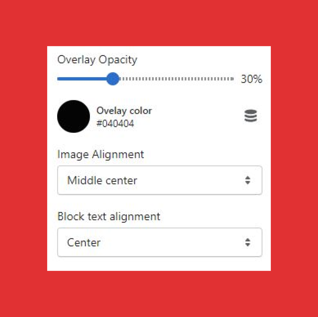
Image alignment
Image alignment will allow you to align the image top to bottom. Whichever option you choose, it will make your image appear as per it.
Image alignment options you can select from the dropdown menu:
- Top left
- Top center
- Top right
- Middle left
- Middle center
- Middle right
- Bottom left
- Bottom center
- Bottom right
For example, if you choose “top left,” the “top” portion of your image will appear in the block. And if you select “bottom right” the entire image will appear and so on.
Block text alignment
With the “block text alignment” you can opt to either make your heading and paragraph content in the block to appear either in the center, left or right by selecting from the following options:
- Left
- Center
- Right
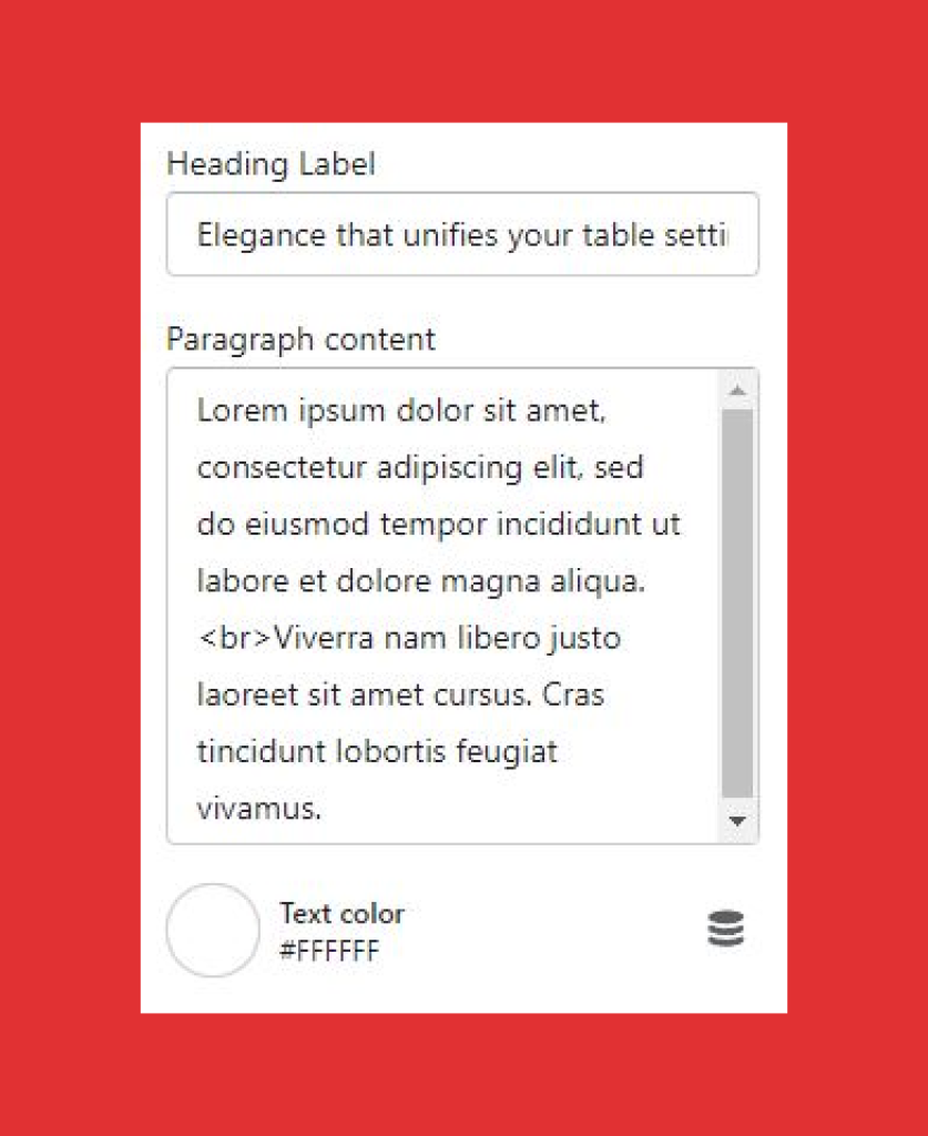
Heading label
Add a clear headline text, which is used for attracting customers.
Paragraph content
Add a banner copy to support your headline and drive customer engagement.
Text color
Change the text color by selecting from the color picker.
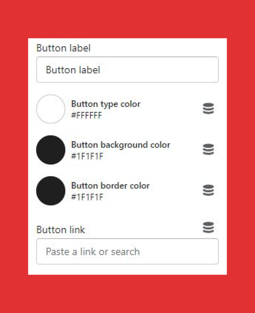
Button label
Add “name or CTA (call to action)” in the button label to guide users to the selected page.
Button link
Paste or search link based on your button label, where you want your users to redirect once they click on the button. For example, if you want your user to visit the “collection” page after he/she clicks on the button, then add “collection” page link in the “button link”
Button background
Change the color of the button by selecting from the color picker.
Button border color
Select a border color for your button from a different color or same as the button, depending on your design requirements.