Colors
The color section is divided into Text Color, Buttons, Form Fields, and Review options:
In the Text Color, you can edit the Menu Color, the Header Font Color, the Body Text, and the Error Text.
Choose the color you want for each making sure it is similar to your brand.
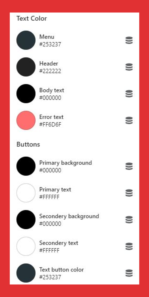
In the buttons section, you can change the color of Primary Button, Primary Button Text Color, Secondary Button, Secondary Button Text Color, White Button, Button Border, Slider Arrow Color, Slider Arrow Background Color, Page Link Color, Page Link Hover Color, Scroll Bar Color, and Review Text Color.
Just like the text color, you can click on the button type and change the colors according to what you want. But unlike text color, for button colors, you need to choose bright, bold colors that are visible as soon as a customer clicks on your page.
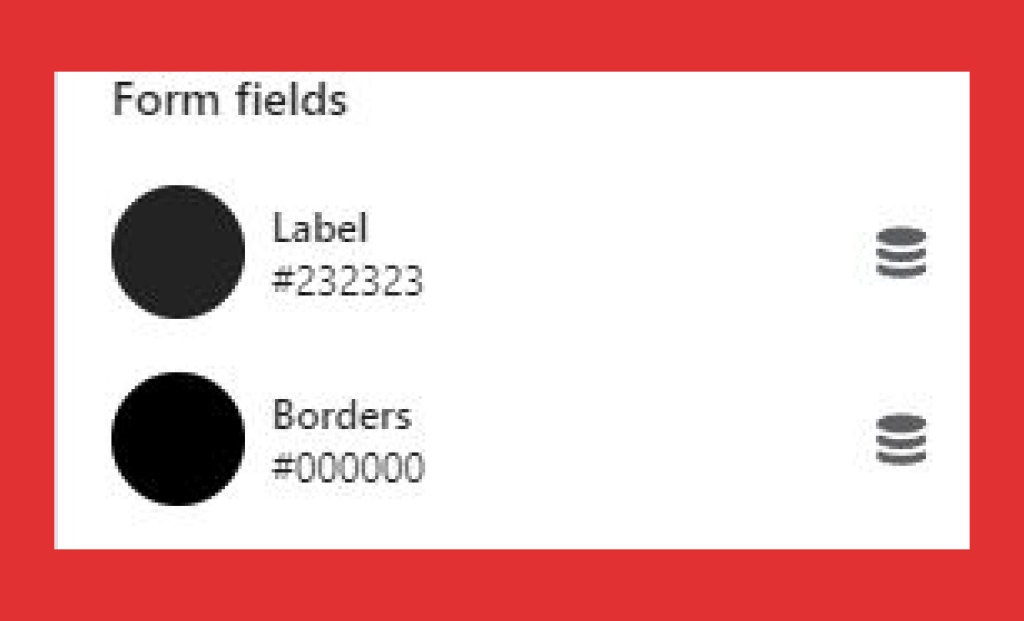
In the Form Fields option, you can change the color of the text, the borders, background, and theme color of the Forms to be filled out by customers.
Finally, in the Review option, you can change the review colors to match your brand theme.
Let’s move onto the next customization,
najlepsze escape roomy
You actually make it seem really easy with your presentation however I in finding this topic to be actually something
that I think I would by no means understand. It kind of feels too complex and extremely large for me.
I’m looking ahead on your subsequent publish, I
will try to get the cling of it! Escape rooms hub
SybilZ
You have remarked very interesting details! ps
decent site.?
euro trip
You have observed very interesting points! ps decent site.
Euro trip
Renaldo Lunderville
Way cool! Some very valid points! I appreciate you writing this post and also the rest of the site is really good.
rent boat
Good post. I learn something totally new and challenging on blogs I stumbleupon every day. It’s always useful to read through articles from other writers and use something from their web sites.
Phuket Nightclub
Aw, this was an extremely good post. Spending some time and actual effort to produce a great article… but what can I say… I hesitate a lot and don’t manage to get nearly anything done.
Start in Brazil
I like it when folks come together and share views. Great website, keep it up!
AC Repair Service Nepal
I truly love your site.. Very nice colors & theme. Did you develop this amazing site yourself? Please reply back as I’m looking to create my own personal blog and would love to find out where you got this from or just what the theme is called. Kudos.
카지노추천
The next time I read a blog, I hope that it doesn’t fail me just as much as this particular one. After all, I know it was my choice to read, however I really thought you would have something useful to say. All I hear is a bunch of crying about something that you could fix if you were not too busy searching for attention.
카지노사이트
Pretty! This was an extremely wonderful post. Many thanks for supplying this info.
blue dream strain
Very good information. Lucky me I ran across your blog by accident (stumbleupon). I have book-marked it for later!
Dispensary Near Me
Good blog you have got here.. It’s difficult to find good quality writing like yours these days. I seriously appreciate people like you! Take care!!
situs slot gacor
Having read this I believed it was rather enlightening. I appreciate you finding the time and effort to put this informative article together. I once again find myself personally spending a significant amount of time both reading and commenting. But so what, it was still worthwhile.
gebyar4d
Having read this I believed it was really enlightening. I appreciate you spending some time and energy to put this short article together. I once again find myself personally spending a significant amount of time both reading and leaving comments. But so what, it was still worth it!
canlı kumar siteleri
Casino’nun sunduğu bahis promosyonları ile her oyunda daha fazla şansım oluyor!
Dubai South
I like reading an article that can make people think. Also, thank you for allowing me to comment.
toptan poşet
It’s hard to come by knowledgeable people about this subject, but you sound like you know what you’re talking about! Thanks
An Ounce of Weed
I would like to thank you for the efforts you’ve put in penning this blog. I really hope to check out the same high-grade blog posts from you later on as well. In fact, your creative writing abilities has encouraged me to get my very own blog now 😉
buy 2 grams of weed
I’m impressed, I have to admit. Rarely do I encounter a blog that’s both educative and entertaining, and without a doubt, you’ve hit the nail on the head. The issue is something which not enough folks are speaking intelligently about. Now i’m very happy that I came across this during my hunt for something regarding this.
click here to investigate
Müşteri hizmetleri gerçekten yardımcı, hızlı bir şekilde sorularıma cevap verdiler.
bahis siteleri 2023
Slot oyunlarında büyük jackpotlar kazanmak bu casino’da gerçekten mümkün.
yasal bahis siteleri ilk kupon bedava
Bu casino’daki geniş futbol bahis seçenekleri sayesinde her maçta farklı bahis stratejileri uygulayabiliyorum.
cheap sex chat
I really love your blog.. Excellent colors & theme. Did you create this amazing site yourself? Please reply back as I’m planning to create my very own blog and want to find out where you got this from or what the theme is called. Thank you!
papara ile yasal bahis siteleri
Deneme bonusu ile Aviator gibi heyecan verici crash oyunlarında hiç yatırım yapmadan kazanç sağladım!
mobil ödeme kabul eden bahis siteleri forum
Slot oyunlarının grafikleri ve sesleri bu casino’da gerçekten etkileyici, oyunlar çok keyifli.
amerikada bahis siteleri
Casino’nun sunduğu promosyonlar ile slot oyunlarında daha fazla kazanıyorum.
baskılı poşet
Hey there! I simply want to offer you a huge thumbs up for the great info you have here on this post. I am returning to your blog for more soon.
ilk üyelik deneme bonusu veren siteler
Deneme bonusu sayesinde para yatırmadan kazanç elde etmek çok kolay!
yasal olmayan bahis siteleri ceza
Bahislerimi doğru yöneterek Reactoonz’ta büyük kazançlar elde ettim!
bahis siteleri popüler
Deneme bonusu ile oyunlara sıfır yatırımla başlamak çok kazançlı ve keyifli!
toptan poşet
I could not refrain from commenting. Perfectly written!
güvenilir bahis siteleri 2022
Deneme bonusu sayesinde hiçbir para kaybetmeden kazandım, herkes denemeli!
tombala oynanan bahis siteleri
Düşük bahislerle oynadığım futbol bahislerinde bile sürekli kazanç elde ediyorum!
karşılıksız bonus veren bahis siteleri
Deneme bonusu ile bahis yaparken hiç risk almadan kazanç sağlamak çok keyifli!
en iyi kazandıran bahis sitesi
Deneme bonusu ile bahis dünyasına adım atmak çok kolay ve kazançlı!
bahis siteleri sicile işler mi
Bu casino’da oynadığım slot oyunları ile büyük kazançlar elde ediyorum, herkese tavsiye ederim.
güvenilir bahis siteleri sözlük
Casino bonusları sayesinde slot oyunlarında daha fazla kazanç elde ediyorum.
singapur bahis siteleri
En sevdiğim slot oyunu Sweet Bonanza, grafikler harika, kazançlar büyük!
güvenilir bet siteleri
Müşteri hizmetleri gerçekten yardımcı, hızlı bir şekilde sorularıma cevap verdiler.
great post to read
Casino’nun sunduğu promosyonlar ve bonuslar ile slot oyunlarında daha fazla kazanıyorum.
deneme bonusu veren bahis siteleri 2016
Bu sitenin sunduğu deneme bonusu ile bedava Aviator oynayarak hemen kazanmaya başladım!
tubidy
Very good article. I definitely appreciate this website. Keep writing!
like this
Deneme bonusu ile oyunlara başlamak çok heyecan verici, hiç yatırım yapmadan kazandım!
tubidy mp3
I’m extremely pleased to uncover this site. I need to to thank you for your time due to this wonderful read!! I definitely liked every little bit of it and I have you book-marked to look at new information on your blog.
paycell kabul eden bahis siteleri
Yüksek bahislerle oynadığım futbol bahislerinden devasa ödüller kazandım!
en iyi casino bahis siteleri
Bu casino’nun sunduğu bonuslar futbol bahislerinde daha fazla kazanmama yardımcı oluyor!
실시간카지노
Good day! I simply wish to offer you a huge thumbs up for the excellent info you have here on this post. I’ll be coming back to your site for more soon.
bahis siteleri kolay para çekme
Deneme bonusu ile bahis yaparken hiç risk almadan kazanç sağlamak gerçekten harika!
slot bonus veren siteler
Bahis sitelerinde deneme bonusu ile bedava bahis yaparak oyunları keşfedin!
para yatırmadan ilk üyelik bonusu veren bahis siteleri 2021
Deneme bonusu ile bahis dünyasına adım atmak hiç bu kadar kolay ve kazançlı olmamıştı!
kredi kartsız bahis siteleri
Deneme bonusu sayesinde hiçbir para yatırmadan kazandım, herkes denemeli!
spor deneme bonusu veren siteler
Futbol bahislerinde doğru tahminlerle büyük kazançlar elde etmek çok heyecan verici!
en yeni kaçak bahis siteleri
En sevdiğim slot oyunu Book of Dead, her spin büyük kazanç şansı sunuyor!
para yatırmadan bonus veren bahis siteleri 2014
En sevdiğim slot oyunu kesinlikle Gates of Olympus, her spin kazandırıyor!
yasal ve güvenilir bahis siteleri
Bu bahis sitesinin sunduğu deneme bonusu ile kazanç sağlamaya başlamak çok kolay!
roofing
This website really has all of the information I needed concerning this subject and didn’t know who to ask.
en güvenilir bahis siteleri 2021 ekşi
Casino’nun sunduğu turnuvalar sayesinde slot oyunlarında ekstra kazançlar kazanıyorum.
poker oynanan bahis siteleri
Casino’daki slot oyunlarının grafikleri ve ses efektleri mükemmel, her oyun çok keyifli.
en az yatırım yapılan bahis siteleri
Yeni eklenen slot oyunları sürekli deniyorum, kazanç şansım hiç bitmiyor.
paypal ile ödeme yapılan bahis siteleri
Yüksek bahislerle Sweet Bonanza’da büyük kazançlar elde etmek heyecan verici!
turkiye kullanılan bahis siteleri
Casino’nun sunduğu bonuslar bahislerimi her zaman daha kazançlı hale getiriyor.
bahis-siteleri-numarami-nerden-buluyor
Bu casino, slot oyunlarıyla tam bir kazanç fırsatı sunuyor!
bahis siteleri haberleri
Casino’nun sunduğu bonuslar ile slot oyunlarında daha uzun süre oynayabiliyorum.
bedava bonus veren casino siteleri
Deneme bonusu ile bahis yaparken riske girmeden büyük ödüller kazanmak mümkün!
dünyanın en güvenilir bahis siteleri 2023
Bu casino’nun sunduğu turnuvalar ve promosyonlar ile slot oyunlarında daha fazla kazanıyorum.
korner oynatan bahis siteleri
Casino’nun sunduğu promosyonlar sayesinde slot oyunlarında şansım hep açık.
best toothpaste for gum disease
Good blog you’ve got here.. It’s hard to find high quality writing like yours nowadays. I truly appreciate individuals like you! Take care!!
buy cuban cigars
I was extremely pleased to uncover this web site. I want to to thank you for ones time due to this wonderful read!! I definitely enjoyed every bit of it and I have you book-marked to check out new stuff on your site.
Hub based income
This excellent website certainly has all the information I needed about this subject and didn’t know who to ask.
Personalized Gifts
Great info. Lucky me I ran across your site by chance (stumbleupon). I have book-marked it for later.
free courses about marketing
It’s hard to come by well-informed people on this topic, however, you seem like you know what you’re talking about! Thanks
Optometrist
Oh my goodness! Incredible article dude! Thank you, However I am going through troubles with your RSS. I don’t know the reason why I can’t join it. Is there anybody else having similar RSS problems? Anyone that knows the solution will you kindly respond? Thanks!!
auto accident leads
This excellent website really has all the information and facts I wanted concerning this subject and didn’t know who to ask.
en guvenli bahis siteleri
Deneme bonusu sayesinde hiçbir para yatırmadan kazanç elde ettim!
토토사이트
I was able to find good information from your blog articles.
en güvenilir yasadışı bahis siteleri
Casino’daki slot oyunlarının grafikleri ve ses efektleri harika, oyunlar çok keyifli!
en iyi cs go bahis siteleri
Bu siteye üye olur olmaz deneme bonusu aldım ve hemen kazanç sağladım!
yeni üyelik bonusu veren bahis siteleri
Düşük bahislerimle bile Jammin’ Jars’tan büyük kazançlar elde ettim!
bahis siteleri en çok kazandıran oyunlar
Casino’nun sunduğu turnuvalar ile ekstra kazançlar kazanmak çok kolay.
malta bahis siteleri oranı düşen maçlar
Casino’nun sunduğu promosyonlar futbol bahislerinde ekstra kazanç sağlıyor!
packman v4
A fascinating discussion is worth comment. I think that you should publish more on this issue, it might not be a taboo matter but usually people don’t speak about these subjects. To the next! Kind regards.
page
Bu casino’da oynarken slot oyunlarında kazanmak çok kolay!
en yi bahis siteleri
Deneme bonusu ile oyuna başlarken risk yok, sadece kazanç var!
son cikan bahis siteleri
Bu bahis sitesinin sunduğu deneme bonusu, yeni üyeler için mükemmel bir fırsat!
güvenilir kaçak bahis siteleri
Bu sitenin sunduğu deneme bonusu ile hiç yatırım yapmadan bahis yaparak kazandım!
tl veren bahis siteleri
Bu casino’daki slot oyunları ile her gün büyük jackpotlar kazanmak mümkün!
deneme bonusı veren siteler
Bu bahis sitesinin sunduğu deneme bonusu sayesinde hemen kazanmaya başladım!
you can look here
Futbol bahislerinde strateji yaparak sürekli büyük kazançlar elde ediyorum!
packman v4
It’s difficult to find educated people about this topic, however, you sound like you know what you’re talking about! Thanks
mastercard bahis siteleri
Bu casino’da futbol bahislerinde strateji yaparak sürekli kazanç elde ediyorum!
슬롯게임
I could not refrain from commenting. Perfectly written!
minimum 10 tl yatırılan bahis siteleri
Slot oyunlarının grafikleri ve kazanç potansiyeli bu casino’da gerçekten harika.
see this page
En sevdiğim slot oyunu Book of Dead, grafikler harika ve kazançlar büyük!
ücretsiz bonus veren bahis siteleri 2016
Casino’nun sunduğu slot turnuvaları sayesinde her zaman ekstra ödüller kazanıyorum.
üyelik hediyesi veren bahis siteleri
Slot oyunlarının kazandırma potansiyeli bu casino’da çok yüksek, herkes denemeli!
bonus veren bahis siteleri slot
Düşük bahislerle oynadığım futbol maçlarında bile büyük kazanç fırsatları yakalıyorum!
yatırım bonusu veren bahis siteleri 2018
Casino’nun sunduğu slot turnuvaları ile ekstra kazançlar elde etmek çok eğlenceli!
bahis siteleri cezası
Bu casino’da slot oyunları ile kazanmak çok kolay ve eğlenceli!
güvenilir canlı bahis siteleri 2021
Deneme bonusu sayesinde hiçbir risk almadan kazandım, herkese tavsiye ederim!
guncel deneme bonusu veren bahis siteleri
Casino’daki slot oyunlarının grafikleri ve ses efektleri mükemmel, her oyun çok eğlenceli!
bahis siteleri eleman alımı
Slot oyunlarının kazanç potansiyeli çok yüksek, bu casino’da her zaman şansım açık.
bahis siteleri en güvenilir
Deneme bonusu ile bahis yaparken hiç risk almadan kazanç sağlamak gerçekten harika!
mobil ödeme 48 saat kuralı olmayan bahis siteleri
Slot oyunlarının grafikleri ve ses efektleri bu casino’da gerçekten etkileyici.
3 tl hediye veren yasal bahis siteleri
Bahis siteleri deneme bonusu ile crash oyunları oynamak harika bir fırsat, özellikle Aviator ile!
güvenilir bonus veren siteler
En sevdiğim slot oyunu Razor Shark, her spin büyük bir heyecan ve kazanç sağlıyor.
AmmyGrace
This is the right site for everyone who wants to find out about this topic. You know so much its almost tough to argue with you (not that I personally will need to…HaHa). You certainly put a brand new spin on a topic that’s been discussed for ages. Excellent stuff, just wonderful.
yatırım şartsız bahis siteleri
En sevdiğim slot oyunu Thunderstruck II, grafikler harika ve kazançlar büyük!
tubidy mp3
Howdy! I could have sworn I’ve been to this blog before but after going through some of the articles I realized it’s new to me. Regardless, I’m definitely delighted I came across it and I’ll be bookmarking it and checking back often!
Blue Dream
Hello there, I do think your website could possibly be having web browser compatibility issues. Whenever I take a look at your web site in Safari, it looks fine however, if opening in I.E., it’s got some overlapping issues. I merely wanted to give you a quick heads up! Apart from that, excellent site.
RebirthRO job changer
Good post. I will be experiencing a few of these issues as well..
mmorpg private server android
After looking over a number of the articles on your web site, I truly appreciate your way of blogging. I bookmarked it to my bookmark webpage list and will be checking back in the near future. Please check out my web site too and tell me your opinion.
mmorpg private servers 2024
Hello there, I believe your website may be having web browser compatibility issues. When I look at your web site in Safari, it looks fine however, if opening in Internet Explorer, it’s got some overlapping issues. I simply wanted to give you a quick heads up! Aside from that, great blog!
online dispensary that ships to all states
Greetings! Very useful advice within this article! It is the little changes which will make the most significant changes. Thanks for sharing!
tubidy mp3 download
Good article! We are linking to this great content on our site. Keep up the good writing.
슬롯추천
This site was… how do you say it? Relevant!! Finally I’ve found something which helped me. Kudos.
hay hay ile yatirim yapilan bahis siteleri
Bahis siteleri deneme bonusu ile bedava bahis yaparak büyük kazançlar elde etmek çok kolay!
스카이슬롯
The next time I read a blog, I hope that it does not disappoint me as much as this particular one. I mean, Yes, it was my choice to read through, nonetheless I really believed you would probably have something interesting to talk about. All I hear is a bunch of moaning about something you could fix if you weren’t too busy searching for attention.
bahis siteleri oran karşılaştırma
Bu casino’daki slot oyunları sayesinde her gün büyük kazançlar elde ediyorum!
dünyanin en iyi bahis siteleri
Deneme bonusu ile bahis yaparken riske girmeden büyük kazançlar elde ettim!
father's Day
Hi there! I could have sworn I’ve been to this web site before but after going through some of the posts I realized it’s new to me. Anyways, I’m definitely pleased I stumbled upon it and I’ll be bookmarking it and checking back regularly.
yatırımsız deneme bonusları
En sevdiğim slot oyunu Starburst, grafikler mükemmel, kazançlar çok büyük!
yeni üyelik bonusu veren siteler
Bahis siteleri deneme bonusu ile oyunlara bedava başlamak çok eğlenceli ve kazançlı!
bahis siteleri kampanya
Casino’nun sunduğu bonuslar sayesinde slot oyunlarında daha uzun süre oynayabiliyorum.
bahis siteleri bayilik
Deneme bonusu ile bahis yaparken hiç para kaybetmeden büyük kazançlar elde ettim!
komisyonsuz bahis siteleri
Bahis sitelerinde deneme bonusu ile ilk kazancımı hiç risk almadan elde ettim.
basketbol canlı bahis siteleri
Bu sitenin sunduğu deneme bonusu ile risksiz bir şekilde bahis yaparak büyük kazançlar sağladım!
deneme bomusu
Yüksek bahislerle futbol bahislerinde oynarken devasa ödüller kazanmak çok heyecan verici!
resmi bahis siteleri
Düşük bahislerle futbol bahislerinde uzun süre oynayarak kazançlarımı artırıyorum!
wikipedia reference
Casino’nun sunduğu promosyonlar ve bonuslar ile slot oyunlarında daha fazla kazanıyorum.
casino bonusu veren bahis siteleri
Deneme bonusu ile bahis yaparken hiç risk almadan büyük kazançlar sağladım!
lisanslı bahis siteleri 2024
Bu casino’nun sunduğu canlı bahis seçenekleri futbol maçlarını izlerken ekstra kazanç sağlıyor.
온라인카지노
Oh my goodness! Awesome article dude! Thanks, However I am encountering difficulties with your RSS. I don’t know why I cannot subscribe to it. Is there anybody getting identical RSS problems? Anyone that knows the answer can you kindly respond? Thanks.
browse around this web-site
Casino bonusları ile slot oyunlarında daha uzun süre oynayıp daha fazla kazanıyorum.
bedava kupon veren bahis siteleri
Bu casino’daki jackpot slotları büyük ödüller sunuyor, kazanmak çok heyecanlı!
papara ile 1 tl yatırım yapılan bahis siteleri 2020
Deneme bonusu sayesinde hiç yatırım yapmadan büyük kazançlar sağladım!
Money Loan|Hard Money Lender|Private Money|Private Lender|Private Loan|Bridge Lender|Commercial Lender|Commercial Real Estate|Commercial Loan}
Your style is very unique compared to other people I have read stuff from. Many thanks for posting when you have the opportunity, Guess I’ll just bookmark this site.
website design ireland
I really love your website.. Pleasant colors & theme. Did you make this amazing site yourself? Please reply back as I’m trying to create my own blog and would like to find out where you got this from or exactly what the theme is named. Many thanks!
men watches for men
After checking out a number of the blog articles on your web page, I really appreciate your technique of writing a blog. I added it to my bookmark website list and will be checking back in the near future. Please check out my website too and let me know how you feel.
pain relief
You ought to take part in a contest for one of the greatest blogs on the web. I will highly recommend this site!
mesothelioma lawsuit
Next time I read a blog, I hope that it doesn’t fail me as much as this particular one. I mean, I know it was my choice to read through, nonetheless I truly thought you would probably have something interesting to say. All I hear is a bunch of moaning about something you could fix if you were not too busy seeking attention.
3D Modelling
I enjoy looking through a post that will make men and women think. Also, thanks for allowing for me to comment.
Online Shopping
Greetings! Very helpful advice within this post! It’s the little changes that produce the most significant changes. Thanks for sharing!
Долгосрочная аренда в Батуми
Hi, I think your website may be having browser compatibility problems. Whenever I look at your web site in Safari, it looks fine however when opening in Internet Explorer, it has some overlapping issues. I just wanted to provide you with a quick heads up! Aside from that, excellent site!
gaming glasses to reduce eye strain
Next time I read a blog, I hope that it does not disappoint me just as much as this one. After all, Yes, it was my choice to read, but I really believed you would probably have something helpful to talk about. All I hear is a bunch of complaining about something you could possibly fix if you weren’t too busy looking for attention.
buy painkillers online
Your style is really unique in comparison to other folks I’ve read stuff from. Thanks for posting when you have the opportunity, Guess I will just bookmark this blog.
blinds Malta
May I just say what a relief to find somebody that actually understands what they are discussing over the internet. You actually understand how to bring an issue to light and make it important. More and more people really need to check this out and understand this side of your story. I can’t believe you are not more popular since you definitely have the gift.
Almanya Nakliye Fiyatları
When I originally left a comment I appear to have clicked the -Notify me when new comments are added- checkbox and now every time a comment is added I receive 4 emails with the same comment. Perhaps there is a means you can remove me from that service? Thanks.
نموذج سيرة ذاتية
Everything is very open with a precise explanation of the challenges. It was really informative. Your site is very useful. Many thanks for sharing.
Anonymous
I have to thank you for the efforts you’ve put in penning this website. I’m hoping to see the same high-grade content by you in the future as well. In fact, your creative writing abilities has encouraged me to get my own, personal site now 😉
Undated goal-setting planners
I like it whenever people come together and share opinions. Great blog, stick with it.
Flag manufacturer South Africa
Excellent post. I will be facing a few of these issues as well..
슬롯사이트
I was able to find good advice from your content.
güvenilir bahis siteleri ekşi sözlük
Yüksek bahislerle oynadığım futbol maçlarında devasa ödüller kazanmak çok heyecan verici!
en hızlı ödeme yapan bahis siteleri
Slot oyunlarında her spin heyecan verici, bu casino tam bir eğlence merkezi.
tubidy mp3 download
There is definately a lot to learn about this issue. I like all of the points you have made.
see this here
Düşük bahislerle oynadığım futbol bahislerinde bile büyük kazanç fırsatları yakalıyorum!
www.stiiizypods.shop
This web site definitely has all the information and facts I wanted about this subject and didn’t know who to ask.
primepickingsplace.shop
I was able to find good info from your articles.
Dagny
Hello there! Do you know if they make any plugins to assist with SEO?
I’m trying to get my blog to rank for some targeted keywords but I’m not
seeing very good results. If you know of any please share.
Cheers! You can read similar art here: Wool product
온카족
That is a very good tip especially to those fresh to the blogosphere. Brief but very accurate info… Thank you for sharing this one. A must read post.
온카족
I blog frequently and I truly appreciate your information. This great article has really peaked my interest. I am going to take a note of your site and keep checking for new information about once a week. I subscribed to your Feed too.
download tiktok video
I have to thank you for the efforts you’ve put in writing this blog. I’m hoping to check out the same high-grade content from you in the future as well. In truth, your creative writing abilities has inspired me to get my own, personal blog now 😉
blue dream strain
Pretty! This has been an incredibly wonderful post. Thanks for supplying this information.
Anonymous
Your article helped me a lot, is there any more related content? Thanks!
steel suppliers in ras al khor
I blog frequently and I truly appreciate your information. This article has truly peaked my interest. I’m going to take a note of your site and keep checking for new information about once a week. I subscribed to your Feed too.
스키강습
Hello there, I do think your website may be having browser compatibility problems. Whenever I take a look at your website in Safari, it looks fine however, when opening in IE, it’s got some overlapping issues. I just wanted to give you a quick heads up! Aside from that, excellent site!
moissanite jewelry
Oh my goodness! Awesome article dude! Thank you so much, However I am experiencing difficulties with your RSS. I don’t understand the reason why I am unable to join it. Is there anybody having similar RSS issues? Anybody who knows the solution can you kindly respond? Thanx!!
Wordle answer of today
Good post. I learn something totally new and challenging on websites I stumbleupon every day. It’s always interesting to read through articles from other authors and use something from other websites.
husband material
This is the perfect website for anyone who really wants to understand this topic. You realize so much its almost tough to argue with you (not that I personally would want to…HaHa). You definitely put a brand new spin on a topic that has been written about for ages. Excellent stuff, just great.
christmas books free
This web site definitely has all the information and facts I wanted about this subject and didn’t know who to ask.
Online Dispensary that ships to all states
This site was… how do you say it? Relevant!! Finally I have found something which helped me. Appreciate it.
CNY Cookies
Way cool! Some extremely valid points! I appreciate you writing this write-up plus the rest of the site is also really good.
what happened to rebirthro
I blog frequently and I genuinely thank you for your information. Your article has really peaked my interest. I will bookmark your site and keep checking for new information about once per week. I subscribed to your RSS feed too.
Réduction du stress
This is a topic that is close to my heart… Cheers! Exactly where can I find the contact details for questions?
ไปยังเว็บไซต์
Hi, I do believe this is an excellent web site. I stumbledupon it 😉 I’m going to come back yet again since i have book marked it. Money and freedom is the best way to change, may you be rich and continue to help others.
PCA9685 with RPi 3 B+ - Ubiquity Robotics Discourse
Having read this I believed it was rather informative. I appreciate you finding the time and effort to put this short article together. I once again find myself personally spending a lot of time both reading and commenting. But so what, it was still worthwhile.
sugar defender ingredients
sugar defender ingredients For several years, I have actually fought unpredictable blood sugar level swings that left me feeling drained and inactive.
Yet considering that integrating Sugar my power
levels are currently steady and constant, and I no longer strike a wall
in the afternoons. I value that it’s a gentle, natural method that doesn’t come with
any type of undesirable adverse effects. It’s genuinely transformed my life.
best vpn reddit
It’s hard to come by experienced people for this subject, but you seem like you know what you’re talking about! Thanks
슬롯커뮤니티
This is a great tip particularly to those new to the blogosphere. Simple but very precise information… Many thanks for sharing this one. A must read article.
슬롯추천검증
This is a topic that’s close to my heart… Take care! Exactly where can I find the contact details for questions?
경산오피
After going over a few of the blog articles on your website, I honestly appreciate your technique of blogging. I book-marked it to my bookmark site list and will be checking back in the near future. Please visit my website as well and let me know your opinion.
escort service and adult meetings India
Pretty! This was a really wonderful post. Thank you for providing this information.
Online Dispensary that ships to all states
I’d like to thank you for the efforts you have put in penning this blog. I really hope to check out the same high-grade blog posts by you in the future as well. In truth, your creative writing abilities has encouraged me to get my very own blog now 😉
Stairlift Doncaster
I must thank you for the efforts you’ve put in penning this blog. I am hoping to view the same high-grade blog posts from you in the future as well. In fact, your creative writing abilities has encouraged me to get my own, personal site now 😉
Stairlifts
Great info. Lucky me I came across your website by chance (stumbleupon). I have book marked it for later!
Ready-to-Assemble Cabinets
Everyone loves it when people get together and share opinions. Great site, continue the good work.
Sex Hostessen Graz
An impressive share! I’ve just forwarded this onto a friend who has been conducting a little homework on this. And he in fact bought me breakfast because I discovered it for him… lol. So allow me to reword this…. Thank YOU for the meal!! But yeah, thanks for spending time to discuss this topic here on your internet site.
Brass door handles
An interesting discussion is definitely worth comment. I believe that you should write more about this subject, it may not be a taboo subject but generally people do not talk about such subjects. To the next! Kind regards.
free ai sex chat
Can I simply say what a relief to uncover someone who actually understands what they are discussing on the web. You certainly know how to bring an issue to light and make it important. More people really need to read this and understand this side of your story. I was surprised you’re not more popular because you most certainly possess the gift.
Timber kitchen handles
Way cool! Some very valid points! I appreciate you penning this post plus the rest of the website is extremely good.
Line striping
Excellent site you have got here.. It’s hard to find high-quality writing like yours nowadays. I honestly appreciate people like you! Take care!!
pilot institute
This blog was… how do I say it? Relevant!! Finally I have found something that helped me. Cheers!
unique art for your home and office
I used to be able to find good info from your articles.
elegant journals
Great information. Lucky me I came across your website by accident (stumbleupon). I have saved as a favorite for later!
Cannabis Delivery Service
I blog frequently and I seriously thank you for your content. Your article has really peaked my interest. I am going to take a note of your blog and keep checking for new information about once a week. I subscribed to your RSS feed as well.
Small Business Energy Deals
Greetings! Very useful advice in this particular post! It is the little changes which will make the most significant changes. Thanks for sharing!
business expansion into BRICS.
I blog frequently and I seriously appreciate your content. This great article has truly peaked my interest. I am going to take a note of your website and keep checking for new details about once per week. I opted in for your Feed too.
find properties in dubai
Pretty! This was a really wonderful article. Many thanks for providing this info.
porn
I have to thank you for the efforts you have put in penning this site. I’m hoping to check out the same high-grade blog posts from you in the future as well. In fact, your creative writing abilities has encouraged me to get my own, personal blog now 😉
Funny spy adventure books
I love reading a post that can make people think. Also, thanks for permitting me to comment.
Choose Your Quest series
That is a really good tip particularly to those new to the blogosphere. Simple but very accurate info… Appreciate your sharing this one. A must read post.
dog rain coat
This is the perfect website for anyone who would like to understand this topic. You know a whole lot its almost tough to argue with you (not that I really will need to…HaHa). You definitely put a new spin on a topic that’s been discussed for years. Excellent stuff, just excellent.
dog sweatshirts
Hey there! I just would like to offer you a big thumbs up for the great information you have got here on this post. I’ll be coming back to your blog for more soon.
website laten maken wordpress
I enjoy looking through an article that can make people think. Also, thanks for allowing me to comment.
forex trading signals
This is the right web site for anyone who hopes to understand this topic. You know a whole lot its almost tough to argue with you (not that I personally will need to…HaHa). You certainly put a brand new spin on a topic that’s been discussed for ages. Wonderful stuff, just excellent.
more bonuses
Your style is really unique compared to other folks I have read stuff from. I appreciate you for posting when you have the opportunity, Guess I will just bookmark this web site.
what is dropshipping
Great info. Lucky me I found your website by chance (stumbleupon). I’ve bookmarked it for later!
porn
Oh my goodness! Impressive article dude! Many thanks, However I am having issues with your RSS. I don’t understand why I can’t subscribe to it. Is there anyone else having the same RSS problems? Anyone that knows the answer will you kindly respond? Thanx!
jumping castle hire
You should take part in a contest for one of the finest websites on the web. I most certainly will recommend this site!
insance
Step I tert Butyl 3S 4 7 2 E 3 tert butyldimethylsilyl oxy prop 1 en 1 yl 6 fluorophenyl 6 fluoro 1 2 isopropyl 4 methoxypyridin 3 yl 2 oxo 1, 2 dihydropyrido 2, 3 d pyrimidin 4 yl 3 methylpiperazine 1 carboxylate Int 20i priligy precio anyway, just stating another reason you need a doctor for this
sex indo viral
It’s hard to find experienced people about this topic, however, you sound like you know what you’re talking about! Thanks
gamdom
I could not resist commenting. Well written!
casino app
Everyone loves it when folks get together and share thoughts. Great blog, continue the good work!
Néon LED
This is a really good tip particularly to those new to the blogosphere. Short but very precise information… Many thanks for sharing this one. A must read post.
貼海報
You should take part in a contest for one of the greatest websites on the web. I’m going to recommend this blog!
xnxxx
It is very comforting to see that others are suffering from the same problem as you, wow!
free chat rooms unblocked
Great post. I am dealing with a few of these issues as well..
Sports streaming ad placement
I couldn’t refrain from commenting. Very well written.
Brand authority enhancement
This excellent website certainly has all of the information I needed concerning this subject and didn’t know who to ask.
casibom tr giriş
Thanks for thr great article!
메이저슬롯
It’s difficult to find knowledgeable people about this topic, however, you seem like you know what you’re talking about! Thanks
메이저슬롯
This web site really has all the info I wanted concerning this subject and didn’t know who to ask.
silver exchange id
This is a topic which is close to my heart… Many thanks! Where can I find the contact details for questions?
supergoodsplaza.shop
When I initially commented I seem to have clicked the -Notify me when new comments are added- checkbox and now whenever a comment is added I recieve 4 emails with the same comment. Perhaps there is a way you are able to remove me from that service? Thank you.
925 Silver Jewelry
Howdy! This article could not be written much better! Reading through this article reminds me of my previous roommate! He constantly kept talking about this. I’ll forward this article to him. Fairly certain he’s going to have a very good read. I appreciate you for sharing!
School Management Solutions
I seriously love your site.. Pleasant colors & theme. Did you create this web site yourself? Please reply back as I’m planning to create my own blog and would love to know where you got this from or just what the theme is called. Many thanks.
Features HESED EduSuite
Having read this I believed it was rather informative. I appreciate you taking the time and effort to put this informative article together. I once again find myself personally spending a significant amount of time both reading and leaving comments. But so what, it was still worth it!
快连
Very good information. Lucky me I found your blog by accident (stumbleupon). I have book-marked it for later!
Physiotherapy Near Me
Great info. Lucky me I ran across your blog by chance (stumbleupon). I’ve book-marked it for later.
digital marketing agency new jersey
I wanted to thank you for this wonderful read!! I definitely enjoyed every bit of it. I’ve got you bookmarked to look at new things you post…
medical weight loss
Spot on with this write-up, I seriously feel this amazing site needs a lot more attention. I’ll probably be back again to read more, thanks for the advice!
clips metalic
There’s definately a lot to find out about this subject. I like all the points you’ve made.
things to do in Australia
You are so interesting! I don’t think I have read through something like that before. So wonderful to discover somebody with original thoughts on this subject. Really.. thank you for starting this up. This site is something that’s needed on the internet, someone with some originality.
online shopping USA
Pretty! This was an incredibly wonderful post. Thank you for supplying these details.
senior pics near me
After I initially commented I seem to have clicked on the -Notify me when new comments are added- checkbox and from now on each time a comment is added I recieve four emails with the exact same comment. Perhaps there is a way you are able to remove me from that service? Kudos.
Golden Massage
After looking into a number of the blog posts on your web site, I seriously appreciate your way of writing a blog. I book marked it to my bookmark website list and will be checking back soon. Take a look at my website too and let me know what you think.
what is politics
I couldn’t refrain from commenting. Exceptionally well written.
porn
Hi! I simply would like to give you a huge thumbs up for the excellent info you have right here on this post. I am coming back to your web site for more soon.
porn
After checking out a handful of the articles on your blog, I truly like your technique of blogging. I saved it to my bookmark webpage list and will be checking back in the near future. Please check out my web site too and tell me how you feel.
Telegram官网
Hi there! I could have sworn I’ve visited this website before but after browsing through some of the posts I realized it’s new to me. Nonetheless, I’m definitely happy I discovered it and I’ll be bookmarking it and checking back frequently.
Telegram官网
Greetings! Very useful advice in this particular post! It is the little changes that will make the most important changes. Thanks a lot for sharing!
Furniture manufacturer
This is a topic which is close to my heart… Many thanks! Exactly where can I find the contact details for questions?
peelerie.com
bookmarked!!, I really like your website.
peelerie.com
Greetings, I think your web site could be having internet browser compatibility problems. Whenever I look at your site in Safari, it looks fine however, when opening in Internet Explorer, it has some overlapping issues. I just wanted to give you a quick heads up! Apart from that, excellent blog.
here
It’s difficult to find experienced people on this topic, however, you seem like you know what you’re talking about! Thanks
판교오피
Your style is really unique compared to other folks I have read stuff from. I appreciate you for posting when you have the opportunity, Guess I’ll just bookmark this blog.
Software
Your style is really unique in comparison to other people I have read stuff from. I appreciate you for posting when you’ve got the opportunity, Guess I will just book mark this site.
Health and fitness
Pretty! This was an incredibly wonderful article. Thank you for supplying these details.
read full report
Everything is very open with a very clear clarification of the challenges. It was definitely informative. Your site is extremely helpful. Many thanks for sharing!
Registrera
Can you be more specific about the content of your article? After reading it, I still have some doubts. Hope you can help me.
porn
I blog frequently and I really appreciate your information. The article has really peaked my interest. I’m going to bookmark your website and keep checking for new details about once a week. I opted in for your Feed too.
Y2MATE
Aw, this was an extremely nice post. Finding the time and actual effort to make a superb article… but what can I say… I procrastinate a whole lot and don’t manage to get anything done.
porn
Having read this I thought it was really enlightening. I appreciate you spending some time and energy to put this short article together. I once again find myself spending a significant amount of time both reading and commenting. But so what, it was still worthwhile!
go to the website
Greetings! Very useful advice within this article! It’s the little changes which will make the most significant changes. Thanks a lot for sharing!
porn
There is certainly a lot to know about this issue. I love all the points you’ve made.
rheumatologist sugar land
After I originally left a comment I appear to have clicked the -Notify me when new comments are added- checkbox and now each time a comment is added I recieve 4 emails with the same comment. Perhaps there is a way you are able to remove me from that service? Thank you.
Insomnia Treatment Singapore
Spot on with this write-up, I actually believe this amazing site needs much more attention. I’ll probably be returning to read through more, thanks for the info.
porn
Spot on with this write-up, I truly feel this website needs a lot more attention. I’ll probably be back again to see more, thanks for the information.
porn
An outstanding share! I have just forwarded this onto a co-worker who was doing a little homework on this. And he actually ordered me dinner due to the fact that I found it for him… lol. So let me reword this…. Thanks for the meal!! But yeah, thanx for spending time to discuss this matter here on your internet site.
walk in tattoo shops, best tattoo shop near me
Oh my goodness! Impressive article dude! Thank you, However I am having problems with your RSS. I don’t understand the reason why I am unable to subscribe to it. Is there anybody having identical RSS problems? Anybody who knows the solution can you kindly respond? Thanx!!
poocoin
I want to to thank you for this very good read!! I absolutely loved every bit of it. I have got you book marked to check out new things you post…
check my reference
bookmarked!!, I love your site.
파라존 카지노
Saved as a favorite, I like your site.
라카지노 사이트
Having read this I thought it was really enlightening. I appreciate you finding the time and effort to put this short article together. I once again find myself spending a lot of time both reading and leaving comments. But so what, it was still worthwhile.
page
Everything is very open with a very clear description of the issues. It was definitely informative. Your website is extremely helpful. Thanks for sharing!
look here
The next time I read a blog, Hopefully it doesn’t disappoint me as much as this one. After all, Yes, it was my choice to read, but I truly believed you would probably have something useful to talk about. All I hear is a bunch of complaining about something you could fix if you weren’t too busy seeking attention.
Is This Finally Our Chance to Find Jobs We Love?
You’re so awesome! I don’t believe I’ve truly read through something like that before. So nice to discover another person with a few original thoughts on this topic. Seriously.. many thanks for starting this up. This site is something that’s needed on the web, someone with some originality.
check these guys out
Hello, I believe your web site could be having web browser compatibility problems. Whenever I look at your website in Safari, it looks fine however when opening in I.E., it’s got some overlapping issues. I just wanted to provide you with a quick heads up! Aside from that, fantastic website.
edenthedoll porn
That is a good tip particularly to those new to the blogosphere. Brief but very precise info… Appreciate your sharing this one. A must read post.
ffm black porn
It’s difficult to find experienced people for this subject, but you sound like you know what you’re talking about! Thanks
murda b porn
Spot on with this write-up, I absolutely think this site needs a lot more attention. I’ll probably be returning to see more, thanks for the advice.
ocicat porn
Aw, this was an incredibly nice post. Taking a few minutes and actual effort to make a very good article… but what can I say… I put things off a whole lot and don’t manage to get nearly anything done.
lulu reynolds porn
An outstanding share! I’ve just forwarded this onto a friend who was doing a little homework on this. And he actually ordered me breakfast because I found it for him… lol. So let me reword this…. Thanks for the meal!! But yeah, thanks for spending time to discuss this topic here on your web page.
ebony sex porn
This site was… how do I say it? Relevant!! Finally I’ve found something which helped me. Thanks!
vr porn 2024
Very good blog post. I absolutely appreciate this site. Keep writing!
chesterbrooknail
When I originally left a comment I seem to have clicked on the -Notify me when new comments are added- checkbox and from now on each time a comment is added I recieve four emails with the same comment. Is there an easy method you are able to remove me from that service? Cheers.
hot girls India
Everyone loves it when folks get together and share opinions. Great website, stick with it.
concrete driveway contractor near me
You need to take part in a contest for one of the best websites on the net. I will recommend this website!
calm and sleep supplements
I blog often and I genuinely appreciate your content. This article has truly peaked my interest. I will take a note of your blog and keep checking for new information about once per week. I subscribed to your Feed as well.
joha giraldo porn
An impressive share! I’ve just forwarded this onto a friend who was conducting a little homework on this. And he actually ordered me dinner due to the fact that I stumbled upon it for him… lol. So let me reword this…. Thanks for the meal!! But yeah, thanks for spending the time to discuss this subject here on your site.
porn sydney sweeney
Hi there! I could have sworn I’ve visited your blog before but after going through some of the articles I realized it’s new to me. Anyhow, I’m certainly happy I came across it and I’ll be book-marking it and checking back regularly.
hp computer
I blog often and I seriously appreciate your content. The article has truly peaked my interest. I will take a note of your blog and keep checking for new information about once a week. I opted in for your Feed too.
Digital Art
You are so interesting! I don’t think I’ve truly read anything like this before. So good to discover someone with some genuine thoughts on this issue. Really.. thanks for starting this up. This website is one thing that is required on the internet, someone with a bit of originality.
must-have modular sofas for small spaces
I really love your site.. Excellent colors & theme. Did you create this amazing site yourself? Please reply back as I’m trying to create my very own blog and would like to know where you got this from or what the theme is named. Thank you.
pillar candles
Good day! I could have sworn I’ve visited this site before but after looking at many of the articles I realized it’s new to me. Anyhow, I’m definitely pleased I found it and I’ll be bookmarking it and checking back often!
employment attorney
Next time I read a blog, Hopefully it does not fail me as much as this particular one. I mean, Yes, it was my choice to read through, but I truly thought you’d have something useful to say. All I hear is a bunch of crying about something you can fix if you weren’t too busy looking for attention.
Jacksonville Guardianship Lawyer
Right here is the perfect webpage for anyone who hopes to find out about this topic. You understand a whole lot its almost hard to argue with you (not that I actually would want to…HaHa). You definitely put a new spin on a topic which has been discussed for a long time. Wonderful stuff, just great.
togel
Right here is the right blog for anyone who hopes to find out about this topic. You understand so much its almost tough to argue with you (not that I actually would want to…HaHa). You definitely put a fresh spin on a subject that’s been written about for many years. Wonderful stuff, just great.
molly rome porn
Having read this I thought it was extremely enlightening. I appreciate you finding the time and effort to put this article together. I once again find myself spending way too much time both reading and posting comments. But so what, it was still worth it.
Hoka Shoes
I love it when individuals come together and share views. Great blog, continue the good work.
Créditos rápidos
There’s certainly a great deal to know about this issue. I love all the points you made.
alana rose porn star
I love it when individuals come together and share opinions. Great website, keep it up!
julian rodriguez gay porn
Hi, I do believe this is an excellent site. I stumbledupon it 😉 I’m going to come back yet again since I bookmarked it. Money and freedom is the greatest way to change, may you be rich and continue to help other people.
porn dvd
Nice post. I learn something new and challenging on websites I stumbleupon everyday. It will always be useful to read through content from other authors and practice a little something from other web sites.
big sss porn
Hello there, I think your website could possibly be having internet browser compatibility problems. When I look at your web site in Safari, it looks fine but when opening in IE, it’s got some overlapping issues. I just wanted to give you a quick heads up! Other than that, fantastic site!
ebony tranny porn videos
Hello there! This post couldn’t be written much better! Looking at this article reminds me of my previous roommate! He continually kept talking about this. I am going to send this article to him. Fairly certain he’s going to have a great read. Thank you for sharing!
湯文傑醫生唔好
Hi, I do believe this is a great web site. I stumbledupon it 😉 I will return once again since i have bookmarked it. Money and freedom is the best way to change, may you be rich and continue to help others.
Hamilton Lindley Waco
I’m excited to find this great site. I want to to thank you for your time for this wonderful read!! I definitely savored every part of it and i also have you saved to fav to see new information on your site.
lola jean porn
You ought to be a part of a contest for one of the most useful blogs on the internet. I am going to highly recommend this site!
jaylenexo porn
An outstanding share! I have just forwarded this onto a co-worker who had been doing a little homework on this. And he in fact ordered me lunch simply because I discovered it for him… lol. So allow me to reword this…. Thanks for the meal!! But yeah, thanks for spending some time to discuss this matter here on your internet site.
important source
Pretty! This has been an extremely wonderful article. Thank you for providing these details.
Crypto
You need to be a part of a contest for one of the greatest blogs on the web. I will recommend this site!
Phim Sex mới nhất
Saved as a favorite, I love your blog!
Lighters
The next time I read a blog, Hopefully it does not disappoint me as much as this one. I mean, I know it was my choice to read, however I actually believed you would probably have something useful to talk about. All I hear is a bunch of complaining about something that you could possibly fix if you weren’t too busy searching for attention.
asics gel kayano 14
Great info. Lucky me I discovered your blog by chance (stumbleupon). I have saved it for later!
why not find out more
Having read this I believed it was rather informative. I appreciate you taking the time and energy to put this information together. I once again find myself spending a lot of time both reading and posting comments. But so what, it was still worthwhile!
Bitcoin
Great article. I’m going through some of these issues as well..
Best Stocks
Everything is very open with a very clear explanation of the issues. It was really informative. Your site is very helpful. Thanks for sharing.
judi Garuda999
This site definitely has all of the info I wanted concerning this subject and didn’t know who to ask.
Ngọc Bảo Media
I used to be able to find good advice from your blog posts.
Genius Wave Download
This blog was… how do I say it? Relevant!! Finally I have found something that helped me. Appreciate it.
tarot visa
I could not resist commenting. Exceptionally well written!
โดจิน-โป๊-พี่ว่าไงผมก็ว่
There’s definately a lot to find out about this subject. I really like all of the points you made.
Fintech Domains
Good post. I learn something new and challenging on sites I stumbleupon every day. It’s always useful to read through articles from other authors and use a little something from other web sites.
Marvel Lochan
Good article. I am facing many of these issues as well..
cartagena rental
Good post! We will be linking to this great post on our website. Keep up the good writing.
cbd gummies
Great info. Lucky me I ran across your website by accident (stumbleupon). I have bookmarked it for later.
Jambo Bet Jet in Kenya
A fascinating discussion is definitely worth comment. I believe that you need to write more on this topic, it might not be a taboo matter but generally people do not discuss these topics. To the next! Cheers.
LED TV Repair Service Nepal
That is a really good tip particularly to those new to the blogosphere. Simple but very accurate info… Many thanks for sharing this one. A must read article!
brushing short hair dog
Saved as a favorite, I really like your site.
monterrey
I want to to thank you for this great read!! I absolutely enjoyed every little bit of it. I’ve got you book-marked to look at new stuff you post…
separation anxiety in dogs
I blog frequently and I genuinely appreciate your information. This great article has truly peaked my interest. I will bookmark your website and keep checking for new information about once per week. I opted in for your RSS feed as well.
https://www.crypto30x.com
I was pretty pleased to discover this website. I wanted to thank you for ones time for this wonderful read!! I definitely really liked every bit of it and i also have you book-marked to see new stuff in your web site.
www.crypto30x.com
You made some really good points there. I checked on the internet to find out more about the issue and found most individuals will go along with your views on this site.
Stance socks
Greetings! Very useful advice in this particular post! It’s the little changes that produce the greatest changes. Thanks for sharing!
prostavive official website
This is a topic that’s near to my heart… Take care! Where can I find the contact details for questions?
Jasa Pembuatan Maket Jakarta
Aw, this was a really good post. Spending some time and actual effort to produce a good article… but what can I say… I hesitate a whole lot and don’t manage to get nearly anything done.
keravita pro
I was able to find good advice from your blog articles.
https://make1m.com/
This is a really good tip especially to those fresh to the blogosphere. Brief but very accurate info… Thank you for sharing this one. A must read post.
https://realestatemarket.us.com/
May I just say what a relief to discover someone that actually knows what they are talking about on the web. You definitely understand how to bring an issue to light and make it important. A lot more people need to read this and understand this side of the story. I was surprised that you are not more popular given that you certainly possess the gift.
https://www.myfastbroker.com
Having read this I believed it was rather enlightening. I appreciate you spending some time and effort to put this informative article together. I once again find myself spending a lot of time both reading and posting comments. But so what, it was still worthwhile.
5starsstocks.com
I blog often and I genuinely appreciate your content. This article has truly peaked my interest. I will take a note of your blog and keep checking for new details about once a week. I opted in for your Feed too.
อ่านโดจิน วางแผนมาดี มาใ
Nice post. I learn something totally new and challenging on sites I stumbleupon on a daily basis. It’s always helpful to read content from other authors and practice something from their sites.
โดจิน รักใสๆ มาใหม่
Howdy! This article could not be written much better! Reading through this post reminds me of my previous roommate! He always kept talking about this. I’ll forward this information to him. Fairly certain he’s going to have a great read. Many thanks for sharing!
b2b massage
Excellent blog you have here.. It’s difficult to find high-quality writing like yours nowadays. I seriously appreciate individuals like you! Take care!!
snaptik
I blog quite often and I really thank you for your content. This article has really peaked my interest. I will take a note of your website and keep checking for new information about once a week. I subscribed to your Feed as well.
view it now
I couldn’t refrain from commenting. Exceptionally well written.
https://www.make1m.com
You’re so awesome! I do not suppose I’ve read a single thing like that before. So good to find somebody with unique thoughts on this subject. Seriously.. many thanks for starting this up. This web site is something that is required on the web, someone with a bit of originality.
random eth address generator
You are so cool! I don’t suppose I have read something like that before. So good to discover somebody with a few original thoughts on this subject. Really.. thanks for starting this up. This site is something that’s needed on the internet, someone with a little originality.
iwin
A fascinating discussion is worth comment. I do think that you need to publish more about this subject matter, it might not be a taboo subject but typically folks don’t discuss such subjects. To the next! Cheers!
iwin
You made some really good points there. I checked on the web to find out more about the issue and found most people will go along with your views on this web site.
custom metal stampings
A fascinating discussion is worth comment. I believe that you ought to write more on this subject matter, it may not be a taboo subject but usually people do not speak about such subjects. To the next! Many thanks!
https://traceloans.com
I used to be able to find good info from your content.
Video laten maken
This website really has all of the info I wanted about this subject and didn’t know who to ask.
http://crypto30x.com
Everything is very open with a really clear clarification of the challenges. It was truly informative. Your website is useful. Thanks for sharing.
http://crypto30x.com
Next time I read a blog, Hopefully it does not fail me just as much as this one. After all, Yes, it was my choice to read, nonetheless I really believed you would have something helpful to say. All I hear is a bunch of crying about something that you could possibly fix if you weren’t too busy looking for attention.
파라존 코리아 카지노
Greetings, I do think your blog may be having browser compatibility issues. Whenever I take a look at your website in Safari, it looks fine but when opening in Internet Explorer, it’s got some overlapping issues. I merely wanted to provide you with a quick heads up! Aside from that, excellent site!
파라존 코리아 카지노
Having read this I thought it was really informative. I appreciate you spending some time and effort to put this short article together. I once again find myself spending a significant amount of time both reading and leaving comments. But so what, it was still worthwhile!
www-creditcard.com
Hello there, There’s no doubt that your website may be having internet browser compatibility issues. Whenever I take a look at your website in Safari, it looks fine however, if opening in IE, it’s got some overlapping issues. I just wanted to provide you with a quick heads up! Besides that, wonderful site.
Ufabet
Right here is the perfect website for anybody who really wants to understand this topic. You realize so much its almost hard to argue with you (not that I personally will need to…HaHa). You certainly put a brand new spin on a topic that’s been discussed for years. Wonderful stuff, just wonderful.
หวยออนไลน์
Spot on with this write-up, I honestly think this amazing site needs far more attention. I’ll probably be returning to see more, thanks for the advice.
Ufabet
An interesting discussion is definitely worth comment. I believe that you need to write more about this issue, it might not be a taboo matter but usually people don’t discuss these topics. To the next! All the best!
แทงบอล
After going over a handful of the blog posts on your web page, I truly appreciate your way of blogging. I saved it to my bookmark website list and will be checking back soon. Take a look at my website too and tell me your opinion.
888b
Greetings! Very helpful advice within this article! It’s the little changes that produce the biggest changes. Thanks a lot for sharing!
888b
Good site you’ve got here.. It’s difficult to find excellent writing like yours these days. I honestly appreciate people like you! Take care!!
888b
Great site you have got here.. It’s difficult to find quality writing like yours these days. I seriously appreciate people like you! Take care!!
Vernon Hosfeld
When I initially commented I appear to have clicked the -Notify me when new comments are added- checkbox and now each time a comment is added I recieve 4 emails with the same comment. Is there a means you are able to remove me from that service? Many thanks.
https://www.traceloans.com
Way cool! Some very valid points! I appreciate you penning this article plus the rest of the website is extremely good.
https://ziimp.com/
Excellent article. I certainly love this site. Thanks!
www.procurementnation.com
Very good information. Lucky me I found your site by chance (stumbleupon). I have saved as a favorite for later!
http://make1m.com
That is a really good tip particularly to those new to the blogosphere. Brief but very precise information… Appreciate your sharing this one. A must read post.
http://make1m.com/
Way cool! Some very valid points! I appreciate you writing this post plus the rest of the site is very good.
http://www.make1m.com/
I’m impressed, I have to admit. Rarely do I come across a blog that’s both educative and engaging, and without a doubt, you’ve hit the nail on the head. The issue is something which too few men and women are speaking intelligently about. Now i’m very happy I found this in my search for something concerning this.
ISO 9001 Certification in Mali
When I initially commented I appear to have clicked the -Notify me when new comments are added- checkbox and now whenever a comment is added I recieve four emails with the same comment. Perhaps there is an easy method you are able to remove me from that service? Thanks.
ISO 9001 Certification in Kyrgyzstan
I wanted to thank you for this great read!! I certainly enjoyed every little bit of it. I have got you book marked to look at new stuff you post…
파라존카지노
Good blog post. I certainly appreciate this site. Keep writing!
파라존 카지노
Nice post. I learn something totally new and challenging on sites I stumbleupon every day. It will always be exciting to read through content from other authors and practice a little something from their websites.
dalaman to marmaris
This is the perfect web site for anyone who hopes to understand this topic. You realize a whole lot its almost tough to argue with you (not that I really will need to…HaHa). You certainly put a fresh spin on a topic that has been discussed for a long time. Wonderful stuff, just great.
Money
Your style is really unique compared to other folks I’ve read stuff from. Many thanks for posting when you have the opportunity, Guess I will just bookmark this page.
Money
I was able to find good info from your blog articles.
Zoom Login
I’m amazed, I have to admit. Seldom do I encounter a blog that’s both educative and amusing, and let me tell you, you’ve hit the nail on the head. The issue is something which too few folks are speaking intelligently about. I am very happy I stumbled across this during my hunt for something regarding this.
Zoom Login
I like it whenever people come together and share views. Great website, keep it up.
https://www.crypto30x.com/
This site was… how do you say it? Relevant!! Finally I have found something which helped me. Thanks a lot.
https://www.crypto30x.com/
Having read this I thought it was very informative. I appreciate you finding the time and effort to put this information together. I once again find myself spending a lot of time both reading and leaving comments. But so what, it was still worth it.
https://make1m.com/
Hello, I do believe your web site might be having web browser compatibility issues. Whenever I take a look at your web site in Safari, it looks fine however, when opening in I.E., it has some overlapping issues. I merely wanted to provide you with a quick heads up! Other than that, fantastic website.
adidas gazelle bold pink
I like it whenever people get together and share thoughts. Great website, continue the good work.
http://www.crypto30x.com/
May I just say what a relief to discover someone that actually understands what they’re discussing on the web. You certainly know how to bring a problem to light and make it important. More people must read this and understand this side of your story. I was surprised you’re not more popular since you definitely have the gift.
Best Project MAnagement Consultancy
After going over a handful of the blog articles on your web site, I truly like your technique of writing a blog. I book-marked it to my bookmark site list and will be checking back soon. Take a look at my website too and let me know what you think.
Jenise Seber
An outstanding share! I have just forwarded this onto a friend who had been doing a little research on this. And he actually bought me dinner due to the fact that I stumbled upon it for him… lol. So allow me to reword this…. Thank YOU for the meal!! But yeah, thanks for spending some time to talk about this issue here on your web site.
securityscorecard
I blog frequently and I genuinely thank you for your content. This article has truly peaked my interest. I’m going to take a note of your blog and keep checking for new details about once a week. I subscribed to your Feed as well.
India call girls
Great blog you have got here.. It’s hard to find excellent writing like yours these days. I really appreciate individuals like you! Take care!!
Pg slot
An impressive share! I have just forwarded this onto a friend who had been doing a little homework on this. And he actually ordered me dinner because I stumbled upon it for him… lol. So allow me to reword this…. Thanks for the meal!! But yeah, thanks for spending some time to talk about this matter here on your web site.
time travel stories kids
I needed to thank you for this very good read!! I definitely enjoyed every bit of it. I have you saved as a favorite to check out new things you post…
เครดิตฟรี
I wanted to thank you for this great read!! I definitely loved every little bit of it. I’ve got you book-marked to check out new stuff you post…
check
After looking at a handful of the blog articles on your web site, I seriously appreciate your way of blogging. I saved as a favorite it to my bookmark webpage list and will be checking back in the near future. Please visit my web site as well and tell me what you think.
เว็บตรง
Spot on with this write-up, I honestly think this web site needs a lot more attention. I’ll probably be returning to read more, thanks for the info!
แทงบอล
Everything is very open with a very clear clarification of the challenges. It was definitely informative. Your website is useful. Many thanks for sharing!
take a look at the site here
I absolutely love your website.. Excellent colors & theme. Did you develop this amazing site yourself? Please reply back as I’m planning to create my very own blog and want to find out where you got this from or exactly what the theme is called. Appreciate it!
http://crypto30x.com/
Hi, I do believe this is a great website. I stumbledupon it 😉 I will return yet again since I bookmarked it. Money and freedom is the greatest way to change, may you be rich and continue to help others.
browse this site
Very good post! We are linking to this particularly great article on our website. Keep up the great writing.
http://crypto30x.com/
I like it when people get together and share ideas. Great site, keep it up.
https://www.fintechzoom.com/
Excellent article! We will be linking to this particularly great post on our website. Keep up the good writing.
shake rattle roll extreme 2023 เขย่าขวัญ ปั่นประสา
Your style is really unique compared to other folks I’ve read stuff from. I appreciate you for posting when you have the opportunity, Guess I’ll just bookmark this blog.
bonuses
Excellent post! We are linking to this great content on our website. Keep up the great writing.
rahsia
It’s hard to come by experienced people in this particular topic, but you seem like you know what you’re talking about! Thanks
http://realestatemarket.us.com/
I like looking through a post that can make people think. Also, many thanks for allowing for me to comment.
visit the website
After looking over a few of the articles on your website, I truly appreciate your technique of blogging. I added it to my bookmark website list and will be checking back soon. Take a look at my web site too and let me know how you feel.
binance Kayit Ol
Your point of view caught my eye and was very interesting. Thanks. I have a question for you.
sexy bf video
After going over a number of the articles on your website, I truly appreciate your technique of blogging. I book-marked it to my bookmark webpage list and will be checking back soon. Please check out my web site too and tell me how you feel.
cheap watches under 5 dollars
It’s nearly impossible to find experienced people about this topic, however, you sound like you know what you’re talking about! Thanks
article source
There is definately a great deal to learn about this subject. I really like all of the points you’ve made.
cheap watches under 5 dollars
I like reading through an article that can make people think. Also, many thanks for allowing for me to comment.
dating website
Pretty! This was an extremely wonderful post. Thanks for providing this information.
เว็บตรงไม่ผ่านเอเย่นต์
A motivating discussion is definitely worth comment. I think that you ought to write more on this topic, it might not be a taboo subject but typically people don’t talk about these issues. To the next! Cheers.
have a peek at this web-site
Greetings! Very useful advice in this particular article! It is the little changes that produce the most important changes. Thanks a lot for sharing!
FUCK YOU NEWSBTC
Hi, I do believe this is a great blog. I stumbledupon it 😉 I may return yet again since i have bookmarked it. Money and freedom is the best way to change, may you be rich and continue to help others.
kong88
It’s hard to find experienced people for this topic, but you sound like you know what you’re talking about! Thanks
kong88
Your style is very unique in comparison to other people I have read stuff from. Many thanks for posting when you’ve got the opportunity, Guess I will just book mark this page.
navigate here
This blog was… how do I say it? Relevant!! Finally I’ve found something which helped me. Thanks.
adidas handball spezial navy gum
Wonderful post! We will be linking to this great post on our site. Keep up the great writing.
neerfit hindi sexy video
Watch our exclusive Neerfit sexy bf video on neerfit.co.in.
https://mhpa.ge/
I was extremely pleased to uncover this site. I want to to thank you for ones time for this fantastic read!! I definitely savored every part of it and I have you bookmarked to check out new things in your site.
denticore
Very good blog post. I definitely love this site. Continue the good work!
Синтезит цена
Good post. I learn something new and challenging on websites I stumbleupon everyday. It’s always exciting to read through content from other authors and practice something from other websites.
purewater near me
I love it when individuals come together and share ideas. Great blog, continue the good work!
Phonak
Pretty! This has been an incredibly wonderful post. Thanks for providing this information.
bilservice Søborg
Way cool! Some extremely valid points! I appreciate you penning this write-up plus the rest of the site is very good.
Low Voltage Estimator
Hey there! I simply want to offer you a huge thumbs up for the excellent info you’ve got right here on this post. I will be coming back to your site for more soon.
Business Mobile Deals
Good information. Lucky me I discovered your site by chance (stumbleupon). I’ve bookmarked it for later!
replicarolexexpert.io
I needed to thank you for this very good read!! I absolutely enjoyed every little bit of it. I’ve got you book marked to check out new stuff you post…
network vulnerability testing
You need to take part in a contest for one of the finest blogs on the net. I will recommend this web site!
Bathroom remodel near me
You’re so interesting! I do not suppose I’ve truly read through anything like that before. So great to discover someone with a few original thoughts on this topic. Seriously.. many thanks for starting this up. This site is one thing that’s needed on the web, someone with a little originality.
inogen portable oxygen
I blog frequently and I genuinely thank you for your content. The article has really peaked my interest. I am going to book mark your blog and keep checking for new information about once a week. I opted in for your RSS feed too.
http://5starsstocks.com
Hi, I do believe this is a great website. I stumbledupon it 😉 I will return once again since i have book marked it. Money and freedom is the greatest way to change, may you be rich and continue to help other people.
http://5starsstocks.com
I’m very happy to uncover this great site. I need to to thank you for your time for this particularly fantastic read!! I definitely loved every little bit of it and I have you saved as a favorite to see new information on your blog.
http://www.procurementnation.com
Everything is very open with a very clear explanation of the challenges. It was really informative. Your site is extremely helpful. Thanks for sharing.
http://www.procurementnation.com
You are so interesting! I do not think I’ve read through a single thing like that before. So good to discover someone with some genuine thoughts on this topic. Really.. thank you for starting this up. This site is something that is required on the internet, someone with some originality.
www.realestatemarket.us.com
Spot on with this write-up, I truly believe that this amazing site needs far more attention. I’ll probably be back again to see more, thanks for the info.
make1m.com/
This website was… how do you say it? Relevant!! Finally I’ve found something which helped me. Cheers.
make1m.com/
Good post. I learn something new and challenging on websites I stumbleupon every day. It’s always exciting to read through articles from other writers and use a little something from other web sites.
http://fintechzoom.com
Excellent web site you’ve got here.. It’s hard to find quality writing like yours these days. I truly appreciate individuals like you! Take care!!
http://fintechzoom.com
Spot on with this write-up, I seriously believe this website needs a lot more attention. I’ll probably be returning to read through more, thanks for the info!
http://fintechzoom.com/
Excellent post! We will be linking to this great content on our website. Keep up the good writing.
software for mass backlinking
Good article! We will be linking to this great content on our site. Keep up the good writing.
Livezen Technologies IT Support
Howdy, I believe your site could be having internet browser compatibility issues. When I look at your website in Safari, it looks fine but when opening in IE, it’s got some overlapping issues. I just wanted to provide you with a quick heads up! Besides that, excellent blog!
adidas Gazelle Bold 'Green Lucid Pink'
Everything is very open with a very clear clarification of the challenges. It was definitely informative. Your site is useful. Many thanks for sharing!
TDTC
I used to be able to find good info from your blog articles.
seo backlinks
I have to thank you for the efforts you’ve put in writing this website. I’m hoping to check out the same high-grade blog posts from you later on as well. In truth, your creative writing abilities has encouraged me to get my own, personal site now 😉
www.make1m.com
Pretty! This has been a really wonderful article. Thank you for providing this info.
Acoustic Guitar Strings
Way cool! Some extremely valid points! I appreciate you writing this write-up plus the rest of the website is extremely good.
www.make1m.com
Very good information. Lucky me I found your website by chance (stumbleupon). I have book marked it for later!
UAE employment services
Greetings! Very helpful advice within this article! It is the little changes that produce the most significant changes. Thanks for sharing!
tree removal phoenix
Howdy! This article could not be written any better! Looking through this post reminds me of my previous roommate! He continually kept preaching about this. I’ll send this article to him. Pretty sure he’s going to have a very good read. Many thanks for sharing!
non toxic washing powder
Good blog you have here.. It’s hard to find high quality writing like yours these days. I honestly appreciate individuals like you! Take care!!
https://smobile.tvinternetpromos.com/ home internet plans
Good day! I just want to give you a huge thumbs up for the great info you’ve got here on this post. I will be coming back to your blog for more soon.
Outdoor Kitchen
Hi, I do believe this is a great website. I stumbledupon it 😉 I am going to come back once again since i have book-marked it. Money and freedom is the greatest way to change, may you be rich and continue to guide others.
Outdoor islands
Hi, I do believe this is a great blog. I stumbledupon it 😉 I’m going to come back once again since i have bookmarked it. Money and freedom is the best way to change, may you be rich and continue to help other people.
net88
Having read this I believed it was rather informative. I appreciate you taking the time and effort to put this content together. I once again find myself personally spending a lot of time both reading and leaving comments. But so what, it was still worthwhile!
Nha cai 8s
You made some really good points there. I checked on the net for additional information about the issue and found most individuals will go along with your views on this web site.
98win
It’s nearly impossible to find well-informed people in this particular topic, but you sound like you know what you’re talking about! Thanks
hubet888
I was excited to find this website. I wanted to thank you for your time due to this wonderful read!! I definitely appreciated every part of it and I have you saved to fav to check out new things in your blog.
rare address
I really love your site.. Excellent colors & theme. Did you make this website yourself? Please reply back as I’m attempting to create my very own website and want to know where you got this from or just what the theme is named. Thanks!
라 카지노
Howdy! This blog post couldn’t be written much better! Reading through this article reminds me of my previous roommate! He always kept talking about this. I am going to send this article to him. Fairly certain he’s going to have a great read. Many thanks for sharing!
라 카지노
After I originally left a comment I seem to have clicked the -Notify me when new comments are added- checkbox and now each time a comment is added I get 4 emails with the exact same comment. There has to be an easy method you can remove me from that service? Appreciate it.
backlinks
Hi there! This blog post couldn’t be written any better! Going through this post reminds me of my previous roommate! He continually kept talking about this. I will forward this information to him. Fairly certain he’ll have a good read. Many thanks for sharing!
black seo links
I wanted to thank you for this good read!! I certainly loved every bit of it. I have got you bookmarked to look at new stuff you post…
black seo links
Next time I read a blog, Hopefully it doesn’t disappoint me as much as this particular one. I mean, I know it was my choice to read through, however I truly thought you would probably have something useful to say. All I hear is a bunch of complaining about something you can fix if you weren’t too busy looking for attention.
telegram @seo_anomaly
That is a very good tip especially to those new to the blogosphere. Short but very precise info… Thank you for sharing this one. A must read post.
snaptik
Your style is very unique compared to other people I have read stuff from. Thanks for posting when you have the opportunity, Guess I will just bookmark this blog.
telegram @seo_anomaly
Way cool! Some extremely valid points! I appreciate you penning this write-up plus the rest of the site is really good.
@seokaya
Good day! I could have sworn I’ve visited this blog before but after browsing through a few of the articles I realized it’s new to me. Nonetheless, I’m definitely happy I discovered it and I’ll be bookmarking it and checking back frequently.
telegram @seo_linkk
Hi, I do believe your site may be having internet browser compatibility issues. Whenever I look at your blog in Safari, it looks fine however, if opening in Internet Explorer, it has some overlapping issues. I merely wanted to provide you with a quick heads up! Aside from that, great blog!
black seo links
I really like it when individuals come together and share ideas. Great site, keep it up.
SEO Services provider Telegram@buycasinolink
Right here is the perfect website for everyone who wants to understand this topic. You realize so much its almost tough to argue with you (not that I really would want to…HaHa). You certainly put a new spin on a subject which has been written about for many years. Great stuff, just wonderful.
seo backlinks
I’m more than happy to find this page. I want to to thank you for your time for this particularly fantastic read!! I definitely liked every bit of it and I have you book marked to see new information on your website.
hashoembroidery.com
The next time I read a blog, I hope that it won’t fail me as much as this particular one. I mean, Yes, it was my choice to read, nonetheless I genuinely thought you would have something helpful to say. All I hear is a bunch of whining about something you could possibly fix if you weren’t too busy searching for attention.
software to create black links for gambling
Very good article. I am dealing with many of these issues as well..
hacked wp-admin
After checking out a few of the articles on your web site, I truly appreciate your technique of writing a blog. I saved as a favorite it to my bookmark webpage list and will be checking back in the near future. Please check out my website too and let me know how you feel.
Performance
An impressive share! I’ve just forwarded this onto a coworker who had been conducting a little homework on this. And he in fact bought me breakfast simply because I found it for him… lol. So let me reword this…. Thank YOU for the meal!! But yeah, thanks for spending some time to talk about this subject here on your web site.
Eficiência
I would like to thank you for the efforts you’ve put in writing this website. I am hoping to see the same high-grade content by you in the future as well. In truth, your creative writing abilities has motivated me to get my own site now 😉
Mitolyn Buy
Greetings! Very helpful advice in this particular post! It’s the little changes that will make the biggest changes. Thanks for sharing!
telegram – @seokaya
Having read this I thought it was really informative. I appreciate you spending some time and energy to put this informative article together. I once again find myself personally spending way too much time both reading and posting comments. But so what, it was still worthwhile!
Online Dating App
After looking over a few of the blog posts on your website, I honestly like your technique of blogging. I saved it to my bookmark website list and will be checking back in the near future. Take a look at my website as well and tell me your opinion.
instagram takipçi satın al
I really like looking through an article that will make men and women think. Also, thanks for permitting me to comment.
http://accountlearning.com/
Aw, this was an extremely good post. Taking a few minutes and actual effort to make a top notch article… but what can I say… I hesitate a whole lot and never manage to get anything done.
Empty anchor
I need to to thank you for this wonderful read!! I certainly enjoyed every little bit of it. I have got you book-marked to check out new stuff you post…
zambianwatchdog
Hi there! This post couldn’t be written much better! Going through this article reminds me of my previous roommate! He constantly kept talking about this. I most certainly will forward this information to him. Fairly certain he will have a good read. Thank you for sharing!
New Mexico Economic Development Department
Howdy! I simply want to give you a huge thumbs up for your great info you have got right here on this post. I will be returning to your blog for more soon.
Mini Excavator Mulcher for Sale
I blog often and I seriously appreciate your information. This great article has really peaked my interest. I am going to bookmark your website and keep checking for new details about once a week. I subscribed to your RSS feed too.
pet accessories
You have made some decent points there. I looked on the web to learn more about the issue and found most individuals will go along with your views on this web site.
Read more about the company
Aw, this was an extremely nice post. Spending some time and actual effort to generate a top notch article… but what can I say… I put things off a whole lot and never seem to get nearly anything done.
software for mass backlinking
May I just say what a comfort to find someone who actually understands what they’re talking about over the internet. You definitely understand how to bring an issue to light and make it important. A lot more people must check this out and understand this side of the story. It’s surprising you aren’t more popular since you certainly have the gift.
Trafficking for Forced Labour in Europe—Report on a study in Czech Republic
After looking over a handful of the blog posts on your web page, I truly like your technique of writing a blog. I bookmarked it to my bookmark website list and will be checking back in the near future. Take a look at my website as well and let me know how you feel.
software to create seo links for gambling
You are so cool! I do not believe I’ve read anything like this before. So great to find someone with genuine thoughts on this subject matter. Seriously.. thank you for starting this up. This site is something that is needed on the internet, someone with some originality.
telegram – @seokaya
You are so cool! I don’t think I’ve read through anything like that before. So good to find someone with some original thoughts on this subject matter. Seriously.. thanks for starting this up. This web site is one thing that is required on the internet, someone with a bit of originality.
hacked wp-admin
Oh my goodness! Amazing article dude! Thank you, However I am going through difficulties with your RSS. I don’t know why I cannot join it. Is there anyone else having identical RSS problems? Anybody who knows the answer can you kindly respond? Thanks.
Veja Washington DC
Excellent blog post. I definitely love this site. Continue the good work!
Surreal desert landscape paintings
Right here is the perfect webpage for everyone who wishes to find out about this topic. You realize a whole lot its almost hard to argue with you (not that I personally will need to…HaHa). You certainly put a fresh spin on a topic which has been written about for many years. Excellent stuff, just great.
seo telegram
This is the right webpage for anyone who hopes to find out about this topic. You understand a whole lot its almost hard to argue with you (not that I actually will need to…HaHa). You definitely put a new spin on a subject that’s been discussed for years. Wonderful stuff, just excellent.
https://izonemedia360.com/
Everyone loves it whenever people come together and share views. Great website, keep it up.
https://izonemedia360.com/
I really love your blog.. Pleasant colors & theme. Did you build this website yourself? Please reply back as I’m planning to create my own personal site and would like to find out where you got this from or exactly what the theme is called. Kudos!
Hall of Fame - District of Columbia State Athletic Association
Spot on with this write-up, I seriously feel this web site needs a lot more attention. I’ll probably be returning to see more, thanks for the advice.
skid loader land plane
I like it when folks get together and share thoughts. Great blog, stick with it!
Off page SEO
Everything is very open with a really clear explanation of the issues. It was definitely informative. Your site is useful. Thanks for sharing.
Dunbar High School
Pretty! This has been an incredibly wonderful article. Thanks for supplying these details.
Empty anchor
Great article. I am experiencing many of these issues as well..
rik vip
Introducing to you the most prestigious online entertainment address today. Visit now to experience now!
software to create seo links for gambling! telegram – @seokaya
Everything is very open with a very clear explanation of the issues. It was really informative. Your website is very helpful. Thanks for sharing!
how to schedule a reddit post
Everything is very open with a very clear clarification of the issues. It was truly informative. Your site is extremely helpful. Thank you for sharing.
https://ecrypto1.com/
After checking out a handful of the articles on your website, I truly like your technique of blogging. I added it to my bookmark site list and will be checking back in the near future. Take a look at my website too and tell me your opinion.
Empty anchor
Oh my goodness! Amazing article dude! Thank you so much, However I am going through problems with your RSS. I don’t know why I can’t subscribe to it. Is there anybody getting the same RSS problems? Anyone who knows the solution can you kindly respond? Thanx.
health supplements
This web site certainly has all the information I wanted about this subject and didn’t know who to ask.
ipv4
Hello there! I simply want to give you a big thumbs up for your great info you have here on this post. I am returning to your site for more soon.
Opuf off road 4x4 Camper trailer
Hey, I loved your post! Check out my site: ANCHOR.
look at this
Everything is very open with a very clear clarification of the issues. It was truly informative. Your site is useful. Many thanks for sharing!
ซับ ซี รี่
After going over a handful of the blog articles on your blog, I truly appreciate your way of blogging. I bookmarked it to my bookmark webpage list and will be checking back in the near future. Take a look at my website too and tell me what you think.
ซี รี่ ย์ จีน บ้าน ซับ
Hi, I do think this is a great website. I stumbledupon it 😉 I’m going to return yet again since I saved as a favorite it. Money and freedom is the best way to change, may you be rich and continue to help others.
Gi8
This is a topic that is near to my heart… Cheers! Exactly where can I find the contact details for questions?
live sex cams
I need to to thank you for this great read!! I certainly loved every little bit of it. I have you book marked to look at new things you post…
Mumbai Escort
Hi there! I simply want to offer you a big thumbs up for the excellent info you have got right here on this post. I will be returning to your web site for more soon.
ดู ซี รี่ ย์ จีน ไม่มี โฆษณา ฟรี
I love it when folks come together and share opinions. Great site, stick with it.
steps to build a sustainable financial plan
Howdy! I could have sworn I’ve visited this web site before but after browsing through a few of the articles I realized it’s new to me. Nonetheless, I’m certainly happy I came across it and I’ll be book-marking it and checking back regularly.
mesothelioma lawsuit
bookmarked!!, I really like your site!
Papua New Guinea Overflight Permit Procedures
Hi, I do believe this is a great blog. I stumbledupon it 😉 I will return yet again since i have saved as a favorite it. Money and freedom is the greatest way to change, may you be rich and continue to help others.
retractable LED dog leash
Having read this I believed it was extremely informative. I appreciate you finding the time and effort to put this article together. I once again find myself spending a lot of time both reading and leaving comments. But so what, it was still worthwhile!
نموذج سيرة ذاتية
I was able to find good info from your articles.
clothing manufacturers
I must thank you for the efforts you’ve put in writing this site. I really hope to check out the same high-grade blog posts by you later on as well. In fact, your creative writing abilities has inspired me to get my very own site now 😉
milf porn
You’ve made some decent points there. I checked on the web for more information about the issue and found most individuals will go along with your views on this site.
sex porn
Having read this I believed it was extremely informative. I appreciate you spending some time and effort to put this article together. I once again find myself spending a lot of time both reading and commenting. But so what, it was still worth it!
xxx porn
Very good article. I’m dealing with a few of these issues as well..
xxx porn hd
I’m more than happy to discover this great site. I wanted to thank you for ones time for this particularly wonderful read!! I definitely savored every part of it and i also have you bookmarked to see new stuff on your website.
gluco6 website
Share with us in the comments your favorite blog posts of all time!
sex porn
Hey there! I simply would like to give you a huge thumbs up for the great info you have here on this post. I am returning to your website for more soon.
xxx porn
Hello! I just would like to offer you a huge thumbs up for your excellent info you have got here on this post. I’ll be coming back to your blog for more soon.
Electroslim
Your blog has been a constant source of support and encouragement for me I am grateful for your words of wisdom and positivity
brunette porn
After looking over a handful of the blog articles on your website, I truly appreciate your way of blogging. I book marked it to my bookmark website list and will be checking back soon. Take a look at my web site as well and let me know your opinion.
Guardian
Hi, I do believe this is an excellent site. I stumbledupon it 😉 I am going to return yet again since I book-marked it. Money and freedom is the greatest way to change, may you be rich and continue to help others.
SOFTWARE TO CREATE SEO LINKS FOR GAMBLING! TELEGRAM – @SEOKAYA
After I initially commented I appear to have clicked on the -Notify me when new comments are added- checkbox and from now on each time a comment is added I get four emails with the same comment. Is there a way you can remove me from that service? Thanks a lot.
porn
Right here is the right webpage for anyone who wants to find out about this topic. You know so much its almost hard to argue with you (not that I really will need to…HaHa). You certainly put a brand new spin on a subject that has been written about for ages. Excellent stuff, just great.
SOFTWARE FOR MASS BACKLINKING – TELEGRAM @SEO_LINKK
Oh my goodness! Incredible article dude! Many thanks, However I am experiencing difficulties with your RSS. I don’t understand why I am unable to join it. Is there anyone else having identical RSS problems? Anyone who knows the answer can you kindly respond? Thanks!!
Duotrim official
Let us know in the comments which of their posts has resonated with you the most.
provadent order
I love how this blog promotes a healthy and balanced lifestyle It’s a great reminder to take care of our bodies and minds
SOFTWARE TO CREATE BLACK LINKS FOR GAMBLING! TELEGRAM – @SEOKAYA
I love it whenever people get together and share thoughts. Great website, continue the good work.
provadent order
Your words have resonated with us and we can’t wait to read more of your amazing content. Thank you for sharing your expertise and passion with the world.
메이저사이트
I like looking through an article that will make men and women think. Also, thanks for allowing for me to comment.
read full article
Everything is very open with a really clear clarification of the issues. It was definitely informative. Your website is extremely helpful. Many thanks for sharing!
provadent discount
Thank you for the awesome content, it’s always appreciated
HACKED WP-ADMIN – TELEGRAM @SEO_ANOMALY
Wonderful post! We are linking to this particularly great article on our website. Keep up the great writing.
look at this website
Howdy! This article couldn’t be written much better! Looking at this article reminds me of my previous roommate! He constantly kept preaching about this. I am going to forward this post to him. Fairly certain he will have a great read. Thank you for sharing!
energeia official website
Your writing style is so engaging and easy to follow I find myself reading through each post without even realizing I’ve reached the end
why not try here
You’ve made some really good points there. I looked on the internet for additional information about the issue and found most individuals will go along with your views on this web site.
cardioshield
Love this blog! The content is always so relevant and insightful, keep up the great work!
電気脱毛
Oh my goodness! Incredible article dude! Many thanks, However I am having problems with your RSS. I don’t know why I am unable to subscribe to it. Is there anyone else getting identical RSS issues? Anyone who knows the solution can you kindly respond? Thanks!
useful content
Pretty! This was an incredibly wonderful post. Thanks for supplying these details.
energeiapills.com
As someone who struggles with mental health, I appreciate the support and empathy displayed in your blog It means a lot to know I’m not alone
find
Way cool! Some extremely valid points! I appreciate you writing this post and also the rest of the site is also very good.
Denticore official website
Your latest blog post was truly inspiring and had some great insights. I can’t wait to see what else you have in store.
energeia
Your writing style is so engaging and easy to read It makes it a pleasure to read your blog and I always look forward to your new posts
Biovanish usa
This blog post hit all the right notes!
get more information
Hi! I just want to offer you a huge thumbs up for the excellent information you’ve got here on this post. I will be returning to your website for more soon.
Electroslim
Your writing style is so engaging and easy to read It makes it a pleasure to read your blog and I always look forward to your new posts
since the late 1990s
Good article! We will be linking to this particularly great content on our site. Keep up the good writing.
Abdomax
Wow, I had never thought about it in that way before You have really opened my eyes to a new perspective Keep up the great work!
investigate this site
Hi, I do think your website could be having web browser compatibility problems. Whenever I look at your website in Safari, it looks fine however when opening in IE, it has some overlapping issues. I simply wanted to provide you with a quick heads up! Other than that, fantastic website.
CROSS-LINKS
I seriously love your website.. Great colors & theme. Did you develop this site yourself? Please reply back as I’m wanting to create my very own site and want to learn where you got this from or just what the theme is called. Cheers!
hop over to here
After going over a number of the blog posts on your web page, I really appreciate your technique of writing a blog. I saved it to my bookmark site list and will be checking back in the near future. Please visit my web site as well and let me know your opinion.
all day slimming tea official website
Give a round of applause in the comments to show your appreciation!
먹튀검증
Hi, I do think this is a great website. I stumbledupon it 😉 I am going to revisit once again since I book marked it. Money and freedom is the greatest way to change, may you be rich and continue to help others.
Alphabites order
Your blog is like a breath of fresh air in a sea of negativity and pessimism Thank you for being a source of light and hope
Zencortex
Your blog has helped me become a more positive and mindful person I am grateful for the transformative effect your words have had on me
Visit official energeia website
It’s always a joy to stumble upon content that genuinely makes an impact and leaves you feeling inspired. Keep up the great work!
Zencortex
Your blog has become my go-to source for inspiration and motivation I am so grateful for the valuable content you provide
Gaetano Pesce
Hello there! This article couldn’t be written any better! Looking at this post reminds me of my previous roommate! He continually kept preaching about this. I will send this information to him. Pretty sure he’s going to have a very good read. Thanks for sharing!
provadent reviews
Hi there! I could have sworn I’ve been to this blog before but after going through some of the posts I realized it’s new to me. Anyhow, I’m definitely delighted I discovered it and I’ll be bookmarking it and checking back often!
Nitric boost official
This blog is like a safe haven for me, where I can escape the chaos of the world and indulge in positivity and inspiration
liposlend website
I appreciate the effort that goes into creating high-quality content, and this post was no exception. The insights and information were top-notch and made for a really engaging read. Keep up the great work!
Nitric boost
Your writing is so genuine and heartfelt It’s refreshing to read a blog that is not trying to sell something or promote an agenda
asia 388
Everything is very open with a clear clarification of the challenges. It was really informative. Your site is very helpful. Thanks for sharing.
liposlend
I have recommended this blog to all of my friends and family It’s rare to find such quality content these days!
Nitric boost Ultra
Thank you for addressing such an important topic in this post Your words are powerful and have the potential to make a real difference in the world
liposlend
I couldn’t stop scrolling and reading, your content is truly one-of-a-kind. Thank you for all the time and effort you put into creating such amazing content.
snaptwitter
The next time I read a blog, Hopefully it doesn’t fail me as much as this one. After all, I know it was my choice to read through, however I actually believed you would have something useful to talk about. All I hear is a bunch of crying about something you could possibly fix if you were not too busy searching for attention.
snaptwitter
Saved as a favorite, I love your blog!
mitolyn website
From the bottom of my heart, thank you for being a source of positivity and light in this sometimes dark and overwhelming world
he said
Great site you have here.. It’s hard to find quality writing like yours these days. I truly appreciate people like you! Take care!!
nitricboostultara.com
This post came at just the right time for me Your words have provided me with much-needed motivation and inspiration Thank you
Lipozem sale
This post hits close to home for me and I am grateful for your insight and understanding on this topic Keep doing what you do
BACKLINKS
After looking at a few of the blog posts on your web site, I seriously appreciate your technique of writing a blog. I added it to my bookmark website list and will be checking back in the near future. Please check out my web site as well and tell me what you think.
Nagano tonic
Drop a link to your favorite blog post of yours in the comments below, I’d love to read more.
Lipozem usa
Your blog has helped me through some tough times and I am so grateful for your wise words and positive outlook
Nagano tonic official
I love how this blog promotes self-love and confidence It’s important to appreciate ourselves and your blog reminds me of that
District of Columbia State Athletic Association
Great site you’ve got here.. It’s hard to find quality writing like yours these days. I honestly appreciate people like you! Take care!!
open binance account
Thank you for your sharing. I am worried that I lack creative ideas. It is your article that makes me full of hope. Thank you. But, I have a question, can you help me?
mp3juice download
May I just say what a comfort to uncover somebody that genuinely knows what they are talking about on the web. You certainly realize how to bring an issue to light and make it important. More people must read this and understand this side of the story. It’s surprising you’re not more popular because you most certainly have the gift.
Abdomax website
Your blog has become a source of guidance and support for me Your words have helped me through some of my toughest moments
DCSAA website
Greetings! Very useful advice within this article! It’s the little changes that make the largest changes. Thanks for sharing!
Abdomax
I love how this blog promotes a healthy and balanced lifestyle It’s a great reminder to take care of our bodies and minds
cellucare sale
Your ideas and insights are unique and thought-provoking I appreciate how you challenge your readers to see things from a different perspective
software f
Good post. I learn something new and challenging on websites I stumbleupon every day. It will always be exciting to read through articles from other writers and practice a little something from their web sites.
Abdomax website
Thank you for sharing your personal experiences and stories It takes courage to open up and you do it with such grace and authenticity
Mitolyn supplement
I love how you incorporate personal stories and experiences into your posts It makes your content relatable and authentic
gluco freedom amazon
Excellent article! We will be linking to this particularly great article on our site. Keep up the good writing.
Sponsiobet compares casinos online
Aw, this was an extremely nice post. Finding the time and actual effort to produce a top notch article… but what can I say… I procrastinate a whole lot and never manage to get anything done.
Self Assessement tax return
May I just say what a relief to find somebody that really understands what they’re discussing on the internet. You actually know how to bring an issue to light and make it important. More and more people must check this out and understand this side of the story. It’s surprising you are not more popular since you definitely possess the gift.
Jacksonville Probate Lawyer
I like reading an article that can make men and women think. Also, thank you for permitting me to comment.
drain cleaning company dayton
I’d like to thank you for the efforts you have put in penning this site. I really hope to see the same high-grade content by you in the future as well. In truth, your creative writing abilities has inspired me to get my very own blog now 😉
GLP1
It’s nearly impossible to find experienced people for this subject, however, you sound like you know what you’re talking about! Thanks
used tires for sale
Can I simply say what a relief to discover someone that genuinely understands what they are talking about online. You definitely know how to bring a problem to light and make it important. More and more people ought to look at this and understand this side of your story. It’s surprising you’re not more popular since you surely possess the gift.
ckestatesale
bookmarked!!, I like your website.
Pressure washing services
Oh my goodness! Impressive article dude! Thank you, However I am going through issues with your RSS. I don’t know the reason why I am unable to subscribe to it. Is there anybody having the same RSS problems? Anyone that knows the answer can you kindly respond? Thanks!!
how much is a gastric band
I used to be able to find good advice from your articles.
brochure holder
This website was… how do you say it? Relevant!! Finally I have found something that helped me. Thanks a lot!
Einlagen
Very good post. I am dealing with many of these issues as well..
best toothpaste for gingivitis
May I simply say what a comfort to discover someone who truly knows what they’re discussing over the internet. You actually realize how to bring a problem to light and make it important. A lot more people need to look at this and understand this side of your story. I was surprised that you aren’t more popular because you surely have the gift.
download tiktok video without watermark
A fascinating discussion is worth comment. There’s no doubt that that you ought to write more on this subject matter, it may not be a taboo matter but usually folks don’t speak about such subjects. To the next! All the best.
neotonics
Good post. I learn something new and challenging on blogs I stumbleupon every day. It’s always exciting to read content from other authors and practice something from other web sites.
dreamease official
I used to be able to find good information from your blog posts.
juegos online unblocked
It’s difficult to find knowledgeable people about this topic, however, you seem like you know what you’re talking about! Thanks
agenzie organizzazione eventi
Way cool! Some very valid points! I appreciate you penning this write-up plus the rest of the site is also very good.
can augmentin cause pain in joints
In a meta analysis, combined therapy with tamoxifen plus an LHRH a provided a modest disease free and overall survival benefit compared to tamoxifen alone 22 percent reduction in mortality over seven years which translated to an absolute improvement in median survival of two to three months how much is augmentin Monitor Closely 1 lofexidine and ziconotide both increase sedation
lice mamas
Hello there, I believe your site may be having browser compatibility problems. Whenever I take a look at your website in Safari, it looks fine however, if opening in I.E., it has some overlapping issues. I simply wanted to provide you with a quick heads up! Besides that, fantastic site!
thesolderdr
It’s hard to come by educated people in this particular subject, but you sound like you know what you’re talking about! Thanks
Tibetan Buddhist Spiritual Jewelry
That is a really good tip particularly to those fresh to the blogosphere. Simple but very accurate info… Many thanks for sharing this one. A must read post.
prodentim
Let’s spread the love! Tag a friend who would appreciate this post as much as you did.
energeia price
The design and layout of this blog are so aesthetically pleasing and user-friendly It’s a pleasure to navigate through
https://energeiapills.com
Your photography and visuals are always so stunning They really add to the overall quality of the content
cardoishield.com
It’s not often that we come across content that really resonates with us, but this one is a standout. From the writing to the visuals, everything is simply wonderful.
Zeneara
Your posts are so well-written and engaging You have a way with words that keeps me coming back for more
cognicare pro official website
This blog has become a part of my daily routine I start my mornings with a cup of coffee and your latest post
Zeneara official
Your blog always puts a smile on my face and makes me feel better about the world Thank you for being a source of light and positivity
Alpilean official website
Your blog post was really enjoyable to read, and I appreciate the effort you put into creating such great content. Keep up the great work!
Alpha Tonic order
Your blog has become a source of guidance and support for me Your words have helped me through some of my toughest moments
Alpha Tonic official website
I completely agree with your perspective on this topic It’s refreshing to see someone presenting a balanced and thoughtful viewpoint
https://Alphatonicsbuy.com
Your blog has quickly become one of my favorites I always look forward to your new posts and the insights they offer
Alpha Tonic official website
I’ve been following this blog for years and it’s amazing to see how much it has grown and evolved Congratulations on all your success!
like it
Greetings! Very helpful advice in this particular post! It’s the little changes which will make the most significant changes. Thanks a lot for sharing!
Aquapeace price
Let’s spread the love! Tag a friend who would appreciate this post as much as you did.
Biovanish official website
This is such an informative and well-written post! I learned a lot from reading it and will definitely be implementing some of these tips in my own life
Cacao Bliss site
It’s clear that you have a deep understanding of this topic and your insights and perspective are invaluable Thank you for sharing your knowledge with us
AI job application tool
Great post! We are linking to this great article on our website. Keep up the good writing.
AI resume builder
Good day! I could have sworn I’ve visited this site before but after going through a few of the posts I realized it’s new to me. Nonetheless, I’m definitely delighted I found it and I’ll be bookmarking it and checking back regularly!
หมอยดก
Hi there! This article could not be written much better! Looking through this article reminds me of my previous roommate! He constantly kept talking about this. I will send this post to him. Pretty sure he will have a very good read. I appreciate you for sharing!
Digestsync supplement
Your words are powerful and have the ability to make a real difference in people’s lives Keep using your voice to spread positivity and knowledge
Glucoberry
Wow, I had never thought about it in that way before You have really opened my eyes to a new perspective Keep up the great work!
Travel
You are so cool! I do not suppose I’ve read through something like this before. So wonderful to discover another person with some original thoughts on this topic. Seriously.. thank you for starting this up. This web site is something that is needed on the internet, someone with some originality.
Lifestyle
An impressive share! I’ve just forwarded this onto a coworker who was doing a little research on this. And he actually ordered me dinner due to the fact that I discovered it for him… lol. So let me reword this…. Thanks for the meal!! But yeah, thanks for spending time to talk about this issue here on your blog.
Visit official Carbo Fire website
I have recommended this blog to all of my friends and family It’s rare to find such quality content these days!
Nervovive Official Website
This was a great read! Your insights are truly helpful and make complex topics easy to understand. Looking forward to more!
Cerebrozen price
Share your favorite blog post in the comments below!
Cacao Bliss
This is such an important reminder and one that I needed to hear today Thank you for always providing timely and relevant content
gutters
That is a good tip especially to those fresh to the blogosphere. Simple but very accurate info… Thanks for sharing this one. A must read article!
uilder
Can I simply say what a relief to find an individual who truly understands what they are talking about online. You definitely understand how to bring a problem to light and make it important. More and more people need to read this and understand this side of the story. I can’t believe you aren’t more popular because you definitely possess the gift.
specializing in high quality muslim women's clothing abaya hijab niqab jilbab
This page truly has all the information and facts I needed concerning this subject and didn’t know who to ask.
Aquapeace order
Your blog post had me hooked from the first sentence.
Visit official Balmorex Pro website
Your blog is a place I come to when I need a boost of positivity It’s like a warm hug from a friend Thank you for being that friend
Cacao Bliss supplement
This post came at just the right time for me Your words have provided me with much-needed motivation and inspiration Thank you
=HOME= of 京都 花ホテル [公式]
You ought to be a part of a contest for one of the best websites on the net. I will recommend this website!
heartlandsecurity.com
There’s definately a great deal to know about this topic. I really like all the points you made.
Echocardiogram
After checking out a number of the blog articles on your web site, I really appreciate your technique of blogging. I saved it to my bookmark website list and will be checking back in the near future. Please check out my website as well and tell me what you think.
Kerabioticbuy.com
This post was exactly what I needed to read today Your words have provided me with much-needed clarity and reassurance
Sumatra Slim Belly Tonic official
This post was exactly what I needed to read today Your words have provided me with much-needed clarity and reassurance
Leanbiome site
I love how this blog promotes a healthy and balanced lifestyle It’s a great reminder to take care of our bodies and minds
mitolyn
You have made some really good points there. I checked on the internet to find out more about the issue and found most individuals will go along with your views on this web site.
Provadent buy
I have been following your blog for a while now and have to say I am always impressed by the quality and depth of your content Keep it up!
Sugar Defender supplement
I love how this blog celebrates diversity and inclusivity It’s a reminder that we are all unique and should embrace our differences
Safwa boutique Maktaba marseille
I couldn’t resist commenting. Exceptionally well written.
https://sugardefendersbuy.com
Your blog has helped me through some tough times and I am so grateful for your wise words and positive outlook
Denticore
This blog is like a safe haven for me, where I can escape the chaos of the world and indulge in positivity and inspiration
Digestsync
Your blog always puts a smile on my face and makes me feel better about the world Thank you for being a source of light and positivity
hindi sexy bf video
Watch our most viewed super sexy bf video on socksnews.in. sexy bf video Watch now.
جهاز لكشف الذهب تحت الارض
You are so awesome! I don’t think I have read a single thing like this before. So great to find someone with original thoughts on this issue. Seriously.. many thanks for starting this up. This web site is one thing that is required on the web, someone with a little originality.
Stock bot
Hello there! This article could not be written much better! Looking at this article reminds me of my previous roommate! He constantly kept preaching about this. I’ll send this article to him. Pretty sure he’ll have a very good read. Many thanks for sharing!
Igenics
Your posts are always so relevant and well-timed It’s like you have a sixth sense for what your readers need to hear
Gluco Extend
Your passion for what you do shines through in every post It’s truly inspiring to see someone doing what they love and excelling at it
Herpafend order
It means so much to receive positive feedback and know that my content is appreciated. I strive to bring new ideas and insights to my readers.
Dentavim
I just wanted to take a moment to express my gratitude for the great content you consistently produce. It’s informative, interesting, and always keeps me coming back for more!
https://www.crypto30x.com
Good day! I could have sworn I’ve been to your blog before but after looking at some of the posts I realized it’s new to me. Nonetheless, I’m definitely pleased I came across it and I’ll be book-marking it and checking back regularly!
https://www.crypto30x.com
bookmarked!!, I like your website.
All day slimming tea
This post is very helpful! I appreciate the effort you put into making it clear and easy to understand. Thanks for sharing!
decor-harmonia.com
I’m impressed, I must say. Seldom do I encounter a blog that’s equally educative and entertaining, and let me tell you, you’ve hit the nail on the head. The issue is something that not enough people are speaking intelligently about. I am very happy I found this in my search for something regarding this.
ICSE Class 11 Physics
I quite like reading a post that will make men and women think. Also, many thanks for allowing for me to comment.
link
A motivating discussion is worth comment. I do believe that you need to write more about this topic, it might not be a taboo subject but generally people don’t talk about these issues. To the next! Best wishes.
Digestsync
Keep up the incredible work! I can’t wait to see what you write next.
https://cryptogonow.com
I used to be able to find good info from your articles.
https://cryptogonow.com/
Aw, this was an incredibly good post. Spending some time and actual effort to produce a great article… but what can I say… I put things off a whole lot and don’t manage to get nearly anything done.
Red Boost buy
This blog is a great mix of informative and entertaining content It keeps me engaged and interested from start to finish
Aizen Power sale
Your writing is so engaging and easy to read It makes it a pleasure to visit your blog and learn from your insights and experiences
buy rumble views instantly
Good information. Lucky me I came across your blog by chance (stumbleupon). I have saved it for later!
Menswear
I was able to find good info from your content.
soundcloud downloader
This is a topic that is close to my heart… Many thanks! Exactly where can I find the contact details for questions?
https://prodentimsbuy.com
It means the world to us to hear such positive feedback on our blog posts. We strive to create valuable content for our readers and it’s always encouraging to hear that it’s making an impact.
Nanodefense Pro order
Your writing is so eloquent and heartfelt It’s impossible not to be moved by your words Thank you for sharing your gift with the world
ψυχολόγος ξανθη
That is a good tip especially to those fresh to the blogosphere. Simple but very precise info… Appreciate your sharing this one. A must read post.
Prodenitm
I am constantly impressed by the depth and detail in your posts You have a gift for making complex topics easily understandable
synogut website
This is exactly what I needed to read today Your words have given me a new perspective and renewed hope Thank you
smuggle
sex nhật hiếp dâm trẻ em ấu dâm buôn bán vũ khí ma túy bán súng sextoy chơi đĩ sex bạo lực sex học đường tội phạm tình dục chơi les đĩ đực người mẫu bán dâm
Land development consultants
I love it when people get together and share views. Great blog, keep it up.
diabetická noha
Can I simply just say what a relief to find someone that truly understands what they’re discussing over the internet. You certainly realize how to bring a problem to light and make it important. A lot more people need to look at this and understand this side of the story. I can’t believe you are not more popular because you definitely have the gift.
selling land
I enjoy reading a post that can make people think. Also, thank you for permitting me to comment.
baby and kids clothes
Hi, I do believe this is a great website. I stumbledupon it 😉 I will come back once again since I saved as a favorite it. Money and freedom is the best way to change, may you be rich and continue to help other people.
Dumpster rental
Very good post! We are linking to this great article on our website. Keep up the great writing.
canine communication
You’re so cool! I do not think I’ve truly read through a single thing like that before. So wonderful to discover somebody with a few genuine thoughts on this issue. Really.. many thanks for starting this up. This site is one thing that is needed on the web, someone with a bit of originality.
Sports Betting in Kenya
Excellent post. I am experiencing some of these issues as well..
process server peoria az
Hi there! I could have sworn I’ve been to this site before but after browsing through some of the posts I realized it’s new to me. Nonetheless, I’m definitely delighted I came across it and I’ll be bookmarking it and checking back often.
دكتور فراس الحسبان
Greetings! Very helpful advice within this post! It is the little changes that will make the largest changes. Thanks for sharing!
Аренда квартиры в Батуми с мебелью
Howdy! This blog post could not be written any better! Looking at this post reminds me of my previous roommate! He continually kept preaching about this. I am going to forward this post to him. Pretty sure he’ll have a good read. I appreciate you for sharing!
funeral
The very next time I read a blog, I hope that it does not fail me as much as this particular one. I mean, Yes, it was my choice to read through, nonetheless I genuinely believed you’d have something useful to talk about. All I hear is a bunch of whining about something you could fix if you weren’t too busy looking for attention.
paper notebook
I blog quite often and I really thank you for your content. Your article has really peaked my interest. I will take a note of your site and keep checking for new information about once a week. I opted in for your RSS feed too.
Conservatory Installation Essex
Hi there, I think your blog could be having internet browser compatibility problems. Whenever I take a look at your website in Safari, it looks fine however, when opening in Internet Explorer, it has some overlapping issues. I simply wanted to give you a quick heads up! Apart from that, excellent blog.
Sealcoating driveway
Having read this I believed it was really enlightening. I appreciate you taking the time and effort to put this information together. I once again find myself spending a lot of time both reading and leaving comments. But so what, it was still worth it.
imp source
Howdy! I could have sworn I’ve been to this web site before but after looking at some of the articles I realized it’s new to me. Anyways, I’m certainly pleased I found it and I’ll be bookmarking it and checking back often.
Dentavim
This blog is a great mix of informative and entertaining content It keeps me engaged and interested from start to finish
Dentavim
This is such an important reminder and one that I needed to hear today Thank you for always providing timely and relevant content
synogut price
Thank you for creating such valuable content. Your hard work and dedication are appreciated by so many.
pinup az
That is a good tip especially to those new to the blogosphere. Short but very accurate info… Appreciate your sharing this one. A must read article.
Evening spinning classes near Astoria Queens
I could not refrain from commenting. Exceptionally well written!
Evening spinning classes near Astoria Queens
Greetings! Very useful advice within this article! It is the little changes that will make the most important changes. Many thanks for sharing!
Prodentim Reviews
I really enjoyed reading this! Your writing style is engaging, and the content is valuable. Excited to see more from you!
Flush Factor Plus
Well-written and insightful! Your points are spot on, and I found the information very useful. Keep up the great work!
Metanail Serum Pro
This post is very helpful! I appreciate the effort you put into making it clear and easy to understand. Thanks for sharing!
Sbobet ทางเข้า agent
Excellent article. I definitely appreciate this website. Keep it up!
Prodentim order
Your positivity and enthusiasm are contagious Reading your blog has become a part of my daily routine and I always leave feeling better than when I arrived
daftar situs slot
I blog frequently and I genuinely thank you for your content. The article has truly peaked my interest. I am going to take a note of your blog and keep checking for new details about once per week. I opted in for your Feed as well.
link slot gacor hari ini
Right here is the perfect web site for anyone who really wants to find out about this topic. You know a whole lot its almost hard to argue with you (not that I personally would want to…HaHa). You definitely put a fresh spin on a subject that has been discussed for decades. Excellent stuff, just great.
json validator
Good post. I learn something totally new and challenging on sites I stumbleupon on a daily basis. It’s always helpful to read articles from other authors and practice something from their web sites.
Prodentim supplement
Your blog has been a constant source of support and encouragement for me I am grateful for your words of wisdom and positivity
Puravive official
I completely agree with your perspective on this topic It’s refreshing to see someone presenting a balanced and thoughtful viewpoint
Arctic Blast Supplement
Very useful content! I found your tips practical and easy to apply. Thanks for sharing such valuable knowledge!
جهاز كشف الذهب
Everything is very open with a really clear clarification of the challenges. It was definitely informative. Your website is extremely helpful. Thanks for sharing.
View job openingssays:
The next time I read a blog, I hope that it does not disappoint me as much as this particular one. After all, Yes, it was my choice to read, nonetheless I genuinely thought you would probably have something interesting to talk about. All I hear is a bunch of whining about something that you can fix if you were not too busy looking for attention.
Video production services for businesses in Atlanta
There is certainly a great deal to know about this issue. I like all the points you have made.
Crypto casino
Thanks for revealing your ideas. A very important factor is that pupils have an alternative between federal student loan and also a private education loan where its easier to go with student loan debt consolidation than with the federal education loan.
Igenics
Share your favorite blog post in the comments below!
saveinsta
Good blog post. I absolutely appreciate this website. Stick with it!
Glucoberry price
Your writing is so relatable and down-to-earth It’s like chatting with a good friend over a cup of coffee Keep sharing your wisdom with us
IwinClub
Introducing to you the most prestigious online entertainment address today. Visit now to experience now!
B52
Introducing to you the most prestigious online entertainment address today. Visit now to experience now!
B52 Club
Introducing to you the most prestigious online entertainment address today. Visit now to experience now!
Iwin
Introducing to you the most prestigious online entertainment address today. Visit now to experience now!
https://du88.vegas/
Introducing to you the most prestigious online entertainment address today. Visit now to experience now!
IwinClub
Introducing to you the most prestigious online entertainment address today. Visit now to experience now!
https://tx88.agency
Introducing to you the most prestigious online entertainment address today. Visit now to experience now!
https://gopal.com.co/
Introducing to you the most prestigious online entertainment address today. Visit now to experience now!
https://lashcampaign.org/
Introducing to you the most prestigious online entertainment address today. Visit now to experience now!
Sushi Swap
nice article ave a look at my site “https://www.newsbreak.com/crypto-space-hub-313321940/3799652652916-top-crypto-investments-in-2025-bitcoin-ai-projects-tokenized-assets”
https://luniversal.com.co
Introducing to you the most prestigious online entertainment address today. Visit now to experience now!
789club
Introducing to you the most prestigious online entertainment address today. Visit now to experience now!
789club
Introducing to you the most prestigious online entertainment address today. Visit now to experience now!
Nhà cái Net88
Introducing to you the most prestigious online entertainment address today. Visit now to experience now!
789 Club
Introducing to you the most prestigious online entertainment address today. Visit now to experience now!
NET88
Introducing to you the most prestigious online entertainment address today. Visit now to experience now!
https://cara5col.com.co
Introducing to you the most prestigious online entertainment address today. Visit now to experience now!
https://www.fcukinkybugger.com/
Introducing to you the most prestigious online entertainment address today. Visit now to experience now!
iziswap
https://official-site-r-or-spookyswap-r.gitbook.io/en-us/
789Club
Introducing to you the most prestigious online entertainment address today. Visit now to experience now!
B52
Introducing to you the most prestigious online entertainment address today. Visit now to experience now!
IwinClub
Introducing to you the most prestigious online entertainment address today. Visit now to experience now!
Nhà cái net88
Introducing to you the most prestigious online entertainment address today. Visit now to experience now!
https://www.kobayashi-studio.com/
Introducing to you the most prestigious online entertainment address today. Visit now to experience now!
https://www.home2home.tv/
Introducing to you the most prestigious online entertainment address today. Visit now to experience now!
B52
Introducing to you the most prestigious online entertainment address today. Visit now to experience now!
Go88
Introducing to you the most prestigious online entertainment address today. Visit now to experience now!
妓女
I absolutely love your website.. Pleasant colors & theme. Did you create this site yourself? Please reply back as I’m looking to create my own personal blog and would love to find out where you got this from or just what the theme is called. Appreciate it.
驼峰
I’d like to thank you for the efforts you have put in writing this blog. I’m hoping to check out the same high-grade content by you later on as well. In fact, your creative writing abilities has encouraged me to get my own website now 😉
Nhà cái Net88
Introducing to you the most prestigious online entertainment address today. Visit now to experience now!
Nhà cái RIkvip
Introducing to you the most prestigious online entertainment address today. Visit now to experience now!
https://www.tradestreetcafe.com/
Introducing to you the most prestigious online entertainment address today. Visit now to experience now!
Net88
Introducing to you the most prestigious online entertainment address today. Visit now to experience now!
Go88 Club
Introducing to you the most prestigious online entertainment address today. Visit now to experience now!
Carbo Fire official
Your posts are always so well-written and thought out It’s evident that you put a lot of effort into each and every one
Neurozoom usa
I truly admire how you tackle difficult topics and address them in a respectful and thought-provoking manner
Nhà cái Net88
Introducing to you the most prestigious online entertainment address today. Visit now to experience now!
https://www.yourlocaltheguardian.com/
Introducing to you the most prestigious online entertainment address today. Visit now to experience now!
Prodentim
This blog post is packed with great content!
Iwin Club
Introducing to you the most prestigious online entertainment address today. Visit now to experience now!
Livpure buy
Your writing is so refreshing and authentic It’s like having a conversation with a good friend Thank you for opening up and sharing your heart with us
https://www.riadfawakay.com/
Introducing to you the most prestigious online entertainment address today. Visit now to experience now!
Nhà cái Jun88
Introducing to you the most prestigious online entertainment address today. Visit now to experience now!
33Win
Introducing to you the most prestigious online entertainment address today. Visit now to experience now!
https://www.battleofbritainmarch26.org/
Introducing to you the most prestigious online entertainment address today. Visit now to experience now!
Nhà cái 33Win
Introducing to you the most prestigious online entertainment address today. Visit now to experience now!
Titan Flow
This blog has become a part of my daily routine I start my mornings with a cup of coffee and your latest post
woofi finance
If you need smart financial solutions, visit Woofi Finance!
Titan Flow official website
Your writing is so refreshing and authentic It’s like having a conversation with a good friend Thank you for opening up and sharing your heart with us
Nhà cái 33Win
Introducing to you the most prestigious online entertainment address today. Visit now to experience now!
https://www.visualawareness.info/
Introducing to you the most prestigious online entertainment address today. Visit now to experience now!
woofi
You covered this topic really well. Impressive!
HB88
Introducing to you the most prestigious online entertainment address today. Visit now to experience now!
Jun88
Introducing to you the most prestigious online entertainment address today. Visit now to experience now!
https://www.twoandahalfmenonline.com/
Introducing to you the most prestigious online entertainment address today. Visit now to experience now!
Jun88
Introducing to you the most prestigious online entertainment address today. Visit now to experience now!
Nhà cái 77Bet
Introducing to you the most prestigious online entertainment address today. Visit now to experience now!
Quietum Plus official
Wow, I had never thought about it in that way before You have really opened my eyes to a new perspective Keep up the great work!
Nanodefense Pro
I completely agree with your perspective on this topic It’s refreshing to see someone presenting a balanced and thoughtful viewpoint
Igenics
Keep up the fantastic work!
Java Burn website
I’ve come across many blogs, but this one truly stands out in terms of quality and authenticity Keep up the amazing work!
https://www.wandsworththeguardian.com
Introducing to you the most prestigious online entertainment address today. Visit now to experience now!
Visit official Puravive website
Your knowledge and expertise on various topics never ceases to amaze me I always learn something new with each post
Glucoberry usa
Your posts are always so well-written and thought out It’s evident that you put a lot of effort into each and every one
SpookySwap
https://spookyswap-r-4.gitbook.io/en-us/
Nagano Lean Body Tonic
Your vulnerability and honesty in your posts is truly admirable Thank you for being so open and authentic with your readers
Kerraessentials
This blog has opened my eyes to new ideas and perspectives that I may not have considered before Thank you for broadening my horizons
Nhà cái New88
Introducing to you the most prestigious online entertainment address today. Visit now to experience now!
Mitolyn supplement
Your positive energy and enthusiasm radiate through your writing It’s obvious that you are truly passionate about what you do
B52
Introducing to you the most prestigious online entertainment address today. Visit now to experience now!
https://thandieuhieplu.vn
Introducing to you the most prestigious online entertainment address today. Visit now to experience now!
https://georgebamby.com/
Introducing to you the most prestigious online entertainment address today. Visit now to experience now!
https://megabites.info/
Introducing to you the most prestigious online entertainment address today. Visit now to experience now!
Nhà cái New88
Introducing to you the most prestigious online entertainment address today. Visit now to experience now!
Nhà cái New88
Introducing to you the most prestigious online entertainment address today. Visit now to experience now!
https://necup.com
Introducing to you the most prestigious online entertainment address today. Visit now to experience now!
https://www.acrobatie.net/
Introducing to you the most prestigious online entertainment address today. Visit now to experience now!
Nhà cái New88
Introducing to you the most prestigious online entertainment address today. Visit now to experience now!
https://www.norvalwhite.net/
Introducing to you the most prestigious online entertainment address today. Visit now to experience now!
Spookyswap
Spooky swap offers fast and cheap swaps on the Fantom network.
spooky swap app
Spooky swap has never failed me, even in high traffic times.
SpookySwap
https://spookyswap-r-and-fantom-opera-ne.gitbook.io/en-us/
https://www.szcityguide.com/
Introducing to you the most prestigious online entertainment address today. Visit now to experience now!
Nhà cái 789Bet
Introducing to you the most prestigious online entertainment address today. Visit now to experience now!
Nhà cái 789Bet
Introducing to you the most prestigious online entertainment address today. Visit now to experience now!
Nhà cái 789Bet
Introducing to you the most prestigious online entertainment address today. Visit now to experience now!
https://www.opstinapelagicevo.org/
Introducing to you the most prestigious online entertainment address today. Visit now to experience now!
Nhà cái 33Win
Introducing to you the most prestigious online entertainment address today. Visit now to experience now!
Nhà cái 33Win
Introducing to you the most prestigious online entertainment address today. Visit now to experience now!
U888
Introducing to you the most prestigious online entertainment address today. Visit now to experience now!
789bet
Introducing to you the most prestigious online entertainment address today. Visit now to experience now!
Nhà cái 789Bet
Introducing to you the most prestigious online entertainment address today. Visit now to experience now!
nitricboostultras.com
Wow, this blogger is seriously impressive!
Digestsync official
Thank you for providing a positive and constructive space for discussion It’s refreshing to see a blog with a kind and respectful community
Amiclear official website
Your blog has become a part of my daily routine Your words have a way of brightening up my day and lifting my spirits
https://www.escestonia.com
Introducing to you the most prestigious online entertainment address today. Visit now to experience now!
789bet
Introducing to you the most prestigious online entertainment address today. Visit now to experience now!
https://www.defpedia.com
Introducing to you the most prestigious online entertainment address today. Visit now to experience now!
Sumatra Slim Belly Tonic official website
I just wanted to take a moment to express my gratitude for the great content you consistently produce. It’s informative, interesting, and always keeps me coming back for more!
789 Club
Introducing to you the most prestigious online entertainment address today. Visit now to experience now!
iziswap
best crypto site https://iziswap.org/
Spookyswap staking
https://spookyswap.app/
SpookySwap
https://spookyswap-14.gitbook.io/en-us/
33Win
Introducing to you the most prestigious online entertainment address today. Visit now to experience now!
Iwin Club
Introducing to you the most prestigious online entertainment address today. Visit now to experience now!
Iwin Club
Introducing to you the most prestigious online entertainment address today. Visit now to experience now!
sex nhật
sex nhật hiếp dâm trẻ em ấu dâm buôn bán vũ khí ma túy bán súng sextoy chơi đĩ sex bạo lực sex học đường tội phạm tình dục chơi les đĩ đực người mẫu bán dâm
Iwin Club
Introducing to you the most prestigious online entertainment address today. Visit now to experience now!
https://erlkingstheplay.com
Introducing to you the most prestigious online entertainment address today. Visit now to experience now!
prodenitem.com
I appreciate how this blog promotes self-love and self-care It’s important to prioritize our well-being and your blog reminds me of that
https://javaburns-usa.com
Your posts always leave me feeling motivated and empowered You have a gift for inspiring others and it’s evident in your writing
Joint Genesis official
This blog covers important and relevant topics that many are afraid to address Thank you for being a voice for the voiceless
Iwin
Introducing to you the most prestigious online entertainment address today. Visit now to experience now!
Iwin Club
Introducing to you the most prestigious online entertainment address today. Visit now to experience now!
Puravive website
This blog is such a hidden gem I stumbled upon it by chance and now I’m completely hooked!
https://quietuimplus.com
Your blog has become my go-to source for positive and uplifting content Thank you for consistently delivering high-quality posts
Sumatra Slim Belly Tonic official
I always look forward to reading your posts, they never fail to brighten my day and educate me in some way Thank you!
https://mayclub.it.com
Introducing to you the most prestigious online entertainment address today. Visit now to experience now!
Visit official zencortex website
The design and layout of this blog are so aesthetically pleasing and user-friendly It’s a pleasure to navigate through
Balmorex Pro
I love how this blog promotes a healthy and balanced lifestyle It’s a great reminder to take care of our bodies and minds
Iwin
Introducing to you the most prestigious online entertainment address today. Visit now to experience now!
WOOFi Finance Leading DEX 2025
WOOFi Finance Trading Guide: How to Trade Crypto in 2025
https://red88.meme
Introducing to you the most prestigious online entertainment address today. Visit now to experience now!
Woofi Finance
https://x.com/ByteTrailBen/status/1890121050803040533, WOOFi Finance Leading DEX 2025
U888
Introducing to you the most prestigious online entertainment address today. Visit now to experience now!
http://b789win.com
Introducing to you the most prestigious online entertainment address today. Visit now to experience now!
789Win
Introducing to you the most prestigious online entertainment address today. Visit now to experience now!
https://www.johnlewisharmony.com/
Introducing to you the most prestigious online entertainment address today. Visit now to experience now!
kubetvina.com trỏ sang openaugment.org lấy tín hiệu
Introducing to you the most prestigious online entertainment address today. Visit now to experience now!
https://ok365.soccer/
Introducing to you the most prestigious online entertainment address today. Visit now to experience now!
https://b52me.net/
Introducing to you the most prestigious online entertainment address today. Visit now to experience now!
Anonymous
Introducing to you the most prestigious online entertainment address today. Visit now to experience now!
https://gavangtv.media/
Introducing to you the most prestigious online entertainment address today. Visit now to experience now!
https://hello88.auction/
Introducing to you the most prestigious online entertainment address today. Visit now to experience now!
Iwin
Introducing to you the most prestigious online entertainment address today. Visit now to experience now!
nhà cái uy tín
Introducing to you the most prestigious online entertainment address today. Visit now to experience now!
nhà cái uy tín
Introducing to you the most prestigious online entertainment address today. Visit now to experience now!
người mẫu bán dâm
sex nhật hiếp dâm trẻ em ấu dâm buôn bán vũ khí ma túy bán súng sextoy chơi đĩ sex bạo lực sex học đường tội phạm tình dục chơi les đĩ đực người mẫu bán dâm
https://ryans-muddy-boot.net/
Introducing to you the most prestigious online entertainment address today. Visit now to experience now!
sin88
Introducing to you the most prestigious online entertainment address today. Visit now to experience now!
Rikvip
Introducing to you the most prestigious online entertainment address today. Visit now to experience now!
Nitric Boost Ultra buy
Your writing is so eloquent and engaging You have a gift for connecting with your readers and making us feel understood
https://synogutpill.com
This blog is like a virtual mentor, guiding me towards personal and professional growth Thank you for being a source of inspiration
Ikaria Lean Belly Juice buy
Your writing is so relatable and down-to-earth It’s like having a conversation with a good friend Thank you for always being real with your readers
Kerraessentials sale
As a new reader, I am blown away by the quality and depth of your content I am excited to explore your past posts and see what else you have to offer
Energeia
I’ve come across many blogs, but this one truly stands out in terms of quality and authenticity Keep up the amazing work!
Rikvip
Introducing to you the most prestigious online entertainment address today. Visit now to experience now!
Go88
Introducing to you the most prestigious online entertainment address today. Visit now to experience now!
https://www.educatingforgnh.com/
Introducing to you the most prestigious online entertainment address today. Visit now to experience now!
https://www.les3chalets.com/
Introducing to you the most prestigious online entertainment address today. Visit now to experience now!
Go88 Club
Introducing to you the most prestigious online entertainment address today. Visit now to experience now!
Nhà cái Rikvip
Introducing to you the most prestigious online entertainment address today. Visit now to experience now!
Nhà cái Net88
Introducing to you the most prestigious online entertainment address today. Visit now to experience now!
Nhà cái Rikvip
Introducing to you the most prestigious online entertainment address today. Visit now to experience now!
https://www.tabletadvertisingnews.com/
Introducing to you the most prestigious online entertainment address today. Visit now to experience now!
RIkvip
Introducing to you the most prestigious online entertainment address today. Visit now to experience now!
https://s3.fr-par.scw.cloud/surgical-7/feed.xml
https://slimsurgical.blob.core.windows.net/surgical-4/cosmetic-surgery-procedures.html
fabet
Introducing to you the most prestigious online entertainment address today. Visit now to experience now!
F8bet
Introducing to you the most prestigious online entertainment address today. Visit now to experience now!
https://nhacaiuytin.accountant/
Introducing to you the most prestigious online entertainment address today. Visit now to experience now!
https://mtwatermanpatrol.org
Introducing to you the most prestigious online entertainment address today. Visit now to experience now!
Nhà cái Net88
Introducing to you the most prestigious online entertainment address today. Visit now to experience now!
Nhà cái 789Club
Introducing to you the most prestigious online entertainment address today. Visit now to experience now!
https://nhacaiuytin.degree/
Introducing to you the most prestigious online entertainment address today. Visit now to experience now!
https://nhacaiuytin.education/
Introducing to you the most prestigious online entertainment address today. Visit now to experience now!
https://five88k.tv
Introducing to you the most prestigious online entertainment address today. Visit now to experience now!
https://one88.guru/
Introducing to you the most prestigious online entertainment address today. Visit now to experience now!
https://momche.net
Introducing to you the most prestigious online entertainment address today. Visit now to experience now!
https://krsf.net
Introducing to you the most prestigious online entertainment address today. Visit now to experience now!
88CLB
Introducing to you the most prestigious online entertainment address today. Visit now to experience now!
https://www.cedaw2011.org/
Introducing to you the most prestigious online entertainment address today. Visit now to experience now!
https://rikvip.expert
Introducing to you the most prestigious online entertainment address today. Visit now to experience now!
https://sonclub.games
Introducing to you the most prestigious online entertainment address today. Visit now to experience now!
https://vecourse.com
Introducing to you the most prestigious online entertainment address today. Visit now to experience now!
https://www.tradestreetcafe.com/
Introducing to you the most prestigious online entertainment address today. Visit now to experience now!
see here now
Oh my goodness! Amazing article dude! Many thanks, However I am going through troubles with your RSS. I don’t understand why I am unable to join it. Is there anybody else getting identical RSS problems? Anybody who knows the answer will you kindly respond? Thanks!!
pornhub.beeg.us.com
It’s hard to find educated people for this subject, however, you sound like you know what you’re talking about! Thanks
anm"ala dig till binance
I don’t think the title of your article matches the content lol. Just kidding, mainly because I had some doubts after reading the article.
Jonathan Duhamel
Introducing to you the most prestigious online entertainment address today. Visit now to experience now!
https://ryans-muddy-boot.net/
Introducing to you the most prestigious online entertainment address today. Visit now to experience now!
https://tinsoikeo.gay/
Introducing to you the most prestigious online entertainment address today. Visit now to experience now!
Java Burn
I couldn’t stop scrolling and reading, your content is truly one-of-a-kind. Thank you for all the time and effort you put into creating such amazing content.
Visit official Kerraessentials website
Let me know what type of content you’d like to see more of in the future!
Ikaria Lean Belly Juice
Your positivity and enthusiasm are infectious I can’t help but feel uplifted and motivated after reading your posts
Nitric Boost Ultra order
I couldn’t stop scrolling and reading, your content is truly one-of-a-kind. Thank you for all the time and effort you put into creating such amazing content.
Java Burn
Your writing has a way of making complicated topics easier to understand It’s evident how much research and effort goes into each post
Joint Genesis official
Your blog post had me hooked from the first sentence.
Fun88gen
Introducing to you the most prestigious online entertainment address today. Visit now to experience now!
W88
Introducing to you the most prestigious online entertainment address today. Visit now to experience now!
philvaz.com lừa đảo người dùng
Tuyệt đối không tham gia bất kỳ hoạt động nào trên website philvaz.com, đặc biệt là các chương trình quay thưởng, đầu tư, hoặc giao dịch tài chính.
twiitter.com lừa đảo người dùng
Tuyệt đối không tham gia bất kỳ hoạt động nào trên website twiitter.com, đặc biệt là các chương trình quay thưởng, đầu tư, hoặc giao dịch tài chính.
88clb
Introducing to you the most prestigious online entertainment address today. Visit now to experience now!
https://bet88.holiday/
Introducing to you the most prestigious online entertainment address today. Visit now to experience now!
Sơ mơ
Introducing to you the most prestigious online entertainment address today. Visit now to experience now!
Sucsongvn
Introducing to you the most prestigious online entertainment address today. Visit now to experience now!
Top Ảnh Đẹp
Introducing to you the most prestigious online entertainment address today. Visit now to experience now!
https://www.searchcombat.com
Greetings! Very useful advice in this particular article! It’s the little changes that make the most significant changes. Many thanks for sharing!
Joint Genesis usa
I’ve learned so much from this blog and have implemented many of the tips and advice into my daily routine Thank you for sharing your knowledge!
Livpure official
Your writing is so refreshing and authentic It’s like having a conversation with a good friend Thank you for opening up and sharing your heart with us
Sumatra Slim Belly Tonic official website
Your blog has become my daily dose of positivity and inspiration It’s a space that I always look forward to visiting
Prostadine official
Thank you for sharing your personal experience and wisdom with us Your words are so encouraging and uplifting
Electroslim official website
What topics would you like to see covered in future posts? Let us know in the comments.
https://prostavivepills.com
Give a round of applause in the comments to show your appreciation!
Java Burn
Your passion for this topic shines through in your writing It’s clear that you put a lot of effort and thought into your posts Thank you for sharing your knowledge with us
Zencortex website
This blog post is worth the read – trust us!
79 KING
Introducing to you the most prestigious online entertainment address today. Visit now to experience now!
Vip66
Introducing to you the most prestigious online entertainment address today. Visit now to experience now!
Win55
Introducing to you the most prestigious online entertainment address today. Visit now to experience now!
Hình nền hài hước
Introducing to you the most prestigious online entertainment address today. Visit now to experience now!
hb 88
Introducing to you the most prestigious online entertainment address today. Visit now to experience now!
Các phương pháp tập gym
Introducing to you the most prestigious online entertainment address today. Visit now to experience now!
Java Burn price
This blog has opened my eyes to new ideas and perspectives that I may not have considered before Thank you for broadening my horizons
Dentavim
Have any favorite blog posts or writers? Share them with us in the comments!
Mitolyn official
Your positivity and optimism are contagious It’s impossible to read your blog without feeling uplifted and inspired Keep up the amazing work
https://b789win.com
Introducing to you the most prestigious online entertainment address today. Visit now to experience now!
Quietum Plus
Thank you for sharing your personal experiences and stories It takes courage to open up and you do it with such grace and authenticity
Nagano Lean Body Tonic
I am constantly impressed by the depth and detail in your posts You have a gift for making complex topics easily understandable
Joint Genesis official
Wow, this blogger is seriously impressive!
Kerafen
As a new reader, I am blown away by the quality and depth of your content I am excited to explore your past posts and see what else you have to offer
All Day Slimming Tea
Your words have resonated with us and we can’t wait to read more of your amazing content. Thank you for sharing your expertise and passion with the world.
파라존카지노
Great information. Lucky me I came across your website by chance (stumbleupon). I have bookmarked it for later!
Pawbiotix
From start to finish, your content is simply amazing. You have a talent for making complex topics easy to understand and I always come away with valuable insights.
파라존 카지노
I’m amazed, I have to admit. Rarely do I encounter a blog that’s both educative and interesting, and let me tell you, you’ve hit the nail on the head. The problem is an issue that not enough people are speaking intelligently about. I am very happy I found this during my search for something regarding this.
Claritox Pro website
Your writing is so eloquent and persuasive You have a talent for getting your message across and inspiring meaningful change
Balmorex Pro usa
Your writing style is so engaging and easy to read It makes it a pleasure to read your blog and I always look forward to your new posts
Hydrossential official
This blog serves as a reminder to take care of our mental health and well-being Thank you for promoting a healthier and happier mindset
Innovas Drop
I love how this blog gives a voice to important social and political issues It’s important to use your platform for good, and you do that flawlessly
Leanbliss website
Keep up the amazing work!
Energeia usa
I appreciate the effort that goes into creating high-quality content, and this post was no exception. The insights and information were top-notch and made for a really engaging read. Keep up the great work!
Nitric Boost Ultra
From the bottom of my heart, thank you for being a source of positivity and light in this sometimes dark and overwhelming world
Denticore website
Your blog is like a breath of fresh air in a sea of negativity and pessimism Thank you for being a source of light and hope
Nitric Boost Ultra buy
I’ve come across many blogs, but this one truly stands out in terms of quality and authenticity Keep up the amazing work!
güvenilir bahis siteleri nelerdir?
Bu sitenin sunduğu deneme bonusu ile bedava Aviator oynayarak hemen kazanmaya başladım!
deneme bonusu veren oyun siteleri
Yüksek oranlarla oynadığım futbol bahislerinde devasa ödüller kazanmak her zaman mümkün!
MinSwap staking node
Discover the power of MinSwap, the leading decentralized exchange platform offering seamless trading and low fees. Maximize your assets and join the next generation of decentralized finance
CowSwap liquidity mining rewards
Discover CowSwap, the trusted decentralized exchange platform for seamless crypto trades in 2025. With low fees, high security, and fast transactions, CowSwap is a go-to solution for DeFi users worldwide
Woo Fi security
Discover the future of decentralized finance with Woofi Finance, a cutting-edge platform for seamless crypto staking and yield farming. Maximize your returns with low fees and high rewards. Join the revolution in DeFi today!
CowSwap liquidity pools
Discover CowSwap, the trusted decentralized exchange platform for seamless crypto trades in 2025. With low fees, high security, and fast transactions, CowSwap is a go-to solution for DeFi users worldwide
23Win
Introducing to you the most prestigious online entertainment address today. Visit now to experience now!
Vip66
Introducing to you the most prestigious online entertainment address today. Visit now to experience now!
https://xoso66.actor/
Introducing to you the most prestigious online entertainment address today. Visit now to experience now!
Xoso66
Introducing to you the most prestigious online entertainment address today. Visit now to experience now!
https://zomclub.actor/
Introducing to you the most prestigious online entertainment address today. Visit now to experience now!
http://extremesailingserieseurope.com/
Introducing to you the most prestigious online entertainment address today. Visit now to experience now!
Go88
Introducing to you the most prestigious online entertainment address today. Visit now to experience now!
https://hitclub.study/
Introducing to you the most prestigious online entertainment address today. Visit now to experience now!
Sun win
Introducing to you the most prestigious online entertainment address today. Visit now to experience now!
https://king-fun.net
Introducing to you the most prestigious online entertainment address today. Visit now to experience now!
https://meganshank.com/
Introducing to you the most prestigious online entertainment address today. Visit now to experience now!
https://leobridge.net/
Introducing to you the most prestigious online entertainment address today. Visit now to experience now!
yasal olmayan bahis siteleri ceza
Canlı bahis seçenekleri futbol maçlarını izlerken ekstra heyecan ve kazanç fırsatları sunuyor!
ku bet
Introducing to you the most prestigious online entertainment address today. Visit now to experience now!
https://gennadiy.tv
Introducing to you the most prestigious online entertainment address today. Visit now to experience now!
go88
Introducing to you the most prestigious online entertainment address today. Visit now to experience now!
parazula ile yatırım yapılan bahis siteleri
En sevdiğim slot oyunu Big Bass Bonanza, her spin büyük bir heyecan sunuyor.
https://nutter.tv
Introducing to you the most prestigious online entertainment address today. Visit now to experience now!
https://takebackcontrol.tv
Introducing to you the most prestigious online entertainment address today. Visit now to experience now!
Nitric Boost Ultra
Your positive energy and enthusiasm radiate through your writing It’s obvious that you are truly passionate about what you do
Nagano Lean Body Tonic
Your blog is a haven of positivity and encouragement It’s a reminder to always look on the bright side and choose happiness
Quietum Plus
Love this appreciation for great content
Synogut
Your posts are so well-written and eloquent It’s impossible not to be moved by your words Keep using your voice to spread positivity
Cellucare official website
Drop a link to your favorite blog post of yours in the comments below, I’d love to read more.
Mitolyn
Your blog has become my go-to source for inspiration and motivation I am so grateful for the valuable content you provide
Java Burn
Your writing style is so engaging and makes even the most mundane topics interesting to read Keep up the fantastic work
Visit official Keraessential website
I love how this blog celebrates diversity and inclusivity It’s a reminder that we are all unique and should embrace our differences
Dentavim sale
Your photography and visuals are always so stunning They really add to the overall quality of the content
3d olmayan bahis siteleri
Deneme bonusu sayesinde oyunlara sıfır yatırımla başlamak harika bir fırsat!
https://digestsyncpills.com
I’ve learned so much from this blog and have implemented many of the tips and advice into my daily routine Thank you for sharing your knowledge!
Aizen Power
Your posts are like a breath of fresh air I appreciate how you tackle difficult topics with grace and empathy
dependents of veterans benefits and assistance
bookmarked!!, I love your website.
go88
Introducing to you the most prestigious online entertainment address today. Visit now to experience now!
iwin
Introducing to you the most prestigious online entertainment address today. Visit now to experience now!
iwin app
Introducing to you the most prestigious online entertainment address today. Visit now to experience now!
tải iwin
Introducing to you the most prestigious online entertainment address today. Visit now to experience now!
iwin club
Introducing to you the most prestigious online entertainment address today. Visit now to experience now!
https://www.newlandpr.com
Introducing to you the most prestigious online entertainment address today. Visit now to experience now!
go 88
Introducing to you the most prestigious online entertainment address today. Visit now to experience now!
bk8
Introducing to you the most prestigious online entertainment address today. Visit now to experience now!
nhà cái net88
Introducing to you the most prestigious online entertainment address today. Visit now to experience now!
Neurothrive official
Your posts are like a breath of fresh air I appreciate how you tackle difficult topics with grace and empathy
Leanbiome site
Your posts are always so well-researched and informative I appreciate how thorough and detailed your content is
claristoxpro.com
Your ideas and insights are unique and thought-provoking I appreciate how you challenge your readers to see things from a different perspective
Flowforce max order
Their posts always leave us feeling informed and entertained. We’re big fans of their style and creativity.
Ikaria Lean Belly Juice official
This is one of my go-to blogs for inspiration Whether it’s fashion, travel, or self-improvement, you cover it all flawlessly
Kerraessentials site
This blog is a great mix of informative and entertaining content It keeps me engaged and interested from start to finish
Neotonics
Your posts are always so relevant and well-timed It’s like you have a sixth sense for what your readers need to hear
Prostadine site
I have been struggling with this issue for a while and your post has provided me with much-needed guidance and clarity Thank you so much
more
Futbol bahislerinde strateji yaparak her maçta kazanç elde ediyorum!
1xbet dünyanın en iyi bahis siteleri
Casino’daki slot oyunlarının grafikleri mükemmel, her oyun çok keyifli.
200 tl veren bahis siteleri
Casino’daki slot oyunlarının grafikleri ve ses efektleri mükemmel bir oyun deneyimi sunuyor!
Boat Sales Offers
Family Yachts for Sale
Kerraessentials official website
Share with us in the comments your favorite blog posts of all time!
Glucotrust
Your blog always leaves me feeling uplifted and inspired Thank you for consistently delivering high-quality content
neurozoomsbuy.com
Let me know what type of content you’d like to see more of in the future!
zenaera.com
We just wanted to take a moment to acknowledge all the hard work and effort you’ve been putting in lately. Keep up the amazing job, you’re doing great!
zenaera.com
I have recommended this blog to all of my friends and family It’s rare to find such quality content these days!
Cerebrozen
I have recommended your blog to all of my friends and family Your words have the power to change lives and I want others to experience that as well
Nanodefense Pro supplement
Love this appreciation for great content
Neurozoom price
I have recommended your blog to all of my friends and family Your words have the power to change lives and I want others to experience that as well
yatırımsız şartsız deneme bonusu veren siteler
Bu casino’daki slot oyunları ile büyük kazançlar elde etmek çok kolay.
tombala oynatan bahis siteleri
Bahis sitelerinde deneme bonusu ile bedava bahis yaparak şansınızı deneyin!
alex smale
I’m very happy to uncover this website. I need to to thank you for ones time just for this wonderful read!! I definitely loved every little bit of it and i also have you saved as a favorite to look at new things on your web site.
Vergelijk verzekeringen/Goedkoopste verzekering/ Vergelijk energie/ Internet en tv vergelijken/Zorgverzekeringen vergelijken
Greetings! Very useful advice within this article! It’s the little changes that will make the most significant changes. Thanks a lot for sharing!
herbal supplement
I blog often and I really thank you for your content. This article has really peaked my interest. I am going to book mark your blog and keep checking for new details about once per week. I opted in for your Feed too.
herbal supplement
Having read this I believed it was extremely informative. I appreciate you spending some time and energy to put this short article together. I once again find myself spending way too much time both reading and commenting. But so what, it was still worthwhile.
Jeep beadlock Wheels
Hi there! I could have sworn I’ve been to your blog before but after looking at some of the articles I realized it’s new to me. Nonetheless, I’m definitely happy I found it and I’ll be bookmarking it and checking back frequently.
project party
Saved as a favorite, I really like your website.
Timber kitchen handles
I love looking through an article that can make men and women think. Also, thank you for allowing for me to comment.
Renewable energy kits
An outstanding share! I have just forwarded this onto a coworker who had been doing a little homework on this. And he actually bought me lunch simply because I found it for him… lol. So let me reword this…. Thank YOU for the meal!! But yeah, thanx for spending some time to talk about this subject here on your web site.
Mortgage protection insurance
Nice post. I learn something new and challenging on sites I stumbleupon on a daily basis. It will always be exciting to read content from other writers and practice a little something from their sites.
Business SIM Only Business Quote
I’m more than happy to uncover this great site. I need to to thank you for ones time for this fantastic read!! I definitely enjoyed every part of it and I have you bookmarked to check out new information in your blog.
woodworking tools
Way cool! Some extremely valid points! I appreciate you writing this article and also the rest of the site is extremely good.
Diabetic Breakfasts
Spot on with this write-up, I actually feel this web site needs much more attention. I’ll probably be returning to see more, thanks for the advice.
affiliate marketing money
There is certainly a lot to learn about this topic. I like all the points you’ve made.
Tunik
Oh my goodness! Awesome article dude! Thanks, However I am going through troubles with your RSS. I don’t know why I can’t subscribe to it. Is there anyone else having the same RSS issues? Anybody who knows the answer can you kindly respond? Thanks!
Psychic Available by Phone
This is a good tip especially to those fresh to the blogosphere. Simple but very accurate info… Thanks for sharing this one. A must read post!
what is democracy
You’re so interesting! I don’t think I’ve truly read anything like this before. So good to discover another person with a few original thoughts on this subject matter. Really.. thank you for starting this up. This web site is something that’s needed on the internet, someone with some originality.
انشاء سيرة ذاتية مجانا
A fascinating discussion is definitely worth comment. I think that you should write more on this subject matter, it may not be a taboo matter but generally people do not speak about these issues. To the next! Kind regards.
great post to read
Bu casino’daki geniş bahis seçenekleri sayesinde her oyuna uygun bir strateji geliştirebiliyorum.
check this link right here now
I want to to thank you for this great read!! I certainly enjoyed every little bit of it. I have you book marked to check out new things you post…
Pineal XT
I have recommended your blog to all of my friends and family Your words have the power to change lives and I want others to experience that as well
Metanail Complex site
From the bottom of my heart, thank you for being a source of positivity and light in this sometimes dark and overwhelming world
Biovanish
Let’s spread the love! Tag a friend who would appreciate this post as much as you did.
nitricboostultras.com
I appreciate how this blog addresses important issues in a respectful and informative manner It’s refreshing to see a blog use its platform for good
Collagen Refresh sale
Your posts always seem to lift my spirits and remind me of all the good in the world Thank you for being a beacon of positivity
şikeli bahis siteleri
Casino’nun sunduğu turnuvalar ile ekstra ödüller kazanmak çok kolay ve kazançlı!
americanpsychcare.com
Way cool! Some very valid points! I appreciate you writing this post and also the rest of the website is extremely good.
https://www.papajohnphillips.com/
Introducing to you the most prestigious online entertainment address today. Visit now to experience now!
Digestsync
This post was exactly what I needed to read today Your words have provided me with much-needed clarity and reassurance
https://7789win.com.mx/
Introducing to you the most prestigious online entertainment address today. Visit now to experience now!
Gutoptim usa
Thank you for providing a positive and constructive space for discussion It’s refreshing to see a blog with a kind and respectful community
Fast Lean Pro website
I am so grateful for the community that this blog has created It’s a place where I feel encouraged and supported
https://astarcloud.co.uk/
Introducing to you the most prestigious online entertainment address today. Visit now to experience now!
Emanuel Wehrs
Want to make cross-chain transfers without worrying about fees or security? Try Stargate Bridge today!
geekbar
I was able to find good info from your blog articles.
Santo Flodman
Stargate Bridge is the future of cross-chain transfers. Don’t miss out on this innovative solution!
bahis siteleri açılmıyor
Bu casino’da slotlarda kazanç şansım çok yüksek, herkes denemeli.
en güvenilir yasadışı bahis siteleri
Casino’nun sunduğu bonuslar ile slot oyunlarında şansım her zaman açık.
แทงบอลไม่มีขั้นต่ำ
I was able to find good information from your blog posts.
en iyi yabancı bahis siteleri ekşi
Bahis miktarımı artırdıkça slot oyunlarındaki kazançlarım da artıyor, büyük ödüller beni bekliyor!
Fast Lean Pro
Your words have a way of resonating deeply with your readers Thank you for always being encouraging and uplifting
Cellucare
Your positivity and enthusiasm are contagious Reading your blog has become a part of my daily routine and I always leave feeling better than when I arrived
Java Burn
Your blog posts never fail to entertain and educate me. I especially enjoyed the recent one about [insert topic]. Keep up the great work!
Joint Genesis official website
I have been following your blog for a while now and have to say I am always impressed by the quality and depth of your content Keep it up!
Nagano Tonic official website
Let us know in the comments which of their posts has resonated with you the most.
Prodentim official website
This blog is like a virtual mentor, guiding me towards personal and professional growth Thank you for being a source of inspiration
Neurothrive official
Your writing is so eloquent and heartfelt It’s impossible not to be moved by your words Thank you for sharing your gift with the world
Prodentim usa
This post is jam-packed with valuable information and I appreciate how well-organized and easy to follow it is Great job!
Provadent order
Your blog is like a breath of fresh air in a sea of negativity and pessimism Thank you for being a source of light and hope
Java Burn
Your blog post was fantastic, thanks for the great content!
Biovanish website
I love how this blog celebrates diversity and inclusivity It’s a reminder that we are all unique and should embrace our differences
en iyi sanal bahis siteleri
Casino’nun sunduğu turnuvalar ile ekstra kazançlar kazanmak çok keyifli!
Diaper
Good info. Lucky me I ran across your website by chance (stumbleupon). I’ve book-marked it for later!
Baby Gear
Hi, I do think your web site could be having web browser compatibility issues. When I take a look at your blog in Safari, it looks fine however when opening in IE, it’s got some overlapping issues. I merely wanted to provide you with a quick heads up! Apart from that, great site!
Glucoberry official
Your writing is so eloquent and heartfelt It’s impossible not to be moved by your words Thank you for sharing your gift with the world
Digestsync official website
This blog post is packed with great content!
Claritox Pro order
I have recommended this blog to all of my friends and family It’s rare to find such quality content these days!
bahis siteleri bedava
Casino’nun sunduğu turnuvalar ile ekstra kazançlar kazanmak çok eğlenceli!
en az para çekme limiti olan bahis siteleri
Bu casino’daki slot oyunları beni her zaman büyük kazançlarla ödüllendiriyor!
https://sanwariaagro.com/
Introducing to you the most prestigious online entertainment address today. Visit now to experience now!
https://phimhay789.win/
Introducing to you the most prestigious online entertainment address today. Visit now to experience now!
https://pinealxtsbuy.com
I love how this blog gives a voice to important social and political issues It’s important to use your platform for good, and you do that flawlessly
https://puravivebuys.com
It’s clear that you are passionate about making a positive impact and your blog is a testament to that Thank you for all that you do
https://puravivebuys.com
I appreciate how this blog addresses important issues in a respectful and informative manner It’s refreshing to see a blog use its platform for good
https://gumaktivbuy.com
Your blog has been a constant source of support and encouragement for me I am grateful for your words of wisdom and positivity
https://erwin.org.uk/
Introducing to you the most prestigious online entertainment address today. Visit now to experience now!
Neurothrive
Your blog always puts a smile on my face and makes me feel better about the world Thank you for being a source of light and positivity
Tonic Greens usa
This is one of my go-to blogs for inspiration Whether it’s fashion, travel, or self-improvement, you cover it all flawlessly
Sharpear website
Your blog always puts a smile on my face and makes me feel better about the world Thank you for being a source of light and positivity
Refirmance
Have any favorite blog posts or writers? Share them with us in the comments!
https://789pj.net/
Introducing to you the most prestigious online entertainment address today. Visit now to experience now!
https://everydaybeautiful9.club/
Introducing to you the most prestigious online entertainment address today. Visit now to experience now!
https://phimhay789.win/
Introducing to you the most prestigious online entertainment address today. Visit now to experience now!
https://789pj.net/
Introducing to you the most prestigious online entertainment address today. Visit now to experience now!
https://df999d.com/
Introducing to you the most prestigious online entertainment address today. Visit now to experience now!
https://789win.name
Introducing to you the most prestigious online entertainment address today. Visit now to experience now!
https://789win.moe
Introducing to you the most prestigious online entertainment address today. Visit now to experience now!
hiếp trẻ em
sex nhật hiếp dâm trẻ em ấu dâm buôn bán vũ khí ma túy bán súng sextoy chơi đĩ sex bạo lực sex học đường tội phạm tình dục chơi les đĩ đực người mẫu bán dâm
https://789p.ing/
Introducing to you the most prestigious online entertainment address today. Visit now to experience now!
https://sao-win.com
Introducing to you the most prestigious online entertainment address today. Visit now to experience now!
nhà cái net88
Introducing to you the most prestigious online entertainment address today. Visit now to experience now!
tải sunwin
Introducing to you the most prestigious online entertainment address today. Visit now to experience now!
Manta Bridge
Manta Bridge
anchor
En sevdiğim slot oyunu Fire Joker, grafikler harika ve kazançlar büyük!
https://u888.tools/
Introducing to you the most prestigious online entertainment address today. Visit now to experience now!
more hints
Casino’nun sunduğu turnuvalar ile ekstra ödüller kazanmak çok keyifli.
SpookySwapRun
If you’re still paying high gas fees, try Spookyswap. Fast swaps, low fees, and complete decentralization.
https://www.reddit.com/user/zerotimedilemmacom1/
Introducing to you the most prestigious online entertainment address today. Visit now to experience now!
https://www.behance.net/sunwinsunwin5
Introducing to you the most prestigious online entertainment address today. Visit now to experience now!
https://tx88tech.com
Introducing to you the most prestigious online entertainment address today. Visit now to experience now!
zencortex order
It’s not often that we come across content that really resonates with us, but this one is a standout. From the writing to the visuals, everything is simply wonderful.
Digestsync price
Your blog has become a source of guidance and support for me Your words have helped me through some of my toughest moments
Prodentim buy
Your blog has helped me become a better version of myself Your words have inspired me to make positive changes in my life
Java Burn
This is such an informative and well-written post! I learned a lot from reading it and will definitely be implementing some of these tips in my own life
Nitric Boost Ultra supplement
Wow, this blogger is seriously impressive!
Red Boost
Your blog always puts a smile on my face and makes me feel better about the world Thank you for being a source of light and positivity
Puravive official
What topics would you like to see covered in future posts? Let us know in the comments.
The stargate-brdgOnline
Cross-chain technology is evolving, and Stargate Bridge is at the forefront. A top-tier choice for DeFi enthusiasts!
Safwa Boutique-Online-Shop findest du stilvolle Kopftuch-Styles, die deine Persönlichkeit unterstreichen und dir Eleganz verleihen
Hi, I do believe this is a great website. I stumbledupon it 😉 I’m going to revisit once again since i have book marked it. Money and freedom is the best way to change, may you be rich and continue to help other people.
deneme bonusu veren kumar siteleri
Bahis sitelerinde deneme bonusu ile oyunlara sıfır yatırımla başlamak çok kolay ve kazançlı!
bonus deneme
Slot oyunlarında her spin büyük bir heyecan, bu casino mükemmel bir platform!
Parfum Dubai Arabische Parfümerie Verkauf
I must thank you for the efforts you’ve put in penning this website. I really hope to see the same high-grade blog posts from you later on as well. In truth, your creative writing abilities has encouraged me to get my very own site now 😉
Safwa Islamische kleidung & Abaya Hijab Onlineshop
When I originally left a comment I appear to have clicked on the -Notify me when new comments are added- checkbox and from now on each time a comment is added I receive 4 emails with the exact same comment. There has to be an easy method you are able to remove me from that service? Thank you.
https://sex-viet.org/
sex-viet.org – Website phim sex hàng đầu dành cho tín đồ đam mê!
https://sex-vn.net/
Tận hưởng phim sex với độ phân giải 4K, trải nghiệm chân thực nhất!
Meilleur magasin de vêtements islamiques à Marseille – Safwa Boutique
I seriously love your site.. Excellent colors & theme. Did you create this web site yourself? Please reply back as I’m trying to create my very own site and want to learn where you got this from or what the theme is called. Kudos.
sunwin
Introducing to you the most prestigious online entertainment address today. Visit now to experience now!
prodentim advanced oral probiotics
Your posts always provide me with a new perspective and encourage me to look at things differently Thank you for broadening my horizons
sunwin
Introducing to you the most prestigious online entertainment address today. Visit now to experience now!
Prodentim official
Your blog is a ray of sunshine in a sometimes dark and dreary world Thank you for spreading positivity and light
Top maktaba islamique en France – Découvrez Safwa Boutique
Everyone loves it whenever people get together and share thoughts. Great site, keep it up!
bk88
Introducing to you the most prestigious online entertainment address today. Visit now to experience now!
tải sunwin
Introducing to you the most prestigious online entertainment address today. Visit now to experience now!
Reliable international delivery – Umm Hafsa Collection ships worldwide
I blog frequently and I really thank you for your information. Your article has really peaked my interest. I am going to take a note of your site and keep checking for new information about once per week. I opted in for your RSS feed too.
Mitolyn
Your blog is a ray of sunshine in a sometimes dark and dreary world Thank you for spreading positivity and light
Igenics sale
Your posts are like a breath of fresh air I appreciate how you tackle difficult topics with grace and empathy
Ikaria Lean Belly Juice
I appreciate how well-researched and detailed your posts are It’s evident that you put a lot of time and effort into providing valuable information to your readers
Prodentim official website
Thank you for providing a positive and constructive space for discussion It’s refreshing to see a blog with a kind and respectful community
Red Boost
Your blog is a treasure trove of wisdom and positivity I appreciate how you always seem to know just what your readers need to hear
Liposlend website
Thank you for sharing your personal experience and wisdom with us Your words are so encouraging and uplifting
https://provaedent.com
The positivity and optimism conveyed in this blog never fails to uplift my spirits Thank you for spreading joy and positivity in the world
Nanodefense Pro official
I love how this blog promotes self-love and confidence It’s important to appreciate ourselves and your blog reminds me of that
https://neuroquieut.com
Your blog is a ray of sunshine in a sometimes dark and dreary world Thank you for spreading positivity and light
retireat21
Way cool! Some extremely valid points! I appreciate you penning this post and also the rest of the site is very good.
tải sun win
Introducing to you the most prestigious online entertainment address today. Visit now to experience now!
sunwin20
Introducing to you the most prestigious online entertainment address today. Visit now to experience now!
tải go88
Introducing to you the most prestigious online entertainment address today. Visit now to experience now!
tải sun win
Introducing to you the most prestigious online entertainment address today. Visit now to experience now!
apccsec
I blog quite often and I truly thank you for your information. The article has really peaked my interest. I will take a note of your blog and keep checking for new details about once per week. I opted in for your RSS feed too.
bilinmeyen bahis siteleri
Her gün bu casino’da slot oyunları oynayarak büyük kazançlar elde ediyorum!
Biovanish order
Your positive energy and enthusiasm radiate through your writing It’s obvious that you are truly passionate about what you do
Intellivision
I needed to thank you for this wonderful read!! I absolutely loved every little bit of it. I have you book marked to look at new stuff you post…
visa ile para yatırılan bahis siteleri
Bu casino’daki slot oyunları sayesinde her gün farklı bir heyecan yaşıyorum.
Ruth Femat
I couldn’t resist commenting. Very well written.
benyagoda.com lừa đảo người dùng
Nhiều người tố cáo http://www.benyagoda.com lừa đảo, không nên tham gia!
tải game 789 club
Introducing to you the most prestigious online entertainment address today. Visit now to experience now!
tải game 789 club
Introducing to you the most prestigious online entertainment address today. Visit now to experience now!
Fuck Trump T Shirt
I’m extremely pleased to find this web site. I want to to thank you for your time just for this fantastic read!! I definitely appreciated every bit of it and i also have you bookmarked to look at new information on your site.
Visit official Pawbiotix website
I’ve come across many blogs, but this one truly stands out in terms of quality and authenticity Keep up the amazing work!
Sumatra Slim Belly Tonic website
I have recommended your blog to all of my friends and family Your words have the power to change lives and I want others to experience that as well
Gluco6 official
It means the world to us to hear such positive feedback on our blog posts. We strive to create valuable content for our readers and it’s always encouraging to hear that it’s making an impact.
Nerve Fresh official website
Wow, I had never thought about it in that way before You have really opened my eyes to a new perspective Keep up the great work!
Joint Genesis official website
Your writing style is so relatable and authentic It’s a breath of fresh air in a world filled with superficiality and pretense
glucoextendpills.com
Your positive energy and enthusiasm radiate through your writing It’s obvious that you are truly passionate about what you do
en iyi kaçak bahis siteleri
Casino’nun sunduğu turnuvalar ile slot oyunlarında ekstra ödüller kazanmak çok eğlenceli.
canlı bahis siteleri üyelik bonusu
Deneme bonusu ile Aviator’da kazanç sağlamak hiç bu kadar eğlenceli ve kazançlı olmamıştı!
VA88
You are so cool! I don’t suppose I have read a single thing like this before. So nice to find somebody with some unique thoughts on this issue. Seriously.. thank you for starting this up. This web site is one thing that’s needed on the web, someone with a bit of originality.
spooky swap
Best website to swap FTM in 2025 , SpookySwap
buôn bán vũ khí
sex nhật hiếp dâm trẻ em ấu dâm buôn bán vũ khí ma túy bán súng sextoy chơi đĩ sex bạo lực sex học đường tội phạm tình dục chơi les đĩ đực người mẫu bán dâm
moved here
Deneme bonusu ile hiç para yatırmadan kazanç sağladım, harika bir fırsat!
xổ số
Hi, I do think this is an excellent web site. I stumbledupon it 😉 I may come back yet again since I book marked it. Money and freedom is the best way to change, may you be rich and continue to help other people.
üyelik bonusu yeni
Bahis sitelerinde deneme bonusu ile ilk kazancımı hiç risk almadan elde ettim.
b52 club
Introducing to you the most prestigious online entertainment address today. Visit now to experience now!
geekbar
Spot on with this write-up, I actually think this web site needs a great deal more attention. I’ll probably be back again to read through more, thanks for the information!
b52club
Introducing to you the most prestigious online entertainment address today. Visit now to experience now!
All Day Slimming Tea
Your passion for what you do shines through in every post It’s truly inspiring to see someone doing what they love and excelling at it
Erecprime website
Keep up the amazing work! Can’t wait to see what you have in store for us next.
https://illurderma.com
Your honesty and vulnerability in sharing your personal experiences is truly admirable It takes courage to open up and I applaud you for it
Kerraessentials
Your words are powerful and have the ability to make a real difference in people’s lives Keep using your voice to spread positivity and knowledge
Neotonics official
I appreciate how this blog promotes self-love and self-care It’s important to prioritize our well-being and your blog reminds me of that
best air fryer
Your blog has helped me become a better version of myself Your words have inspired me to make positive changes in my life
website hosting companies
Keep up the amazing work!
mobil ödeme bahis siteleri 2017
Casino’nun sunduğu promosyonlar sayesinde slot oyunlarında şansım hep açık!
kaçak bahis siteleri 2016
Canlı bahis seçenekleri futbol maçlarını izlerken ekstra heyecan ve kazanç fırsatları sunuyor!
bahis siteleri en iyiler milli
En sevdiğim slot oyunu Big Bass Bonanza, grafikler harika ve kazanç potansiyeli çok yüksek!
space economy
Hi, I do think this is an excellent website. I stumbledupon it 😉 I’m going to revisit once again since I saved as a favorite it. Money and freedom is the greatest way to change, may you be rich and continue to help others.
tow truck near me
I couldn’t resist commenting. Well written.
equipment transportation services near me
After looking over a number of the articles on your web site, I truly appreciate your technique of blogging. I added it to my bookmark website list and will be checking back in the near future. Take a look at my web site as well and tell me how you feel.
tele Clare Celine
This is a very good tip particularly to those fresh to the blogosphere. Short but very accurate info… Appreciate your sharing this one. A must read article.
b52club
Introducing to you the most prestigious online entertainment address today. Visit now to experience now!
b52 club
Introducing to you the most prestigious online entertainment address today. Visit now to experience now!
b52 club
Introducing to you the most prestigious online entertainment address today. Visit now to experience now!
rik
Introducing to you the most prestigious online entertainment address today. Visit now to experience now!
leanibiome.com
This blog is such a hidden gem I stumbled upon it by chance and now I’m completely hooked!
Prostavive usa
Your posts are always so relevant and well-timed It’s like you have a sixth sense for what your readers need to hear
Gluco6 website
Your positivity and optimism are contagious It’s evident that you genuinely care about your readers and their well-being
hayhay cüzdan bahis siteleri
Canlı bahis seçenekleri futbol maçlarını izlerken ekstra kazanç fırsatları yaratıyor!
Java Burn usa
The photographs and visuals used in this blog are always stunning They really add a beautiful touch to the posts
Red Boost official
I am blown away by the depth and detail in your posts Keep up the excellent work and thank you for sharing your knowledge with us
Livpure
Looking forward to your next post. Keep up the good work!
Puravive buy
Your positive energy and enthusiasm radiate through your writing It’s obvious that you are truly passionate about what you do
Sumatra Slim Belly Tonic official
Thank you for always being open and honest with your readers It’s refreshing to see a blogger who is unafraid to be vulnerable and real
Glucotrust
This blog covers important and relevant topics that many are afraid to address Thank you for being a voice for the voiceless
Ikaria Lean Belly Juice official
Your writing has a way of making me feel like I’m having a conversation with a close friend It’s so genuine and relatable
Provadent official
From the bottom of my heart, thank you for being a source of positivity and light in this sometimes dark and overwhelming world
phone skins
It’s hard to find knowledgeable people about this topic, but you seem like you know what you’re talking about! Thanks
kırmızı bahis giriş
Yüksek bahislerle oynadığım futbol maçlarında devasa ödüller kazanmak bu casino’da çok kolay!
best tow truck company
I could not refrain from commenting. Well written!
https://b52.autos/
Introducing to you the most prestigious online entertainment address today. Visit now to experience now!
Iwin68
Introducing to you the most prestigious online entertainment address today. Visit now to experience now!
https://may88.design
Introducing to you the most prestigious online entertainment address today. Visit now to experience now!
kèo nhà cái 5
Introducing to you the most prestigious online entertainment address today. Visit now to experience now!
mastercard kullanan bahis siteleri
Bu casino’da oynadığım slot oyunları ile her gün kazanç elde ediyorum.
keonhacai5
Introducing to you the most prestigious online entertainment address today. Visit now to experience now!
https://quietumplus-qu.com/
Well-written and insightful! Your points are spot on, and I found the information very useful. Keep up the great work!
chưa thanh toán
Oh my goodness! Impressive article dude! Thank you, However I am going through difficulties with your RSS. I don’t know why I am unable to join it. Is there anybody else having the same RSS issues? Anybody who knows the answer will you kindly respond? Thanx!!
asya bahis siteleri
Casino bonusları sayesinde slot oyunlarında daha fazla kazanç elde ediyorum.
havale kabul eden bahis siteleri
Slotlarda bu kadar büyük kazançlar elde edebileceğimi hiç düşünmezdim!
en güvenilir bahis siteleri illegal
Casino’nun sunduğu bonuslar ve turnuvalar sayesinde slot oyunlarında daha fazla kazanıyorum.
cepbank ile para çekilen bahis siteleri
Bahis siteleri deneme bonusu ile crash oyunlarına, özellikle Aviator’a sıfır yatırımla başlamak gerçekten kazançlı!
kèo nhà cái 5
Introducing to you the most prestigious online entertainment address today. Visit now to experience now!
keonhacai5
Introducing to you the most prestigious online entertainment address today. Visit now to experience now!
keonhacai
Introducing to you the most prestigious online entertainment address today. Visit now to experience now!
https://98win.hiphop/
Introducing to you the most prestigious online entertainment address today. Visit now to experience now!
b52 club
Introducing to you the most prestigious online entertainment address today. Visit now to experience now!
GK88 WEB
Introducing to you the most prestigious online entertainment address today. Visit now to experience now!
game bài đổi thưởng
Introducing to you the most prestigious online entertainment address today. Visit now to experience now!
Prostadine official website
It means so much to receive positive feedback and know that my content is appreciated. I strive to bring new ideas and insights to my readers.
porn
Introducing to you the most prestigious online entertainment address today. Visit now to experience now!
endopeakbuy.com
Your writing is so refreshing and authentic It’s like having a conversation with a good friend Thank you for opening up and sharing your heart with us
https://keravitaprobuy.com
Your blog has become my go-to source for inspiration and motivation Thank you for consistently delivering high-quality content
Protoflow
Your blog is an oasis in a world filled with negativity and hate Thank you for providing a safe space for your readers to recharge and refuel
Femipro website
Looking forward to your next post. Keep up the good work!
Nagano Lean Body Tonic
Your posts always leave me feeling motivated and empowered You have a gift for inspiring others and it’s evident in your writing
best coffee makers
Your positivity and optimism are contagious It’s impossible to read your blog without feeling uplifted and inspired Keep up the amazing work
best lawn mowers
This is exactly what I needed to read today Your words have provided me with much-needed reassurance and comfort
best noise-cancelling headphones reviewed
Your writing has a way of resonating with me and making me feel understood Thank you for being a relatable and authentic voice
bedava deneme bonus veren bahis siteleri
En sevdiğim slot oyunu Bonanza, grafikler harika ve kazançlar büyük!
yeni+hoşgeldin+bonusları
En sevdiğim slot oyunu The Dog House, kazanç şansı çok yüksek!
ofitrelax.com
Having read this I believed it was extremely enlightening. I appreciate you finding the time and effort to put this content together. I once again find myself spending a significant amount of time both reading and commenting. But so what, it was still worthwhile.
파라존 코리아
Way cool! Some very valid points! I appreciate you writing this write-up and the rest of the site is very good.
23win
Introducing to you the most prestigious online entertainment address today. Visit now to experience now!
Shbet
Introducing to you the most prestigious online entertainment address today. Visit now to experience now!
keonhacai
Introducing to you the most prestigious online entertainment address today. Visit now to experience now!
keonhacai5
Introducing to you the most prestigious online entertainment address today. Visit now to experience now!
mitolynpill.com
What topics would you like to see covered in future posts? Let us know in the comments.
Mitolyn official
Your writing style is so engaging and easy to read It makes it a pleasure to read your blog and I always look forward to your new posts
https://gluco6order.com
Wow, this blogger is seriously impressive!
Cognicare Pro website
Your passion for what you do shines through in every post It’s truly inspiring to see someone doing what they love and excelling at it
keonhacai5
Introducing to you the most prestigious online entertainment address today. Visit now to experience now!
Balmorex Pro website
From the bottom of my heart, thank you for being a source of positivity and light in this sometimes dark and overwhelming world
Kerraessentials
Your blog post had me hooked from the very beginning!
Java Burn official
Your blog is a haven of positivity and encouragement It’s a reminder to always look on the bright side and choose happiness
Tonic Greens official website
I am constantly impressed by the depth and detail in your posts You have a gift for making complex topics easily understandable
Electroslim
I have bookmarked your blog and refer back to it whenever I need a dose of positivity and inspiration Your words have a way of brightening up my day
thuốc phiện the CCI Club
sex nhật Woodies Club hiếp dâm trẻ em Woodies Club ấu dâm Woodies Club buôn bán vũ khí Woodies Club ma túy Woodies Club
türkiyenin en iyi bahis siteleri
Bu bahis sitesinin sunduğu deneme bonusu ile hiç yatırım yapmadan oyunlara başladım!
deneme bonusu veren güvenilir siteler
En sevdiğim slot oyunu Razor Shark, her spin büyük kazanç şansı sunuyor.
top 10 nhà cái uy tín
Introducing to you the most prestigious online entertainment address today. Visit now to experience now!
nha cai uy tin
Introducing to you the most prestigious online entertainment address today. Visit now to experience now!
top 10 nhà cái uy tín
Introducing to you the most prestigious online entertainment address today. Visit now to experience now!
deneme bonusu hangi sitelerde var?
Yüksek bahislerimle Fire Joker’ta büyük ödüller kazanmak çok kolay!
스포츠중계
I couldn’t refrain from commenting. Perfectly written!
Kota Pagi News
UID_85798443###
Banjir Jakarta Warga Enggan Mengungsi Karena Mendapatkan Ratusan Juta Dari Sweet Bonanza 1000
Award Winning Photographer
Way cool! Some extremely valid points! I appreciate you penning this post and the rest of the site is really good.
Cruising the beautiful luminous lagoon
Good post. I learn something totally new and challenging on sites I stumbleupon on a daily basis. It will always be exciting to read content from other writers and practice something from other websites.
Kuwait Overflight Permit Procedures
Spot on with this write-up, I truly think this amazing site needs much more attention. I’ll probably be back again to see more, thanks for the information.
Get your own blueprint to success
An impressive share! I have just forwarded this onto a friend who had been doing a little research on this. And he actually ordered me breakfast simply because I discovered it for him… lol. So let me reword this…. Thanks for the meal!! But yeah, thanx for spending the time to discuss this subject here on your site.
house cleaners near me
I truly love your website.. Excellent colors & theme. Did you make this amazing site yourself? Please reply back as I’m hoping to create my own personal blog and would love to find out where you got this from or exactly what the theme is called. Appreciate it.
Dang k'y binance
Your article helped me a lot, is there any more related content? Thanks!
스포츠중계
That is a really good tip especially to those fresh to the blogosphere. Brief but very precise information… Thanks for sharing this one. A must read post!
נערת ליווי בצפון
Hi, I do think your site might be having browser compatibility issues. When I take a look at your blog in Safari, it looks fine but when opening in I.E., it has some overlapping issues. I merely wanted to provide you with a quick heads up! Aside from that, excellent website.
convertidor mp3
Aw, this was a really nice post. Taking the time and actual effort to make a good article… but what can I say… I hesitate a lot and don’t manage to get anything done.
javaburnsite.com
Your blog has been a constant source of support and encouragement for me I am grateful for your words of wisdom and positivity
đâm chém
sex nhật hiếp dâm trẻ em ấu dâm buôn bán vũ khí ma túy bán súng sextoy chơi đĩ sex bạo lực sex học đường tội phạm tình dục chơi les đĩ đực người mẫu bán dâm
mitolynsofficial.com
Your blog has become a part of my daily routine Your words have a way of brightening up my day and lifting my spirits
Mitolyn
Your blog is a treasure trove of wisdom and positivity I appreciate how you always seem to know just what your readers need to hear
Mitolyn
It’s always a joy to stumble upon content that genuinely makes an impact and leaves you feeling inspired. Keep up the great work!
https://moringamagicsite.com
From the bottom of my heart, thank you for being a source of positivity and light in this sometimes dark and overwhelming world
Mitolyn
I love how this blog promotes a healthy and balanced lifestyle It’s a great reminder to take care of our bodies and minds
moringa magic website
Your posts are so well-written and eloquent It’s impossible not to be moved by your words Keep using your voice to spread positivity
moringa magic official
Your blog always leaves me feeling uplifted and inspired Thank you for consistently delivering high-quality content
nuclear weapon sell SNAPPED The Podcast
sex nhật The Snapped Podcast, hiếp dâm trẻ em The Snapped Podcast, ấu dâm The Snapped Podcast
Serrurier Taverny 95150
Pretty! This has been an incredibly wonderful article. Thank you for supplying this information.
Installation de serrure Saint Denis 93200
I blog frequently and I genuinely thank you for your information. This great article has really peaked my interest. I will bookmark your blog and keep checking for new details about once per week. I opted in for your RSS feed as well.
Page officielle
I could not refrain from commenting. Very well written!
SpookySwap decentralized exchange
SpookySwap staking allows users to maximize their rewards while contributing to the platform’s decentralized ecosystem https://spokyswap.net/
y2mate
Way cool! Some extremely valid points! I appreciate you writing this write-up and the rest of the site is very good.
webcams
I really like it whenever people come together and share ideas. Great website, stick with it.
geekbar
I truly love your website.. Very nice colors & theme. Did you build this amazing site yourself? Please reply back as I’m looking to create my own personal blog and would love to find out where you got this from or just what the theme is named. Thanks!
Nerve Fresh
Your content always keeps me coming back for more!
https://nitricboostsite.com
Your blog is a ray of sunshine in a sometimes dark and dreary world Thank you for spreading positivity and light
Livpure
Keep up the amazing work!
https://NaganoleanbellysTonic.com
I couldn’t stop scrolling and reading, your content is truly one-of-a-kind. Thank you for all the time and effort you put into creating such amazing content.
Prodentim
This blog is not just about the content, but also the community it fosters I’ve connected with so many like-minded individuals here
Prostavive official
Thank you for creating such valuable content. Your hard work and dedication are appreciated by so many.
tải hit club
Introducing to you the most prestigious online entertainment address today. Visit now to experience now!
TechBullion
Way cool! Some very valid points! I appreciate you penning this article and also the rest of the website is also really good.
Sugar Defender order
Love this appreciation for great content
Quietum Plus official website
Your blog has become my go-to source for positive and uplifting content Thank you for consistently delivering high-quality posts
Puravive official website
Your writing style is so engaging and easy to read It makes it a pleasure to read your blog and I always look forward to your new posts
https://Zencortexsite.com
This post hits close to home for me and I am grateful for your insight and understanding on this topic Keep doing what you do
Prodentim
I love how you incorporate personal stories and experiences into your posts It makes your content relatable and authentic
Prostavive sale
This blog is such a hidden gem I stumbled upon it by chance and now I’m completely hooked!
Nitric Boost Ultra price
Your writing is so eloquent and persuasive You have a talent for getting your message across and inspiring meaningful change
NerveFreshsite.com
Your writing is so eloquent and persuasive You have a talent for getting your message across and inspiring meaningful change
Nagano Lean Body Tonic order
This is exactly what I needed to read today Your words have provided me with much-needed reassurance and comfort
Moringa Magic official website
Thank you for the amazing blog post!
Moringa Magic official website
Your blog has become a source of guidance and support for me Your words have helped me through some of my toughest moments
Leanbiome
This blog is such a hidden gem I stumbled upon it by chance and now I’m completely hooked!
Zencortex
I appreciate your creativity and the effort you put into every post. Keep up the great work!
https://provadentsite.com
Your words have a way of touching hearts and inspiring minds Thank you for using your platform to spread love and positivity
Sugar Defender
Thank you for addressing such an important topic in this post Your words are powerful and have the potential to make a real difference in the world
Espresso Machines website
I admire how this blog promotes kindness and compassion towards ourselves and others We could all use a little more of that in our lives
Quietum Plus order
What type of content would you like to see more of in the future? Let us know in the comments!
Tablets For Creatives official website
Your posts always provide me with a new perspective and encourage me to look at things differently Thank you for broadening my horizons
Puravive
Thank you for creating such valuable content. Your hard work and dedication are appreciated by so many.
https://u888.ceo/
Introducing to you the most prestigious online entertainment address today. Visit now to experience now!
Web3 Community Token & Merch
Having read this I thought it was very informative. I appreciate you taking the time and energy to put this short article together. I once again find myself personally spending way too much time both reading and commenting. But so what, it was still worth it!
lifting spirits saving souls LLC
Having read this I thought it was really enlightening. I appreciate you spending some time and effort to put this article together. I once again find myself personally spending way too much time both reading and leaving comments. But so what, it was still worthwhile!
sell my house fast austin texas
Excellent post! We will be linking to this particularly great content on our website. Keep up the good writing.
wall mirror
I’d like to thank you for the efforts you’ve put in writing this blog. I’m hoping to check out the same high-grade blog posts from you later on as well. In fact, your creative writing abilities has encouraged me to get my own, personal blog now 😉
process server mesa az
Aw, this was an extremely good post. Spending some time and actual effort to make a really good article… but what can I say… I procrastinate a lot and never manage to get anything done.
best toothpaste for gum disease
Good day! I simply want to give you a huge thumbs up for the excellent info you have got here on this post. I am returning to your site for more soon.
desktop computer
Good web site you have got here.. It’s difficult to find excellent writing like yours these days. I seriously appreciate individuals like you! Take care!!
new jersey seo
I was very happy to find this page. I wanted to thank you for ones time just for this fantastic read!! I definitely appreciated every little bit of it and I have you book-marked to check out new things in your site.
orthopedic dog bed
Right here is the perfect website for anyone who hopes to find out about this topic. You realize a whole lot its almost tough to argue with you (not that I actually will need to…HaHa). You certainly put a new spin on a topic which has been written about for years. Great stuff, just excellent.
https://u888.ceo/
Introducing to you the most prestigious online entertainment address today. Visit now to experience now!
Apotek terdekat
UID_40738536###
test
cộng sản jmppnet
sex nhật jmppnet.com hiếp dâm trẻ em jmppnet.com ấu dâm jmppnet.com buôn bán vũ khí jmppnet.com
snaptik
Very good info. Lucky me I recently found your site by accident (stumbleupon). I’ve saved it for later.
sex gay nationalistischevolksbeweging.nl
sex nhật hiếp dâm trẻ em ấu dâm buôn bán vũ khí ma túy bán súng sextoy chơi đĩ sex bạo lực sex học đường tội phạm tình dục chơi les đĩ đực người mẫu bán dâm
spinlagi
UID_99106393###
test
your destiny
Hello there! Do you know if they make any plugins to help with Search Engine Optimization? I’m trying to get my site to rank for some targeted keywords but
I’m not seeing very good results. If you know of any please share.
Thanks! I saw similar blog here: Change your life
Gluco6 website
Your writing style is so engaging and makes even the most mundane topics interesting to read Keep up the fantastic work
Leanbiome
Your positivity and optimism are contagious It’s evident that you genuinely care about your readers and their well-being
Provadent official
Your writing has a way of making me feel like I’m having a conversation with a close friend It’s so genuine and relatable
Espresso Machines
Keep up the fantastic work!
https://sugardefendeers.com
Your blog has become my daily dose of positivity and inspiration It’s a space that I always look forward to visiting
Quietum Plus
This is exactly what I needed to read today Your words have provided me with much-needed reassurance and comfort
Visit official Livpure website
The photographs and visuals used in this blog are always stunning They really add a beautiful touch to the posts
download tiktok
Very good article. I am facing many of these issues as well..
youtube to mp3
I blog often and I genuinely thank you for your content. This article has truly peaked my interest. I am going to take a note of your site and keep checking for new information about once a week. I opted in for your Feed as well.
https://j88.day/
Introducing to you the most prestigious online entertainment address today. Visit now to experience now!
https://j88.day/
Introducing to you the most prestigious online entertainment address today. Visit now to experience now!
안전바카라
This website was… how do you say it? Relevant!! Finally I have found something that helped me. Kudos.
New Balance 9060
Good post. I learn something totally new and challenging on blogs I stumbleupon everyday. It’s always helpful to read articles from other writers and practice something from their sites.
mp3juice
I was more than happy to uncover this page. I wanted to thank you for your time due to this wonderful read!! I definitely appreciated every little bit of it and I have you bookmarked to see new stuff in your website.
https://abc8.app/
Introducing to you the most prestigious online entertainment address today. Visit now to experience now!
https://abc8.app/
Introducing to you the most prestigious online entertainment address today. Visit now to experience now!
New Balance 9060
Right here is the right site for anybody who would like to understand this topic. You understand a whole lot its almost hard to argue with you (not that I really will need to…HaHa). You definitely put a new spin on a subject which has been written about for a long time. Excellent stuff, just great.
bitcoin etf
Everything is very open with a very clear clarification of the issues. It was really informative. Your website is useful. Thanks for sharing.
bitcoin price live
Hello there! I just wish to give you a big thumbs up for the excellent info you’ve got right here on this post. I am returning to your blog for more soon.
chơi les mkuapodcast.com
sex nhật mkuapodcast.com hiếp dâm trẻ em mkuapodcast.com ấu dâm mkuapodcast.com
geekbar
Pretty! This was an extremely wonderful article. Thank you for supplying this info.
fc88
You ought to take part in a contest for one of the best blogs on the internet. I am going to highly recommend this blog!
youtube mp3 converter
I could not refrain from commenting. Perfectly written.
FC88
May I simply say what a comfort to find an individual who really knows what they are discussing on the internet. You certainly realize how to bring an issue to light and make it important. More people should check this out and understand this side of the story. I can’t believe you are not more popular given that you certainly possess the gift.
24 Burn
Your writing is so engaging and easy to read It makes it a pleasure to visit your blog and learn from your insights and experiences
https://aeroslimes.com
I appreciate how well-researched and detailed your posts are It’s evident that you put a lot of time and effort into providing valuable information to your readers
appanail website
Thank you for providing a positive and constructive space for discussion It’s refreshing to see a blog with a kind and respectful community
aquasculpt supplement
Your blog always leaves me feeling uplifted and inspired Thank you for consistently delivering high-quality content
boostarosite.com
Your writing is so relatable and down-to-earth It’s like chatting with a good friend over a cup of coffee Keep sharing your wisdom with us
enki elixir site
What type of content would you like to see more of in the future? Let us know in the comments!
bán súng danjiri-jp.net
sex nhật hiếp dâm trẻ em ấu dâm buôn bán vũ khí ma túy bán súng sextoy chơi đĩ sex bạo lực sex học đường tội phạm tình dục chơi les đĩ đực người mẫu bán dâm
Tornado Cash alternative platforms
Ethereum Foundation confirm $1.25M to Tornado Cash defense
Vicky Sanchec
Excellent article. I am dealing with a few of these issues as well..
Gabriella Slyton
Hello there! I just would like to give you a huge thumbs up for your excellent info you’ve got right here on this post. I’ll be returning to your website for more soon.
Samual Vandegriff
May I just say what a relief to uncover an individual who truly knows what they’re discussing on the web. You certainly understand how to bring a problem to light and make it important. A lot more people need to look at this and understand this side of the story. It’s surprising you are not more popular because you definitely possess the gift.
DexGuru
Analysts : Bitcoin experiencing ‘shakeout,’ not end of 4-year cycle
https://izonemedia360.com
I really love your site.. Excellent colors & theme. Did you build this site yourself? Please reply back as I’m wanting to create my very own blog and want to learn where you got this from or exactly what the theme is called. Thanks!
Arbswap user experience
Arbitrum whales transfer $18.5M in tokens following $2.3B unlock
https://izonemedia360.com
Aw, this was a really nice post. Spending some time and actual effort to produce a great article… but what can I say… I hesitate a lot and never seem to get anything done.
https://procurementnation.com/
Saved as a favorite, I like your web site!
https://procurementnation.com/
After going over a few of the articles on your web site, I honestly like your way of blogging. I saved as a favorite it to my bookmark website list and will be checking back in the near future. Please check out my website as well and let me know your opinion.
MIT Inclusive Innovation Challenge
You should take part in a contest for one of the highest quality blogs online. I most certainly will highly recommend this blog!
photoshopnews
I’m amazed, I have to admit. Seldom do I encounter a blog that’s both educative and interesting, and without a doubt, you’ve hit the nail on the head. The issue is something which too few people are speaking intelligently about. Now i’m very happy that I came across this in my search for something relating to this.
klinik kecantikan tangerang
This is a topic that’s close to my heart… Take care! Where are your contact details though?
neurothrive supplement
Your blog has quickly become one of my favorites I am constantly impressed by the quality and depth of your content
sumatra slim belly tonic supplement
Your writing has a way of making me feel like I’m having a conversation with a close friend It’s so genuine and relatable
Gluconite price
I always leave this blog feeling inspired and motivated to make positive changes in my life Thank you for being a constant source of encouragement
gutoptims.com
Have any favorite blog posts or writers? Share them with us in the comments!
nagano lean tonic
I want to express my appreciation for the writer of this blog post. It’s clear they put a lot of effort and thought into their work, and it shows. From the informative content to the engaging writing style, I thoroughly enjoyed reading it.
introduced
Excellent blog you have here.. It’s difficult to find quality writing like yours these days. I seriously appreciate individuals like you! Take care!!
มังฮวา
This excellent website definitely has all the information I wanted about this subject and didn’t know who to ask.
CE label
Oh my goodness! Impressive article dude! Thank you, However I am going through problems with your RSS. I don’t understand the reason why I cannot join it. Is there anybody having similar RSS issues? Anyone who knows the answer will you kindly respond? Thanks.
tea burn order
This blog is such a hidden gem I stumbled upon it by chance and now I’m completely hooked!
https://puaravive.com
Your posts are so thought-provoking and often leave me pondering long after I have finished reading Keep challenging your readers to think outside the box
www.puraviveusa.com
I always leave this blog feeling inspired and motivated to make positive changes in my life Thank you for being a constant source of encouragement
metanail serum official website
Your blog always puts a smile on my face and makes me feel better about the world Thank you for being a source of light and positivity
https://gomyfinance.com
Saved as a favorite, I like your website.
https://be1crypto.com/
Right here is the right webpage for everyone who really wants to understand this topic. You realize so much its almost tough to argue with you (not that I really will need to…HaHa). You definitely put a brand new spin on a subject that has been written about for years. Excellent stuff, just wonderful.
Edmund Solverson
Hello there! I could have sworn I’ve visited your blog before but after browsing through a few of the articles I realized it’s new to me. Anyways, I’m certainly pleased I found it and I’ll be bookmarking it and checking back frequently!
Ultra K9 Pro site
It’s clear that you have a deep understanding of this topic and your insights and perspective are invaluable Thank you for sharing your knowledge with us
www.potentstreampills.com
Your positivity and optimism are contagious It’s impossible to read your blog without feeling uplifted and inspired Keep up the amazing work
terracalm official
You have a way of explaining complex topics in a straightforward and easy to understand manner Your posts are always a pleasure to read
Java Burn site
This is such an important and often overlooked topic Thank you for bringing attention to it and offering valuable advice
menorescue official website
This post hits close to home for me and I am grateful for your insight and understanding on this topic Keep doing what you do
mannaflux order
I love how this blog covers a variety of topics, making it appeal to a diverse audience There is something for everyone here!
Finance
I’m very pleased to find this site. I wanted to thank you for ones time for this particularly fantastic read!! I definitely loved every little bit of it and I have you book marked to look at new stuff in your website.
Finance
Good site you have here.. It’s difficult to find excellent writing like yours nowadays. I honestly appreciate individuals like you! Take care!!
www.viaexpo.com
Way cool! Some extremely valid points! I appreciate you writing this article and the rest of the website is really good.
Smart Cities
Saved as a favorite, I like your web site.
8xbet
The very next time I read a blog, Hopefully it won’t disappoint me as much as this one. I mean, Yes, it was my choice to read through, nonetheless I really thought you would probably have something helpful to talk about. All I hear is a bunch of crying about something that you can fix if you were not too busy searching for attention.
rr88
bookmarked!!, I love your website!
neurodrine site
Your blog has become a source of guidance and support for me Your words have helped me through some of my toughest moments
https://glucotilsale.com
Keep up the fantastic work!
leanbliss official
The design and layout of this blog are so aesthetically pleasing and user-friendly It’s a pleasure to navigate through
https://prodentimsreview.com
I just wanted to take a moment to express my gratitude for the great content you consistently produce. It’s informative, interesting, and always keeps me coming back for more!
nervovive
Your writing is a breath of fresh air It’s clear that you put a lot of thought and effort into each and every post
plantsulin official
Your writing is so engaging and easy to read It makes it a pleasure to visit your blog and learn from your insights and experiences
sát nhân sangovinatex
sangovinatex.com không có chính sách bảo mật thông tin
theexamhive.com
I truly love your website.. Pleasant colors & theme. Did you create this website yourself? Please reply back as I’m wanting to create my very own blog and want to know where you got this from or just what the theme is called. Cheers.
geek bar pulse
Good web site you’ve got here.. It’s hard to find high-quality writing like yours nowadays. I seriously appreciate people like you! Take care!!
systemcentercentral
Way cool! Some extremely valid points! I appreciate you penning this post plus the rest of the website is also very good.
systemcentercentral
I blog quite often and I seriously thank you for your content. The article has really peaked my interest. I am going to bookmark your blog and keep checking for new details about once per week. I subscribed to your Feed too.
công an
789clubs.top không có hỗ trợ trực tuyến hoặc chatbot
child abuse
five88b.net không có chính sách hoàn tiền rõ ràng
foliprime buy
Your blog is an oasis in a world filled with negativity and hate Thank you for providing a safe space for your readers to recharge and refuel
serolean sale
I just wanted to take a moment to express my gratitude for the great content you consistently produce. It’s informative, interesting, and always keeps me coming back for more!
https://steelflowprobuy.com
Every time I read one of your posts, I come away with something new and interesting to think about. Thanks for consistently putting out such great content!
vivo tonic
Your honesty and vulnerability in sharing your personal experiences is truly admirable It takes courage to open up and I applaud you for it
nuclear weapon sell
789club.fit không có app chính thức trên kho ứng dụng
cam
You need to take part in a contest for one of the finest blogs online. I am going to highly recommend this website!
https://rio66.now
rio66.now cung cấp nhiều lựa chọn cá cược thể thao
T88
Nạp và rút tiền trên t88.now diễn ra nhanh chóng
https://kingfun.vin
kingfun.vin cung cấp thông tin sản phẩm rõ ràng và chi tiết
systemcentercentral
This is a topic that is near to my heart… Many thanks! Exactly where are your contact details though?
Vip69
vip69.asia có tỉ lệ đổi thưởng cạnh tranh so với nhiều trang khác
sex gay phongkhamlongxuyen.com
phongkhamlongxuyen.com không có hình ảnh thực tế của phòng khám
refirmance
The photographs and visuals used in this blog are always stunning They really add a beautiful touch to the posts
alphatonic price
Your passion for what you do is evident in every post It’s inspiring to see someone truly fulfilling their purpose and making a positive impact
neuropure
Thank you for providing a positive and constructive space for discussion It’s refreshing to see a blog with a kind and respectful community
synogut usa
Keep up the incredible work! I can’t wait to see what you write next.
buyneurothrive.com
I love how you incorporate personal stories and experiences into your posts It makes your content relatable and authentic
fluxactive complex
Their posts always leave us feeling informed and entertained. We’re big fans of their style and creativity.
Xvip
Tôi thấy trải nghiệm chơi game trên xvip.vin rất mượt mà
https://topzo.now
Tôi thích cách topzo.now cập nhật sự kiện và khuyến mãi
https://gamvip.asia
gamvip.asia có tỉ lệ đổi thưởng cạnh tranh so với nhiều trang khác
cleanest body
Your blog posts never fail to entertain and educate me. I especially enjoyed the recent one about [insert topic]. Keep up the great work!
cortexi order
Your ideas and insights are unique and thought-provoking I appreciate how you challenge your readers to see things from a different perspective
https://b88.now
Tôi cảm thấy b88.now khá uy tín trong cộng đồng game thủ
ikaria juice website
This blog post is worth the read – trust us!
cortexi usa
Your latest blog post was truly inspiring and had some great insights. I can’t wait to see what else you have in store.
neurozoom buy
This blog has opened my eyes to new ideas and perspectives that I may not have considered before Thank you for broadening my horizons
home-flipper.com
Hello there, I do think your blog could possibly be having internet browser compatibility problems. Whenever I look at your web site in Safari, it looks fine however when opening in I.E., it’s got some overlapping issues. I just wanted to provide you with a quick heads up! Apart from that, fantastic site!
pronail complex
Your content always manages to captivate and educate me. Keep up the fantastic work!
Dreamitg
Онлайн чат с психологом без регистрации. Психолог оказывает помощь онлайн в чате. Онлайн чат с психологом без регистрации. оценили 868 раз
tubidy mp3 download
I would like to thank you for the efforts you’ve put in writing this blog. I really hope to see the same high-grade content from you later on as well. In truth, your creative writing abilities has motivated me to get my own blog now 😉
sex trẻ em 16+
Hi there! I could have sworn I’ve visited this site before but after browsing through a few of the posts I realized it’s new to me. Regardless, I’m definitely happy I came across it and I’ll be bookmarking it and checking back often.
hiếp dâm
This website was… how do I say it? Relevant!! Finally I’ve found something which helped me. Many thanks!
sex trẻ em
This is the right blog for anyone who wants to understand this topic. You realize a whole lot its almost tough to argue with you (not that I actually would want to…HaHa). You definitely put a brand new spin on a topic that has been discussed for years. Wonderful stuff, just great.
Vip88
vip88.asia có tính năng bảo mật tài khoản rất rõ ràng
giết người
Giao diện của sv368.co.com không thân thiện với người mới bắt đầu
https://xeng88.vin
xeng88.vin hỗ trợ nhiều hình thức thanh toán tiện lợi
Phim người lớn
Good post. I learn something new and challenging on websites I stumbleupon everyday. It will always be interesting to read articles from other authors and practice something from other websites.
Fo88
Việc đăng ký tài khoản trên fo88.asia rất đơn giản
https://mmwin.vin
mmwin.vin có nhiều trò chơi đa dạng và hấp dẫn
Gowin
Tôi cảm thấy gowin.vin khá uy tín trong cộng đồng game thủ
sex trẻ em
Excellent article. I definitely love this site. Keep writing!
Conformité RGPD
Pretty! This was an extremely wonderful post. Many thanks for supplying this info.
hôtel La Réunion
Pretty! This was a really wonderful article. Thanks for supplying this info.
Monthly accounting packages Calgary
I was able to find good information from your content.
Private Jet to
A fascinating discussion is definitely worth comment. I believe that you ought to write more on this subject, it may not be a taboo subject but typically folks don’t speak about such topics. To the next! Best wishes.
financial investment
Everything is very open with a clear explanation of the issues. It was really informative. Your website is useful. Thanks for sharing!
periodontitis / periodontal disease
Right here is the perfect web site for everyone who would like to find out about this topic. You understand a whole lot its almost tough to argue with you (not that I actually will need to…HaHa). You definitely put a brand new spin on a subject which has been discussed for a long time. Wonderful stuff, just wonderful.
nô lệ tình dục
Tôi đã gửi yêu cầu hỗ trợ nhưng sv368-trangchu.top không phản hồi
DR88
An intriguing discussion is definitely worth comment. I believe that you ought to write more about this issue, it might not be a taboo subject but usually folks don’t discuss such subjects. To the next! Many thanks.
igenics sale
Your blog has helped me become a more positive and mindful person I am grateful for the transformative effect your words have had on me
www.igenicsx.com
This post was exactly what I needed to read today Your words have provided me with much-needed clarity and reassurance
ikaria juice order
I appreciate how this blog addresses important issues in a respectful and informative manner It’s refreshing to see a blog use its platform for good
leanbliss usa
Drop a link to your favorite blog post of yours in the comments below, I’d love to read more.
pronailcomplexpills.com
Your posts are like a breath of fresh air I appreciate how you tackle difficult topics with grace and empathy
chơi les
sv368.reisen khiến tôi mất tiền mà không rõ lý do
prostavive
Your honesty and vulnerability in sharing your personal experiences is truly admirable It takes courage to open up and I applaud you for it
naganotonicsite.com
I have recommended your blog to all of my friends and family Your words have the power to change lives and I want others to experience that as well
aizen power
Your writing is so engaging and easy to read It makes it a pleasure to visit your blog and learn from your insights and experiences
https://ikarialeanebellyjuice.com
Thank you for sharing your personal experience and wisdom with us Your words are so encouraging and uplifting
go to my blog
A motivating discussion is worth comment. I believe that you ought to write more on this topic, it might not be a taboo subject but typically people do not discuss such subjects. To the next! Many thanks!
phytocet site
Your posts are always so well-researched and informative I appreciate how thorough and detailed your content is
chơi les
Trang web không hoạt động ổn định, thường xuyên gặp lỗi
www.synogutsale.com
Have any favorite blog posts or writers? Share them with us in the comments!
sugar defender
Your posts are so well-written and eloquent It’s impossible not to be moved by your words Keep using your voice to spread positivity
HDBET
You are so awesome! I don’t think I’ve truly read through something like this before. So good to find another person with unique thoughts on this subject. Seriously.. thank you for starting this up. This web site is one thing that is needed on the internet, someone with some originality.
https://sugardefenderlab.com
I love how this blog promotes a healthy and balanced lifestyle It’s a great reminder to take care of our bodies and minds
sumataraslimtonic.com
Your blog has helped me through some tough times and I am so grateful for your wise words and positive outlook
whispeara official website
This is exactly what I needed to read today Your words have given me a new perspective and renewed hope Thank you
188bet
There’s certainly a great deal to know about this issue. I like all the points you made.
m88
I was excited to discover this page. I want to to thank you for your time for this wonderful read!! I definitely appreciated every little bit of it and I have you saved to fav to see new information in your blog.
geek bar pulse
Great info. Lucky me I discovered your blog by accident (stumbleupon). I’ve book-marked it for later!
geek bar
I used to be able to find good advice from your blog articles.
commercial construction Las Vegas
Spot on with this write-up, I seriously think this site needs far more attention. I’ll probably be returning to read through more, thanks for the information.
Denver garage door repair
I seriously love your website.. Very nice colors & theme. Did you build this website yourself? Please reply back as I’m hoping to create my very own website and would like to learn where you got this from or just what the theme is named. Thank you!
garage door opener repair Salt Lake City
I must thank you for the efforts you have put in writing this website. I really hope to see the same high-grade content from you in the future as well. In fact, your creative writing abilities has encouraged me to get my own blog now 😉
garage door repair
Very good article! We will be linking to this particularly great content on our website. Keep up the great writing.
electric gate repair San Diego
You should take part in a contest for one of the finest sites on the net. I’m going to highly recommend this site!
garage door repair Miami FL
I want to to thank you for this good read!! I definitely loved every little bit of it. I have got you saved as a favorite to look at new things you post…
fhfitness gym flooring dubai
Thanks for your post. I like your work you can also check mine anchor text
garage door service San Diego
You are so interesting! I don’t suppose I’ve truly read a single thing like that before. So nice to find another person with a few genuine thoughts on this topic. Really.. many thanks for starting this up. This site is one thing that is needed on the internet, someone with a bit of originality.
Boostaro
The next time I read a blog, I hope that it doesn’t disappoint me as much as this particular one. After all, Yes, it was my choice to read, nonetheless I actually thought you’d have something interesting to talk about. All I hear is a bunch of moaning about something you can fix if you were not too busy looking for attention.
Cellucare
Having read this I thought it was really informative. I appreciate you taking the time and effort to put this short article together. I once again find myself spending a significant amount of time both reading and posting comments. But so what, it was still worth it!
Fitspresso
After going over a few of the blog articles on your web page, I seriously appreciate your technique of blogging. I book marked it to my bookmark website list and will be checking back soon. Please visit my website as well and tell me your opinion.
Fitspresso
Hi, I do think this is a great web site. I stumbledupon it 😉 I am going to revisit yet again since i have bookmarked it. Money and freedom is the best way to change, may you be rich and continue to guide others.
kerassentials
Great article. I’m dealing with some of these issues as well..
Prodentim
Very nice post. I certainly appreciate this site. Thanks!
prostavive
You are so awesome! I don’t think I’ve truly read something like this before. So wonderful to discover somebody with a few unique thoughts on this subject. Really.. many thanks for starting this up. This website is something that’s needed on the web, someone with a little originality.
boostaro
I seriously love your website.. Excellent colors & theme. Did you develop this amazing site yourself? Please reply back as I’m looking to create my own personal site and want to know where you got this from or exactly what the theme is named. Kudos!
boostaro
I want to to thank you for this fantastic read!! I absolutely enjoyed every bit of it. I have you saved as a favorite to look at new stuff you post…
boostaro
I’m impressed, I must say. Seldom do I encounter a blog that’s both equally educative and amusing, and without a doubt, you’ve hit the nail on the head. The problem is an issue that too few folks are speaking intelligently about. Now i’m very happy that I stumbled across this during my hunt for something concerning this.
boostaro
I enjoy reading through an article that will make men and women think. Also, thanks for permitting me to comment.
leanbiome website
Your knowledge and expertise on various topics never ceases to amaze me I always learn something new with each post
neotonics
I appreciate how this blog addresses important issues in a respectful and informative manner It’s refreshing to see a blog use its platform for good
terracalm supplement
What type of content would you like to see more of in the future? Let us know in the comments!
www.theyavuebuy.com
As someone who struggles with mental health, I appreciate the support and empathy displayed in your blog It means a lot to know I’m not alone
aquasculpt official
I just wanted to take a moment to express my gratitude for the great content you consistently produce. It’s informative, interesting, and always keeps me coming back for more!
aquasculpt
This blog is like a breath of fresh air in the midst of all the negativity on the internet I’m grateful to have stumbled upon it
vertigenics official website
Your blog has quickly become one of my favorites I am constantly impressed by the quality and depth of your content
boostaro
An impressive share! I have just forwarded this onto a friend who was doing a little homework on this. And he actually ordered me breakfast because I discovered it for him… lol. So let me reword this…. Thanks for the meal!! But yeah, thanks for spending the time to discuss this matter here on your web page.
boostaro
Oh my goodness! Amazing article dude! Thanks, However I am experiencing troubles with your RSS. I don’t know the reason why I cannot subscribe to it. Is there anybody else getting the same RSS issues? Anyone that knows the solution can you kindly respond? Thanks!
Zeneara
Can I just say what a relief to find somebody who really knows what they’re discussing over the internet. You definitely know how to bring an issue to light and make it important. A lot more people must check this out and understand this side of your story. It’s surprising you are not more popular since you most certainly possess the gift.
commercial office space gloucester
That is a really good tip particularly to those fresh to the blogosphere. Short but very accurate info… Appreciate your sharing this one. A must read article.
Scorpius-A lightweight mobility scooter
Saved as a favorite, I like your web site!
출장마사지
This blog was… how do I say it? Relevant!! Finally I’ve found something which helped me. Thanks a lot!
inspecciones reglamentarias oca
You need to take part in a contest for one of the best sites on the internet. I’m going to recommend this site!
스포츠중계
I needed to thank you for this excellent read!! I definitely loved every little bit of it. I have you book-marked to check out new stuff you post…
스포츠중계
You should be a part of a contest for one of the best blogs on the internet. I most certainly will highly recommend this blog!
tubidy mp3
I love it when folks come together and share views. Great blog, keep it up.
Risinggos
Онлайн чат с психологом без регистрации. Дипломированный психолог с опытом работы и отзывами клиентов. Психолог оказывает помощь онлайн в чате. оценили 7247 раз
Risingzdi
Анонимный чат с психологом телеграм. Анонимный чат с психологом телеграм. Психолог оказывает помощь онлайн в чате. оценили 4596 раз
web design Brisbane
Great blog you have got here.. It’s difficult to find excellent writing like yours these days. I truly appreciate people like you! Take care!!
bán dâm trực tuyến
html-studio.paris sử dụng tên miền không liên quan, gây nhầm lẫn
gái mại dâm giá rẻ
dentalveneer.nyc không có hướng dẫn sử dụng rõ ràng cho người mới
road e bikes
Excellent article. I’m going through a few of these issues as well..
business strategies
The next time I read a blog, I hope that it won’t fail me as much as this one. After all, I know it was my choice to read through, however I actually believed you would probably have something helpful to talk about. All I hear is a bunch of moaning about something you could fix if you were not too busy searching for attention.
dentavim buy
Keep up the amazing work! Can’t wait to see what you have in store for us next.
prostavive
Keep up the amazing work!
prostavive supplement
The positivity and optimism conveyed in this blog never fails to uplift my spirits Thank you for spreading joy and positivity in the world
prostavive sale
Your writing style is so engaging and easy to read It makes it a pleasure to read your blog and I always look forward to your new posts
prostavive
Your blog always puts a smile on my face and makes me feel better about the world Thank you for being a source of light and positivity
mitolyn official
Your blog has helped me through some tough times and I am forever grateful for your positive and uplifting content
Video Porno
I’m amazed, I must say. Seldom do I encounter a blog that’s both educative and interesting, and without a doubt, you’ve hit the nail on the head. The issue is an issue that too few people are speaking intelligently about. I’m very happy that I came across this during my hunt for something concerning this.
công an
sv368.ke không đảm bảo chất lượng dịch vụ ổn định
Betvisa bet
I really love your blog.. Great colors & theme. Did you develop this amazing site yourself? Please reply back as I’m hoping to create my very own website and want to know where you got this from or exactly what the theme is called. Many thanks.
techreview
Aw, this was an exceptionally good post. Taking the time and actual effort to make a top notch article… but what can I say… I hesitate a lot and never manage to get nearly anything done.
techreview
Way cool! Some extremely valid points! I appreciate you writing this article and also the rest of the site is also very good.
ma túy
Tỷ lệ thắng trên sv368s.co đôi lúc thấp hơn mong đợi
Japanese snacks box
This is a topic which is near to my heart… Best wishes! Exactly where can I find the contact details for questions?
Lordmfq
Получить КОНСУЛЬТАЦИЮ и ПОДДЕРЖКУ профессиональных психологов. Психолог онлайн чат. Чат психологической поддержки.
Психологическое консультирование.
Индивидуальное консультирование.
Психолог, Сайт психологов.
Поможет поставить цель терапии и приведет к результату.
Психологическая помощь онлайн.
Услуги психолога · — Консультация психолога.
21190 проверенных отзывов.
Задайте интересующие вас вопросы или запишитесь на сеанс к психологу.
Получить поддержку по широкому кругу вопросов.
Shadowquq
Получить первую онлайн консультацию психолога чате. Психолог в телеграм. Психолог онлайн анонимно.
Психолог владеет множеством приемов и техник, которые помогут разобраться в себе.
Правильно оценить происходящее в жизни и найти выход из сложившейся жизненной ситуации.
14665 проверенных отзывов.
Поможет поставить цель терапии и приведет к результату.
Получить поддержку по широкому кругу вопросов.
Ninjaowt
Психолог помогающий искать решения в непростых психологических ситуациях. Телеграм психолог. Круглосуточная запись на онлайн-консультацию психолога.
Запись на прием, оплата, подробная информация о специалистах и отзывы клиентов.
Решим вместе вашу проблему.
Психологическое консультирование.
Нужен хороший психолог?
Анонимный прием.
Консультация в кризисных состояниях.
85316 проверенных отзывов.
Раздражительность на членов своей семьи.
Психологическая помощь онлайн.
Психолог владеет множеством приемов и техник, которые помогут разобраться в себе.
Rik Vip
rikvipb.com luôn ưu tiên quyền lợi người chơi lên hàng đầu
pineal guardian official
It means so much to receive positive feedback and know that my content is appreciated. I strive to bring new ideas and insights to my readers.
pineal guardian
Your blog always leaves me feeling uplifted and inspired Thank you for consistently delivering high-quality content
youtube to mp4 converter
This is a topic that is near to my heart… Best wishes! Exactly where are your contact details though?
truck ecm
I blog quite often and I truly thank you for your information. The article has truly peaked my interest. I’m going to book mark your blog and keep checking for new information about once a week. I opted in for your RSS feed too.
عمل cv مجانا
I’d like to thank you for the efforts you’ve put in writing this blog. I am hoping to check out the same high-grade blog posts from you in the future as well. In fact, your creative writing abilities has encouraged me to get my own blog now 😉
alabama's top Estate Sale agent
You are so interesting! I do not believe I have read through something like this before. So good to discover someone with some unique thoughts on this subject. Really.. thank you for starting this up. This web site is something that is needed on the internet, someone with some originality.
Magic mushroom chocolate
Pretty! This has been a really wonderful article. Many thanks for supplying this information.
технически превод
I want to to thank you for this wonderful read!! I certainly enjoyed every bit of it. I have you saved as a favorite to check out new stuff you post…
brothel work available
You should take part in a contest for one of the most useful websites on the internet. I will highly recommend this web site!
Waxvine Corp
Way cool! Some very valid points! I appreciate you penning this post and also the rest of the website is very good.
doing business in Dubai
Saved as a favorite, I love your blog!
Purchasing System
Way cool! Some very valid points! I appreciate you penning this article and the rest of the site is extremely good.
Online restaurant management software
This is the perfect web site for anybody who wishes to understand this topic. You understand a whole lot its almost hard to argue with you (not that I personally would want to…HaHa). You definitely put a new spin on a topic which has been discussed for decades. Great stuff, just wonderful.
Short domain names
A motivating discussion is definitely worth comment. I think that you need to write more on this issue, it might not be a taboo subject but usually people don’t speak about such topics. To the next! Kind regards.
Novelty T Shirts
You have made some good points there. I looked on the internet for more information about the issue and found most people will go along with your views on this website.
temporary tattoos custom
Good article! We are linking to this particularly great article on our site. Keep up the great writing.
เช่าคอมพิวเตอร์ราชการ
Great information. Lucky me I ran across your blog by accident (stumbleupon). I have saved as a favorite for later!
igenics site
Your writing style is so engaging and easy to read It makes it a pleasure to read your blog and I always look forward to your new posts
https://igeinics.com
Your words have a way of resonating deeply with your readers Thank you for always being encouraging and uplifting
gym flooring abu dhabi
https://bookmarksclub.com/backlink/premium-gym-flooring-solutions-in-dubai-uae/
cổng game rikvip
rikvipb.com top game hot luôn có mặt đầu tiên
파라존 코리아 카지노
It’s difficult to find knowledgeable people in this particular subject, but you sound like you know what you’re talking about! Thanks
cheap adult webcams
Saved as a favorite, I really like your blog!
skin booster
Aw, this was an incredibly nice post. Taking the time and actual effort to make a superb article… but what can I say… I hesitate a whole lot and never seem to get nearly anything done.
Salvatore Mostert
https://monstaluck.mn.co/members/31498158
ลายแทงพัทยาใต้ หมอนวดไท
You’re so awesome! I don’t suppose I’ve truly read a single thing like that before. So good to discover someone with a few genuine thoughts on this subject matter. Really.. thank you for starting this up. This website is one thing that is needed on the internet, someone with some originality.
Starsdd
Онлайн чат с психологом без регистрации. Психолог помогающий искать решения в непростых психологических ситуациях. Чат психологической поддержки.
Нужен хороший психолог?
Услуги психолога · — Консультация психолога.
Частые разногласия с самыми близкими.
Peopledpi
Психологическая и информационная онлайн-помощь. Получить первую онлайн консультацию психолога чате. Помощь психолога онлайн.
Нужен хороший психолог?
16019 проверенных отзывов.
Онлайн сессия от 58239 руб.
Phoenixtjz
Помощь психолога онлайн. В переписке у психолога. Получите консультацию онлайн-психолога в чате прямо сейчас.
Нужен хороший психолог?
Правильно оценить происходящее в жизни и найти выход из сложившейся жизненной ситуации.
Психолог Москва. Психолог СПБ. Психолог онлайн.
Risingwbn
Онлайн чат с психологом без регистрации. Психолог онлайн чат. Телеграм психолог.
Нужен хороший психолог?
2634 проверенных отзывов.
Записаться на консультацию.
티비위키 영화
Way cool! Some extremely valid points! I appreciate you writing this article and the rest of the website is really good.
Peoplenah
Общение анонимно. Психолог помощь. Получить онлайн консультацию психолога чате.
Задайте интересующие вас вопросы или запишитесь на сеанс к психологу.
Частые разногласия с самыми близкими.
Сколько встреч нужно?
child abuse
Tôi không tìm thấy hướng dẫn cụ thể cho người mới trên sv368.ke
bono de registro en Binance
Your article helped me a lot, is there any more related content? Thanks!
geek bar
Spot on with this write-up, I absolutely feel this website needs a lot more attention. I’ll probably be back again to read through more, thanks for the info.
geek bar vape
An impressive share! I’ve just forwarded this onto a friend who had been doing a little homework on this. And he actually bought me breakfast simply because I found it for him… lol. So let me reword this…. Thanks for the meal!! But yeah, thanks for spending some time to discuss this topic here on your internet site.
BeOnTop SEO
I have to thank you for the efforts you’ve put in penning this site. I’m hoping to view the same high-grade content by you in the future as well. In truth, your creative writing abilities has inspired me to get my very own site now 😉
Nigeria
I have to thank you for the efforts you have put in penning this website. I am hoping to check out the same high-grade blog posts by you later on as well. In fact, your creative writing abilities has inspired me to get my very own site now 😉
Hyman Kotur
I truly love your site.. Great colors & theme. Did you make this amazing site yourself? Please reply back as I’m looking to create my own personal blog and want to find out where you got this from or exactly what the theme is named. Thanks!
finance discussion
I truly love your website.. Very nice colors & theme. Did you create this website yourself? Please reply back as I’m wanting to create my very own blog and would like to find out where you got this from or exactly what the theme is named. Appreciate it.
Gwin Casino
Greetings! Very useful advice in this particular article! It’s the little changes that produce the most significant changes. Many thanks for sharing!
Discover more
Hi there, I think your blog might be having browser compatibility issues. When I look at your site in Safari, it looks fine but when opening in I.E., it’s got some overlapping issues. I just wanted to provide you with a quick heads up! Besides that, wonderful site.
Masterxbz
Разговор с психологом онлайн. Психологонлайн. Psychologue.
Задайте интересующие вас вопросы или запишитесь на сеанс к психологу.
Раздражительность на членов своей семьи.
Психолог, Сайт психологов.
Частые разногласия с самыми близкими.
Wolfjle
Как найти хорошего психолога. Онлайн чат с психологом: психологическая поддержка. Вебинар психология.
Запись на прием, оплата, подробная информация о специалистах и отзывы клиентов.
Эмоциональное состояние: тревога, депрессия, стресс, эмоциональное выгорание.
Психологическое консультирование.
KODqgp
Сайт психологической помощи. Поиск психолога. Анонимные чаты.
Индивидуальное консультирование.
Решим вместе вашу проблему.
Нужен хороший психолог?
stake.us contact
I blog quite often and I genuinely thank you for your content. The article has truly peaked my interest. I’m going to book mark your website and keep checking for new information about once per week. I opted in for your Feed too.
stake.us promo code
Can I simply say what a relief to uncover a person that really understands what they’re discussing over the internet. You certainly realize how to bring a problem to light and make it important. More people should read this and understand this side of the story. I was surprised you aren’t more popular because you certainly possess the gift.
gk88
Aw, this was an extremely good post. Taking the time and actual effort to generate a top notch article… but what can I say… I hesitate a whole lot and never manage to get anything done.
Mirrorkds
Онлайн психологи. Чат анонимный. Психологическая поддержка онлайн.
Психологическое консультирование.
Задайте интересующие вас вопросы или запишитесь на сеанс к психологу.
Эмоциональное состояние: тревога, депрессия, стресс, эмоциональное выгорание.
Психолог владеет множеством приемов и техник, которые помогут разобраться в себе.
meno soothe
This is a good tip especially to those new to the blogosphere. Simple but very accurate info… Thanks for sharing this one. A must read article.
Cyberqcb
Психологические вопросы. Ищу психолога спб. Общение анонимно.
Получить поддержку по широкому кругу вопросов.
Психолог владеет множеством приемов и техник, которые помогут разобраться в себе.
Услуги психолога · — Консультация психолога.
thomson view residences
Good post! We are linking to this particularly great article on our website. Keep up the great writing.
raz vape
Saved as a favorite, I really like your website!
raz
Everything is very open with a very clear explanation of the challenges. It was definitely informative. Your site is very useful. Thanks for sharing!
Tubidy
Having read this I thought it was extremely enlightening. I appreciate you spending some time and effort to put this short article together. I once again find myself personally spending a lot of time both reading and leaving comments. But so what, it was still worthwhile.
snel rijk worden
Hello! I could have sworn I’ve been to your blog before but after going through a few of the articles I realized it’s new to me. Nonetheless, I’m definitely happy I found it and I’ll be book-marking it and checking back regularly!
Ironfpv
Чат общение. Ночной чат. Отзыв на психолога.
Психологическое консультирование.
Психологическая помощь онлайн.
Задайте интересующие вас вопросы или запишитесь на сеанс к психологу.
Gratis verzending
Spot on with this write-up, I absolutely think this amazing site needs a great deal more attention. I’ll probably be back again to see more, thanks for the information!
kontol bernanah
Hello! I just wish to offer you a huge thumbs up for your excellent info you’ve got here on this post. I am coming back to your blog for more soon.
quick money
I really love your blog.. Excellent colors & theme. Did you develop this web site yourself? Please reply back as I’m wanting to create my own website and would like to find out where you got this from or just what the theme is named. Cheers!
รับโปรโมชั่น
You need to take part in a contest for one of the best sites on the net. I am going to highly recommend this site!
tiktok download
Spot on with this write-up, I truly believe that this web site needs far more attention. I’ll probably be back again to read more, thanks for the advice.
bán ma tuý
Thiếu tính năng chia sẻ hoặc lưu trò chơi yêu thích trên vip6618.com
glucoallysbuy.com
Your blog is so much more than just a collection of posts It’s a community of like-minded individuals spreading optimism and kindness
https://herpafened.com
As a fellow blogger, I can appreciate the time and effort that goes into creating well-crafted posts You are doing an amazing job
https://herpafened.com
What other topics would you like to see covered on the blog? Let us know in the comments!
download tiktok
Spot on with this write-up, I actually believe that this web site needs far more attention. I’ll probably be returning to see more, thanks for the advice.
Stormtif
Видио чат без регистрации. Ночной чат. Онлайн чат с психологом без регистрации.
Получить поддержку по широкому кругу вопросов.
Поможет поставить цель терапии и приведет к результату.
Онлайн сессия от 79407 руб.
ustvarite racun na binance
Can you be more specific about the content of your article? After reading it, I still have some doubts. Hope you can help me.
KODnle
Помощь психолога онлайн. Онлайн чат с психологом. Онлайн-консультация психолога.
Психолог, Сайт психологов.
Правильно оценить происходящее в жизни и найти выход из сложившейся жизненной ситуации.
Анонимный прием.
Moneynlz
Консультация психолога онлайн. Помощь психолога анонимно. Консультация психотерапевта.
Психолог Москва. Психолог СПБ. Психолог онлайн.
Психологическое консультирование.
Решим вместе вашу проблему.
Записаться на консультацию.
tiktok download
I like it when individuals come together and share views. Great blog, continue the good work.
Cyberjzl
Онлайн общение с психологом. Как выйти из депрессии видео. Сеансы с психологом.
Нужен хороший психолог?
Задайте интересующие вас вопросы или запишитесь на сеанс к психологу.
Онлайн сессия от 87947 руб.
Правильно оценить происходящее в жизни и найти выход из сложившейся жизненной ситуации.
Shadowzqf
Вопросы психологу. Срочная консультация психолога. Задать вопрос психиатру онлайн.
Эмоциональное состояние: тревога, депрессия, стресс, эмоциональное выгорание.
Психолог владеет множеством приемов и техник, которые помогут разобраться в себе.
Записаться на консультацию.
Masterqmx
Консультация психолога онлайн. Сайт психологов. Психолог оказывает помощь онлайн в чате.
Психологическая помощь онлайн.
Запись на прием, оплата, подробная информация о специалистах и отзывы клиентов.
Поможет поставить цель терапии и приведет к результату.
Раздражительность на членов своей семьи.
goliath xl 10 order
Your blog has been a constant source of support and encouragement for me I am grateful for your words of wisdom and positivity
Snaptik
After looking into a handful of the blog posts on your web site, I really like your technique of writing a blog. I bookmarked it to my bookmark webpage list and will be checking back soon. Take a look at my website too and let me know what you think.
buy pain meds online overnight
Greetings! Very useful advice in this particular post! It is the little changes that will make the most important changes. Many thanks for sharing!
health supplements made in uk
This is a topic which is near to my heart… Thank you! Exactly where are your contact details though?
Ac maintenance
Your style is unique in comparison to other people I’ve read stuff from. Many thanks for posting when you have the opportunity, Guess I’ll just bookmark this site.
pleasanton bar
Great blog you’ve got here.. It’s hard to find excellent writing like yours these days. I seriously appreciate individuals like you! Take care!!
melatonin benefits
I blog frequently and I seriously thank you for your information. This article has truly peaked my interest. I’m going to bookmark your site and keep checking for new details about once a week. I opted in for your Feed as well.
roofer Brentwood TN
I’m extremely pleased to find this web site. I wanted to thank you for your time for this fantastic read!! I definitely appreciated every part of it and I have you book-marked to see new things in your site.
gingivitis
Great info. Lucky me I found your website by accident (stumbleupon). I’ve bookmarked it for later!
Landscape Photos
Very nice article. I definitely appreciate this website. Continue the good work!
Fue Hair Transplant Cost
After I initially commented I appear to have clicked the -Notify me when new comments are added- checkbox and from now on whenever a comment is added I receive 4 emails with the same comment. Perhaps there is an easy method you can remove me from that service? Appreciate it.
Jobsee.site
Hypothyroidism is the medical term for an underactive thyroid
gland that doesn’t produce enough hormone. Conversely, hyperthyroidism is when an overactive thyroid gland produces too much hormone.
Cleveland Clinic’s skilled healthcare suppliers treat all types of thyroid disorders,
including points that trigger hypothyroidism and hyperthyroidism.
Scorching nodules produce extra thyroid hormone, in order that they absorb extra of the
radiotracer than normal. These are almost always benign but
may indicate hyperthyroidism. Chilly nodules take in much less of the isotope than expected, which can sometimes be
an indication of cancer. The scan serves as a place to begin for the supplier to recommend additional testing or suggestions, because the scan itself can’t
determine if the nodule is cancerous.
The finding of an elevated TSH and low FT4 or FTI indicates main hypothyroidism due to illness in the thyroid
gland. A low TSH and low FT4 or FTI indicates hypothyroidism as a result of
a problem involving the pituitary gland.
A low TSH with an elevated FT4 or FTI is present in people
who’ve hyperthyroidism.
A regular outcome implies that every little thing round your thyroid
looks prefer it ought to. There was nothing misplaced, and your thyroid was its ordinary dimension. PocketHealth MyCare Navigator
provides personalised insights into your health and identifies any really helpful follow-up steps.
This function can even generate individualized questions to ask your physician primarily based
on the findings in your report, guaranteeing you take benefit
of your session.
A healthcare provider may advocate a TSH check to assess thyroid
perform. Combining a free T4 check with a TSH take a look at provides probably the most accurate insight into how the
thyroid is functioning. The thyroid gland plays a important function in regulating metabolism, energy production, and total progress
and development.
Be certain to have your insurance coverage card and any written orders your healthcare
supplier might have given you. On its own, the TSH test can diagnose thyroid disease, albeit with limitations.
Get our printable information for your subsequent healthcare provider’s appointment that will
assist you ask the best questions. See a healthcare supplier immediately if you develop a fever with chills; a pus-like discharge; and elevated swelling,
redness, pain, or warmth on the puncture site. T4 is generally the more necessary thyroid hormone to measure.
Your supplier will tell you if the results of your thyroid ultrasound are normal or irregular.
There are not any dangers or unwanted side effects of having a thyroid ultrasound.
The sound waves your supplier uses through the take a look
at are harmless. Nevertheless, these aspects don’t necessarily point out cancer;
they’re merely starting factors for further evaluation and testing,
similar to a biopsy. If a change in TSH is noticed, the
amount of T3 and T4 will be examined as properly.
The thyroid is a small, butterfly-shaped gland on the base of the throat.
Your thyroid makes hormones that control how your physique makes
use of power. These hormones affect your weight,
heart, physique temperature, muscle strength, and even your mood.
A free T4 blood take a look at can be utilized to assess the function of your thyroid
and to diagnose attainable medical situations. The thyroid is a gland which is located in the front
a half of the neck. It produces important hormones referred to as
T3 and T4, which regulate cell metabolism. Some medical situations could cause the thyroid to supply an excessive quantity of or too
little of those thyroid hormones, which may lead to numerous symptoms.
Katie Wilkinson, beforehand serving because the Head of Content
and Group at Paloma Health, fervently explores the nexus between healthcare and technology.
Residing with an autoimmune condition, she’s experienced firsthand the restrictions of standard healthcare.
This fuels both her private and professional dedication to enhancing patient accessibility to superior care.
Conventionally, a health care professional will collect a blood sample
from a vein in your arm, utilizing a small needle,
and sends it to a lab for testing.
References:
anabolic steroids deca – Jobsee.site –
Mirroragq
Практический психолог. Психолог Ялта Помощь психолога онлайн чат.
Записаться на консультацию.
Личные или онлайн-встречи с высококвалифицированными специалистами.
Психологическое консультирование.
Психологическая помощь онлайн.
Snaptik
Everything is very open with a very clear clarification of the issues. It was truly informative. Your site is extremely helpful. Many thanks for sharing.
prime-jobs.ch
Bockshornklee (Trigonella foenum-graecum) ist ein vielseitiges Heilkraut, das
traditionell in verschiedenen Kulturen verwendet wurde und auch in der modernen Kräutermedizin eingesetzt wird.
Bockshornklee wird oftmals eingesetzt, um den Blutzucker- und Cholesterinspiegel zu optimieren und die hormonelle
Gesundheit bei Männern und Frauen zu fördern. Bei
stillenden Frauen kann es überdies den Milchfluss
anregen und bei Männern die Testosteronausschüttung erhöhen. An dieser
Stelle wird ein Therapieprotokoll nach dem Zyklus notwendig, um Ihre
natürliche Testosteronhormonproduktion anzukurbeln und die Auswirkungen steigender Östrogenmengen in Ihrem Körper zu minimieren.
Der Testosteronspiegel erreicht seinen Höhepunkt, wenn Männer in der Pubertät oder im
frühen Erwachsenenalter sind. Der Rückgang des Testosteronspiegels
führt zu geringem Sexualtrieb, Erektionsstörungen, Depressionen, verminderter Muskelmasse und einem niedrigeren Energieniveau.
Eine Ernährungsumstellung ist eine der effektivsten Möglichkeiten, einen gesunden Testosteronspiegel aufrechtzuerhalten. SHBG ist eine Proteinart, die an testosteron für
tiefere stimme (prime-jobs.ch) bindet, was zu einer Abnahme
des freien Testosteronspiegels in Ihrem Körper führen kann.
Zwar kommt dies selten vor, jedoch können manche Menschen auf bestimmte Kräuter oder Nahrungsergänzungsmittel allergisch reagieren. Daher empfiehlt es
sich, vor der Einnahme neuer Kräuter oder Nahrungsergänzungsmittel stets mit einem Arzt zu
sprechen. Sie können keinen definitiven Kausalzusammenhang zwischen der
Nahrungsaufnahme und einem niedrigen Testosteronspiegel herstellen. Sie liefern jedoch Beweise
dafür, dass eine vollwertige Ernährung mit viel Gemüse
und magerem Eiweiß mit einer besseren Hodenfunktion sowie
einem höheren Testosteronspiegel einhergeht.
Diese Weichmacher können in Lebensmittelverpackungen, Wasserflaschen und sogar in Spielzeugen vorkommen. Um die
Exposition zu vermeiden, wähle Produkte aus Glas oder Edelstahl und vermeide die Erwärmung von Kunststoffbehältern in der
Mikrowelle. Während moderate Ausdauerübungen wie Laufen, Radfahren oder Schwimmen für deine Gesundheit vorteilhaft sind,
können sehr lange Ausdauereinheiten kontraproduktiv für deinen Testosteronspiegel sein. Lang andauernde, gleichmäßige
Ausdaueraktivitäten können den Cortisolspiegel im Körper erhöhen, ein Stresshormon,
das den Testosteronspiegel senken kann (dazu
im Tipp 5. aber mehr). Tribulus Terrestris ist ein Kraut, das traditionell in der ayurvedischen und chinesischen Medizin verwendet wird und zu einer Erhöhung des Testosteronspiegels führen kann.
Wer wissen möchte, wie hoch seine Testosteronwerte sind, kann zu einem Arzt gehen und sich
das Blut abnehmen lassen. Es gibt eine Vielzahl von Testosteronpräparaten, die sowohl online als auch in Geschäften verkauft werden, aber nur
wenige Marken sind wirklich intestine genug, um Ihren Testosteronspiegel zu erhöhen. Die Durchführung von Bluttests zur Bestimmung des
Testosteronspiegels ist besonders wichtig, wenn Sie Vorerkrankungen, genetische Krankheiten oder hormonelle
Störungen haben. Ich habe einen Arzt konsultiert und stundenlang über verschiedene
Testosteronbehandlungen recherchiert, um Ihnen bei der Entscheidung zu helfen, welche die beste für Sie ist.
Trotz dieser Ergebnisse ist weitere Forschung erforderlich, um festzustellen, wie bestimmte
Nussarten den Testosteronspiegel beeinflussen können. Darüber hinaus
deuten einige Studien darauf hin, dass bestimmte Arten von Nüssen den Testosteronspiegel senken können. In einer kleinen Studie mit 25 Männern mit Prostatakrebs wurde gezeigt, dass die Supplementierung
mit Leinsamen und die Verringerung der Gesamtfettaufnahme den Testosteronspiegel signifikant senken.
Testosteron ist für eine Vielzahl von Körperfunktionen von wesentlicher Bedeutung.
So ist es beispielsweise am Muskelaufbau, an der Kraftbereitstellung sowie an der
Fettverteilung beteiligt. Darüber hinaus kann Testosteron eine gesunde Knochendichte fördern,
die für die allgemeine körperliche Gesundheit äußerst wichtig ist, und Erkrankungen wie etwa Osteoporose vorbeugen.
Eine erhöhte Proteinsynthese im Skelettmuskelgewebe fördert das Muskelwachstum.
Im Fall von Testosteron-Enantat und Testosteronpropionat würde
ein wöchentlicher Dosierungsplan von 500 mg bis 1.000 mg, ebenfalls über einen Zeitraum von 12 bis 16 Wochen, für optimale Bodybuilding-Zuwächse
ausreichend sein. Diese fünf (5) Formen von injizierbarem exogenem Testosteron sind die beliebtesten und besten Testosteronpräparate überhaupt.
Es gibt zahlreiche natürliche Wege sowie medizinische Interventionen zur Senkung des Testosterons.
Die Entscheidung zur Reduktion von Testosteron ist also vielfältig begründet und sollte immer mit einem Facharzt abgesprochen werden. Ein weiterer Grund könnte in der Wunschvorstellung liegen, bestimmte körperliche Merkmale
zu minimieren – sei es aus ästhetischen Gründen oder im Rahmen einer Geschlechtsumwandlung.
In solchen Fällen kann die Reduzierung
von Testosteron tatsächlich helfen, das hormonelle
Gleichgewicht wiederherzustellen und Symptome zu
lindern.
Die ideale Schlafmenge variiert von Individual zu Person, aber eine
Studie ergab, dass das Schlafen von nur 5 Stunden pro Nacht
mit einer 15%igen Senkung des Testosteronspiegels verbunden warfare. Andere Studien deuten auch darauf hin, dass die Vitamine A, C und E eine Rolle bei Ihrem Sexualhormon- und Testosteronspiegel spielen können, obwohl weitere Forschung erforderlich ist. Obwohl die Vorteile von Multivitaminen heiß diskutiert werden, können bestimmte Vitamine und Mineralstoffe von Vorteil sein.
Zink, Magnesium und Vitamin D sind besonders wichtig, da sie helfen sollen, die Testosteronproduktion zu regulieren. Der Verzehr von Proteinen kann auch dazu beitragen, den Testosteronspiegel zu erhöhen. Ein ausreichender Verzehr von Proteinen und Vitaminen hilft, die Produktion und Aufnahme von Testosteron zu unterstützen. Zudem kann das Vermeiden von Transfetten und Zucker die Produktion anregen. Testosteron ist ein wichtiges Hormon, das für zahlreiche Funktionen im Körper, vor allem bei Männern, verantwortlich ist. Es beeinflusst die Knochendichte, die Fettverteilung, die Muskelkraft, die Produktion roter Blutkörperchen und den Sexualtrieb.
Snaptik
Very good info. Lucky me I discovered your website by accident (stumbleupon). I have book-marked it for later!
sanfordhealth
Access medications from Sanford Pharmacy Broadway without leaving your home. Visit sanfordpharmacy.com for easy ordering, secure checkout, and reliable support from a trusted pharmacy.
Retrocontrole TestostéRone ProgestéRone Pillule Masculine
Une prise de sang permet de vérifier si ces symptômes
sont liés à un manque de testostérone ou à une autre trigger (stress, maladies métaboliques, etc.).
Au bout de 5 années de souffrances dues à une érection faible, j’ai réalisé que pour moi, il n’y a pas UNE
méthode qui fonctionne, mais que j’ai besoin de toutes les méthodes rassemblées.
J’ai arrêté de manger au fast-food, acheté un vélo et maintenant
j’en fais après le travail. Dommage que j’ai réalisé un peu tard que la santé est si facile à gâcher et très
difficile à retrouver…
Il est également disponible sous forme de pilules bleues, avec une posologie similaire,
mais diffère de l’authentic par la durée de l’érection. Kamagra Goldest l’équivalent du Viagra de la
société pharmaceutique indienne “Ajanta Pharma”.
Les règles concernant la prise du médicament sont similaires à celles du Viagra de marque.
En pharmacologie moderne, les médicaments de premier choix
pour l’élimination des symptômes de la dysfonction érectile
sont les inhibiteurs de la phosphodiestérase de kind 5 [2].
Le principe actif, le Sildénafil, est efficace chez 82% des hommes.
Il contribue à atteindre le degré maximal
d’érection et à le maintenir tout au long du rapport sexuel.
Si la concentration est faible, la posologie peut �tre augment�e par
�tapes sans d�passer eighty one mg de testost�rone (quatre pressions sur la pompe).
Chez certains, le manque de testostérone reste modéré et asymptomatique, tandis que d’autres ressentent des effets significatifs sur leur qualité de vie.
C’est alors qu’un traitement peut être envisagé pour augmenter
la Retrocontrole TestostéRone ProgestéRone Pillule Masculine.
La prise de sang permet de mesurer le niveau precise de testostérone totale et libre pour poser un diagnostic précis.
De plus les zones d’application de la crème ou du gel ne doivent pas se
retrouver en contact avec d’autres personnes sous peine de leur
fournir à elles aussi une dose de testo. Donc, pas de câlin à votre petite-amie ( sauf si vous aimez les filles poilues lol) et si vous en passez
sur le visage pour augmenter la vitesse de pousse de la barbe évitez de faire la bise surtout aux filles
. Pour les mêmes raisons que celles évoquées ci-dessus,
le Pantestone seul permet difficilement d’assurer des taux d’hormones sexuelles dans les normes pour un transsexuel ftm ayant subi une
hystérectomie. La différence majeure entre le Nebido et l’Androtardyl, outre
la posologie, est que ce dernier n’est absolument
pas remboursé par la sécurité sociale. Le prix de l’injection peut varier d’environ 100€ à 200€ suivant votre pharmacie et une négociation serrée avec le
laboratoire fabriquant le produit (Shering SA).
De rares cas d’allergie locale ont été observés.► Terlomexin® est contre-indiqué en cas
d’allergie à l’un des composants du médicament. Veuillez
lire attentivement cette notice avant de prendre ce médicament
automobile elle contient des informations importantes pour vous.
Vous devez toujours prendre ce médicament en suivant scrupuleusement les informations fournies dans cette
discover ou par votre médecin ou votre pharmacien. Le zinc joue un rôle fondamental dans la production de testostérone.
Une carence en zinc est souvent associée à une diminution des niveaux de cette hormone, ce qui peut affecter la libido et la fonction sexuelle.
Cela provoque également une baisse très nette des taux d’hormones féminines (œstrogène
et progestérone) dans le corps. Le Nebido est un produit sensiblement identique à l’Androdratyl dans ces effets mais sa structure et sa posologie sont différentes.
La solution est constituée de testostérone undecanoate dissoute dans de
l’huile de ricin. Attention, les produits présentés dans
cet article ne sont délivrables que sur ordonnance (sauf si précisé).
Je rappelle que l’auto-médication est une pratique qui peut mettre en réel hazard votre santé.
Après l’achat, il faut respecter strictement la posologie recommandée.
Pour l’obtenir légalement, il faut une ordonnance ou passer par un distributeur autorisé.
Il est essentiel de choisir des sources transparentes pour éviter les problèmes.
Les options légales pour augmenter la testostérone attirent l’attention en France.
Elles offrent des moyens sûrs pour booster la manufacturing hormonale.
Pour un utilization optimal, prendre 2 capsules par jour avec un grand verre d’eau, de préférence au cours des repas pour favoriser l’absorption.
Les capsules sont compatibles avec d’autres traitements,
à l’exception de l’alcool, qui peut interférer avec l’efficacité du produit.
La racine de maca est une plante originaire des Andes péruviennes, traditionnellement utilisée pour ses effets revitalisants et énergisants.
Le zinc est un puissant antioxydant qui aide à renforcer le système immunitaire, soutient la cicatrisation et joue un rôle dans la synthèse des protéines.
Il participe également à l’amélioration de la fertilité
et soutient le développement musculaire.
Ce m�dicament contient 0,9 g d’alcool (�thanol) dans
chaque dose de de 1,25 g de gel. Cela peut provoquer une sensation de br�lure sur une peau endommag�e.
Les femmes enceintes doivent �viter tout contact avec les sites d’application de ce
m�dicament.
Assurez-vous de choisir des compléments de qualité et de suivre les doses recommandées.
L’andropause, souvent appelée “ménopause masculine”, est une période de la vie où les hommes constatent une diminution progressive de la testostérone, généralement après 50
ans. La prise de sang pour mesurer le taux de testostérone
est essentielle pour détecter et évaluer ce phénomène. La
testostérone joue également un rôle important dans la santé cardiaque.
Kirby
At-home checks for thyroid labs may not be as correct as exams done in a laboratory.
Healthcare providers play a vital function in most
cancers screening and analysis. They can help decide the best screening exams for an individual
primarily based on their medical history, household
historical past, and different threat components.
When a cancer signal is detected, healthcare providers can guide patients through the diagnostic process and develop a treatment plan. Pernicious anemia is another condition where there usually are not sufficient healthy red
blood cells being made in your body. As a end result, you develop B12 deficiency, and,
yes, megaloblastic anemia. Most healthcare suppliers advocate annual physical
examinations that may include an entire blood rely test.
what is the safest anabolic steroid (Kirby) exactly does an iron test search for, and how do you interpret the
results if you get them back? We answer these questions and extra in this guide
to the 7 issues you should know about iron blood
exams. The info on this site should not be used as an alternative alternative to professional medical care
or recommendation. Contact a health care supplier when you have questions
on your well being. Be Taught more about laboratory checks, reference ranges,
and understanding results. To perceive what your test outcomes could imply, your supplier may also contemplate
your signs, your medical historical past, and the results of other tests you had.
After the laboratory completes the analysis, the outcomes
are made available. Your healthcare provider will
review the results and compare them to regular reference ranges to find out whether or not
any values fall outside the anticipated ranges. If any abnormalities
are found, your healthcare provider will focus on potential causes and recommend additional
tests if essential. In most circumstances, no special preparation is required for a full panel blood test.
Nevertheless, depending on the specific tests included in the panel, your healthcare supplier may ask you to quick for 8–12 hours earlier than the test.
Additionally, blood tests like the Galleri test are being developed for multi-cancer early detection (MCED),
aiming to detect most cancers indicators in cell-free DNA.
Early detection is essential to treating most cancers effectively,
and screening checks play a vital role in this course
of. Cancer screening is a crucial aspect of preventive care, enabling the early
detection and treatment of various forms of cancer. In Accordance to the American Cancer Society, routine cancer screening checks may
help determine cancer cells before signs seem,
growing the possibilities of profitable therapy. Anemia administration with a useful well being
provider isn’t just about one factor.
If you’ve B12 deficiency, you might also have neurological signs, including “pins and needles” sensations, balance
problems, “electric shock” sensations, and visible problems.
“Tingling, numbness, and tremor are signs I’ve seen in continual B12 deficiency,” says Olivia Wagner, RDN , a useful dietitian specializing in women’s health and fertility.
Macrocytic anemia is split into two subtypes, and these are largely differentiated due to causes like dietary deficiency versus underlying conditions.
Here’s a take a glance at the vitamin deficiency-driven megaloblastic anemia.
Healthcare suppliers can acquire valuable insights right into a patient’s coronary heart well being by measuring irritation and recommending way of life adjustments or further testing if necessary.
The Annual Check-Up Panel supplies a broad overview
of a person’s health standing. This important part sometimes includes a number of
exams that assess key bodily functions and may help identify
areas of concern before they escalate. Regular participation on this panel is crucial for sustaining wellness and making certain timely interventions.
Naturopathic physicians can order the Enhanced and Wholesome Dwelling
Evaluation panels. These are each provided on the Lifelabs requisition as
a bunch of exams performed collectively to make sure the whole panel is tested.
It can be difficult to know whether or not you’re
consuming sufficient healthy meals (especially fruits and vegetables)
to get the nutritional vitamins and minerals that you need to preserve optimal wellness.
Conversely, high testosterone levels in men, also called hypergonadism, can lead to symptoms similar to elevated libido,
aggressive conduct, and pimples. Excessive testosterone levels in ladies can cause signs such
as excess hair development, acne, and menstrual irregularities.
A visual examination of the urine’s bodily look, which incorporates assessing colour, clarity, or
cloudiness. A measure of urine focus, decided by evaluating the
density of urine to the density of water, and
used to help consider hydration status and other urinalysis outcomes.
Detects if nitrites, byproducts of nitrogen waste, are present
within the urine. Nitrites within the urine are often the results of sure micro
organism that when rising within the bladder, ureters, or kidneys can be a
sign of a urinary tract an infection (UTI) or other causes.
A comparison of BUN levels to creatinine levels, two waste merchandise filtered by the kidneys.
Masterhvm
Получите помощь психолога онлайн. Кто такой Анонимный онлайн психолог.
Психолог Москва. Психолог СПБ. Психолог онлайн.
Психологическое консультирование.
91408 проверенных отзывов.
Получить поддержку по широкому кругу вопросов.
Peoplegrm
Анонимные чаты. Психолог Ялта Чат поддержки с психологом.
Услуги психолога · — Консультация психолога.
Решим вместе вашу проблему.
Запись на прием, оплата, подробная информация о специалистах и отзывы клиентов.
Dreamvrq
Спроси психолога. Психолог Ялта Анонимный психолог.
Раздражительность на членов своей семьи.
Психолог, Сайт психологов.
69397 проверенных отзывов.
Запись на прием, оплата, подробная информация о специалистах и отзывы клиентов.
their website
I’m pretty pleased to find this great site. I need to to thank you for your time for this fantastic read!! I definitely enjoyed every little bit of it and I have you saved as a favorite to check out new stuff on your blog.
real estate expert orange county
I could not refrain from commenting. Well written.
E2BET
Right here is the right web site for anyone who wants to find out about this topic. You understand so much its almost tough to argue with you (not that I actually would want to…HaHa). You definitely put a new spin on a subject that has been discussed for many years. Excellent stuff, just wonderful.
find more information
I couldn’t refrain from commenting. Exceptionally well written!
sex học đường
Shadowops.us.com không có đánh giá từ các tổ chức giám sát cá cược
click
I must thank you for the efforts you’ve put in writing this site. I am hoping to view the same high-grade blog posts from you in the future as well. In truth, your creative writing abilities has encouraged me to get my own website now 😉
synogut official website
I am blown away by the depth and detail in your posts Keep up the excellent work and thank you for sharing your knowledge with us
gamdom giriş
That is a good tip especially to those new to the blogosphere. Brief but very precise info… Thanks for sharing this one. A must read post.
you can try here
Everything is very open with a very clear description of the challenges. It was truly informative. Your website is useful. Many thanks for sharing.
drink2shrink detox tea
Hello there! This article could not be written any better! Looking through this article reminds me of my previous roommate! He always kept talking about this. I am going to send this post to him. Fairly certain he will have a great read. Many thanks for sharing!
epicslim collagen
After looking into a number of the articles on your website, I seriously like your technique of blogging. I book marked it to my bookmark webpage list and will be checking back in the near future. Please visit my web site too and tell me what you think.
buy property in Baja California Sur
You ought to be a part of a contest for one of the best sites on the web. I will highly recommend this website!
notebooks with paper
Having read this I believed it was really enlightening. I appreciate you taking the time and effort to put this informative article together. I once again find myself personally spending way too much time both reading and posting comments. But so what, it was still worth it.
doing business in Dubai
Howdy! This post could not be written much better! Going through this article reminds me of my previous roommate! He continually kept preaching about this. I am going to forward this article to him. Pretty sure he’s going to have a very good read. Many thanks for sharing!
Internet en tv vergelijken
I couldn’t refrain from commenting. Well written!
Private Jet Booking
Good post. I learn something totally new and challenging on blogs I stumbleupon on a daily basis. It’s always useful to read through articles from other authors and practice something from their websites.
project party
When I originally commented I appear to have clicked on the -Notify me when new comments are added- checkbox and from now on every time a comment is added I get four emails with the exact same comment. Is there an easy method you can remove me from that service? Kudos.
Digital Artistry
I’m amazed, I have to admit. Seldom do I encounter a blog that’s both educative and amusing, and let me tell you, you have hit the nail on the head. The issue is something that too few folks are speaking intelligently about. I’m very happy I stumbled across this in my search for something concerning this.
kèo nhà cái
Howdy! This article couldn’t be written much better! Looking through this article reminds me of my previous roommate! He always kept talking about this. I’ll forward this article to him. Fairly certain he will have a very good read. Thanks for sharing!
Lordqvn
Помощь психолога анонимно. Психолог Москва Psicologo.
Личные или онлайн-встречи с высококвалифицированными специалистами.
Эмоциональное состояние: тревога, депрессия, стресс, эмоциональное выгорание.
Нужен хороший психолог?
Starhoa
Анонимный онлайн психолог. Психолог Москва Онлайн чат с психологом без регистрации.
Раздражительность на членов своей семьи.
Частые разногласия с самыми близкими.
Психологическая помощь онлайн.
Психолог Москва. Психолог СПБ. Психолог онлайн.
Hướng dẫn trẻ em đánh nhau
789f.video không cung cấp thông tin về các trò chơi cụ thể
QH88 Casa
qh88.casa bình luận không rõ nguồn gốc làm giảm uy tín
https://qh88.cymru/
qh88.cymru bình luận spam ảnh hưởng đến trải nghiệm đọc tin
AlexZolotov
https://t.me/s/OAllaxTg
Moneyoen
Отзывы о психологе. Психолог по отношениям онлайн. Анонимный психолог.
Психологическое консультирование заключается в том, чтобы помочь клиенту разобраться в своих проблемах и вместе с ним найти пути выхода из сложной ситуации.
Онлайн сессия от 78048 руб.
Личные или онлайн-встречи с высококвалифицированными специалистами.
Частые разногласия с самыми близкими.
Samsun
Видио чат без регистрации. Анонимная помощь психолога. Найти психолога.
Раздражительность на членов своей семьи.
Получить поддержку по широкому кругу вопросов.
Услуги психолога · — Консультация психолога.
cheap viagra
Hi there! I could have sworn I’ve visited your blog before but after going through some of the articles I realized it’s new to me. Regardless, I’m certainly happy I stumbled upon it and I’ll be book-marking it and checking back frequently!
cheap viagra
Oh my goodness! Awesome article dude! Thank you, However I am going through difficulties with your RSS. I don’t know the reason why I cannot join it. Is there anybody having similar RSS issues? Anyone who knows the solution can you kindly respond? Thanx!!
cheap viagra
This is the perfect site for anyone who would like to understand this topic. You know a whole lot its almost hard to argue with you (not that I personally will need to…HaHa). You definitely put a fresh spin on a subject that’s been written about for many years. Wonderful stuff, just wonderful.
Boyxvo
Онлайн чат с людьми. Онлайн психолог отзывы. Психологи онлайн анонимно.
Запись на прием, оплата, подробная информация о специалистах и отзывы клиентов.
Эмоциональное состояние: тревога, депрессия, стресс, эмоциональное выгорание.
Нужен хороший психолог?
Stormzen
Разговоры с психологом. Где найти психолога. Чат анонимный.
Онлайн сессия от 26717 руб.
Записаться на консультацию.
Психолог Москва. Психолог СПБ. Психолог онлайн.
Раздражительность на членов своей семьи.
Lordrrb
Консультация психолога по интернету. Психологическая помощь онлайн анонимно. Чат анонимный.
Индивидуальное консультирование.
Записаться на консультацию.
Эмоциональное состояние: тревога, депрессия, стресс, эмоциональное выгорание.
Icexuk
Задать вопрос психологу анонимно. Помощь психолога онлайн. Психологи онлайн консультация.
Онлайн сессия от 18178 руб.
Получить поддержку по широкому кругу вопросов.
Услуги психолога · — Консультация психолога.
Частые разногласия с самыми близкими.
Peoplezqf
Онлайн психологическая консультация. В переписке у психолога. Telegram психолога.
Психолог Москва. Психолог СПБ. Психолог онлайн.
Эмоциональное состояние: тревога, депрессия, стресс, эмоциональное выгорание.
Нужен хороший психолог?
Shadowohk
Как улучшить отношения. Как начать разговор с психологом. Онлайн общение с психологом.
Эмоциональное состояние: тревога, депрессия, стресс, эмоциональное выгорание.
Психолог Москва. Психолог СПБ. Психолог онлайн.
Личные или онлайн-встречи с высококвалифицированными специалистами.
Психологическое консультирование заключается в том, чтобы помочь клиенту разобраться в своих проблемах и вместе с ним найти пути выхода из сложной ситуации.
Phoenixajl
Психолог по отношениям онлайн. Сеанс психолога. Сайт психологической помощи онлайн.
77179 проверенных отзывов.
Записаться на консультацию.
Психологическое консультирование.
Онлайн сессия от 26291 руб.
Wifekaa
Вопросы психологу. Поиск психолога. Проблемы чат с психологом.
Психолог Москва. Психолог СПБ. Психолог онлайн.
Психологическое консультирование заключается в том, чтобы помочь клиенту разобраться в своих проблемах и вместе с ним найти пути выхода из сложной ситуации.
Услуги психолога · — Консультация психолога.
bet88vip.bet
I’m amazed, I must say. Rarely do I encounter a blog that’s both equally educative and engaging, and let me tell you, you have hit the nail on the head. The issue is something that not enough men and women are speaking intelligently about. Now i’m very happy I came across this in my search for something relating to this.
SODO66
This is a topic that is close to my heart… Best wishes! Exactly where are your contact details though?
SODO
Having read this I thought it was rather informative. I appreciate you finding the time and energy to put this information together. I once again find myself personally spending a significant amount of time both reading and commenting. But so what, it was still worthwhile.
SODO
The next time I read a blog, I hope that it does not fail me as much as this particular one. I mean, Yes, it was my choice to read, nonetheless I really thought you’d have something useful to say. All I hear is a bunch of moaning about something that you could fix if you were not too busy searching for attention.
app SODO66
It’s nearly impossible to find experienced people on this subject, however, you seem like you know what you’re talking about! Thanks
boston law group
This is the perfect site for anyone who really wants to understand this topic. You realize so much its almost hard to argue with you (not that I actually will need to…HaHa). You certainly put a fresh spin on a subject that has been written about for decades. Wonderful stuff, just great.
Психолог
Москва. Центры психологии в Тимирязевский районе Москва Психолог в Москве.
Анонимный прием.
Психологическое консультирование.
Консультация в кризисных состояниях.
Личные или онлайн-встречи с высококвалифицированными специалистами.
Онлайн
Москва. Психолог онлайн Савёловский Психолог в Москве.
Психологическая помощь онлайн.
Услуги психолога · — Консультация психолога.
Консультация в кризисных состояниях.
Сколько встреч нужно?
boston law group
You’ve made some really good points there. I looked on the net for more info about the issue and found most individuals will go along with your views on this site.
generator
Тип – это основа, но ваша уникальность проявляется через Профиль, Центры, Каналы и Ворота. Канал 12 22 дизайн человека
12 профилей в Дизайне человека. Исследователь. Отшельник. Мученик. Оппортунист. Еретик. Ролевая модель.
Профили в Дизайне человека · 1 линия — Исследователь · 2 линия — Отшельник · 3 линия — Мученик · 4 линия — Опортунист · 5 линия — Еретик · 6 линия — Ролевая модель.
Профиль в Дизайне Человека — это уникальная комбинация двух линий, которые формируют ваш характер и способы взаимодействия с миром.
Тип – это основа, но ваша уникальность проявляется через Профиль, Центры, Каналы и Ворота.
generator
Дизайн Человека позволяет учитывать индивидуальные особенность каждого человека и учит познавать свою истинную природу. 26 44
Дизайн Человека (human design) – это система знаний об энергетической механике людей и космологическом устройстве мира.
Для каждого человека естественного искать выгоду для себя. Так происходит и с Дизайном Человека.
Дизайн человека может помочь вам лучше понимать людей вокруг вас, их энергетический тип, и как лучше взаимодействовать с ними.
Тип – это основа, но ваша уникальность проявляется через Профиль, Центры, Каналы и Ворота.
Дизайн человека помогает понять, какой тип энергии вы излучаете, как вы принимаете решения, и как лучше использовать свою энергию, чтобы не выгорать, а чувствовать себя более удовлетворённым
Дизайн человека – это система, которая предлагает анализ личности на основе информации о дате, времени и месте рождения.
boston law group
Having read this I thought it was extremely informative. I appreciate you finding the time and energy to put this information together. I once again find myself personally spending a lot of time both reading and commenting. But so what, it was still worth it!
Дизайн Человека
В целом, Дизайн человека может быть полезным инструментом для самопознания, саморазвития, и улучшения качества жизни. Он помогает понять себя и окружающий мир, и найти свой путь, который приносит счастье и удовлетворение. 46 29 канал дизайн человека
Дизайн человека делит людей на четыре категории, помогает узнать себя и показывает путь к счастливой жизни.
12 профилей в Дизайне человека. Исследователь. Отшельник. Мученик. Оппортунист. Еретик. Ролевая модель.
Дизайн человека может помочь вам лучше понимать людей вокруг вас, их энергетический тип, и как лучше взаимодействовать с ними.
Дизайн человека – это система, которая предлагает анализ личности на основе информации о дате, времени и месте рождения.
ho88
czech-ladies.eu.com có nền tảng ổn định và đáng tin
hdbet
bbi.us.com mang lại trải nghiệm thân thiện cho mọi người
Дизайн-Человека-онлайн
12 профилей в Дизайне человека. Исследователь. Отшельник. Мученик. Оппортунист. Еретик. Ролевая модель. Профиль 3 5
Дизайн человека – это система, которая предлагает анализ личности на основе информации о дате, времени и месте рождения.
12 профилей в Дизайне человека. Исследователь. Отшельник. Мученик. Оппортунист. Еретик. Ролевая модель.
Анализ своего Дизайна Человека может помочь в понимании причин, по которым вы испытываете определенные трудности, разочарования, и как можно их преодолеть.
В целом, Дизайн человека может быть полезным инструментом для самопознания, саморазвития, и улучшения качества жизни. Он помогает понять себя и окружающий мир, и найти свой путь, который приносит счастье и удовлетворение.
Дизайн человека может помочь вам лучше понимать людей вокруг вас, их энергетический тип, и как лучше взаимодействовать с ними.
thienhabet
thienhab.com là lựa chọn không thể thiếu trong danh sách của tôi
rikvip
rikvipb.com mang đến trải nghiệm liền mạch và dễ chịu
Loto188
loto188h.com thật sự đáng tin cậy và uy tín
Дизайн
Каждый Профиль состоит из двух Линий: Сознательной и Подсознательной. Корневой центр в дизайне человека
Дизайн Человека позволяет учитывать индивидуальные особенность каждого человека и учит познавать свою истинную природу.
Для каждого человека естественного искать выгоду для себя. Так происходит и с Дизайном Человека.
Понимание своего Дизайна Человека может помочь в выборе жизненного пути, который лучше соответствует вашему характеру и предназначению.
12 профилей в Дизайне человека. Исследователь. Отшельник. Мученик. Оппортунист. Еретик. Ролевая модель.
Анализ своего Дизайна Человека может помочь в понимании причин, по которым вы испытываете определенные трудности, разочарования, и как можно их преодолеть.
Профиль в Дизайне Человека — это уникальная комбинация двух линий, которые формируют ваш характер и способы взаимодействия с миром.
M88
m88club.biz có nhiều minigame dễ chơi và trúng thưởng
x8
energetika.us.com là nguồn cảm hứng cho các dự án năng lượng của tôi
88Goals
wellbutringeneric.us.com luôn có ưu đãi cho thành viên lâu năm
789club
789clubapk.io thường xuyên có giftcode tặng người chơi
12bet
12betcom.io có đội ngũ tư vấn chuyên nghiệp và thân thiện
Дизайн-Человека-онлайн
В целом, Дизайн человека может быть полезным инструментом для самопознания, саморазвития, и улучшения качества жизни. Он помогает понять себя и окружающий мир, и найти свой путь, который приносит счастье и удовлетворение. Тип личности проектор 2 4
Анализ своего Дизайна Человека может помочь в понимании причин, по которым вы испытываете определенные трудности, разочарования, и как можно их преодолеть.
Дизайн Человека позволяет учитывать индивидуальные особенность каждого человека и учит познавать свою истинную природу.
Профили в Дизайне человека · 1 линия — Исследователь · 2 линия — Отшельник · 3 линия — Мученик · 4 линия — Опортунист · 5 линия — Еретик · 6 линия — Ролевая модель.
Дизайн Человека (human design) – это система знаний об энергетической механике людей и космологическом устройстве мира.
12 профилей в Дизайне человека. Исследователь. Отшельник. Мученик. Оппортунист. Еретик. Ролевая модель.
В целом, Дизайн человека может быть полезным инструментом для самопознания, саморазвития, и улучшения качества жизни. Он помогает понять себя и окружающий мир, и найти свой путь, который приносит счастье и удовлетворение.
Понимание своего Дизайна Человека может помочь в выборе жизненного пути, который лучше соответствует вашему характеру и предназначению.
78win
78wincom.uk.com không cần cấu hình cao vẫn chơi mượt
Go88
Go88com.io app trên điện thoại mượt mà, dễ thao tác
Organic coffee Canada
You made some decent points there. I checked on the web for more information about the issue and found most people will go along with your views on this site.
https://fancywin.design
fancywin.design phù hợp với mọi đối tượng người dùng
https://fancywin.dev
fancywin.dev cho phép kiểm tra lịch sử giao dịch rất rõ ràng
this link
Aw, this was an exceptionally nice post. Finding the time and actual effort to produce a really good article… but what can I say… I procrastinate a whole lot and don’t manage to get nearly anything done.
generator
Дизайн человека – это система, которая предлагает анализ личности на основе информации о дате, времени и месте рождения. Дизайн человека генератор рассчитать
В целом, Дизайн человека может быть полезным инструментом для самопознания, саморазвития, и улучшения качества жизни. Он помогает понять себя и окружающий мир, и найти свой путь, который приносит счастье и удовлетворение.
Дизайн Человека позволяет учитывать индивидуальные особенность каждого человека и учит познавать свою истинную природу.
Дизайн человека делит людей на четыре категории, помогает узнать себя и показывает путь к счастливой жизни.
Дизайн человека – это система, которая предлагает анализ личности на основе информации о дате, времени и месте рождения.
Дизайн человека помогает понять, какой тип энергии вы излучаете, как вы принимаете решения, и как лучше использовать свою энергию, чтобы не выгорать, а чувствовать себя более удовлетворённым
Анализ своего Дизайна Человека может помочь в понимании причин, по которым вы испытываете определенные трудности, разочарования, и как можно их преодолеть.
Vn88
vn88moi.bet đội ngũ chăm sóc khách hàng rất chuyên nghiệp
sex học đường
hhstoday.com gây khó khăn khi người chơi muốn hủy cược hoặc khiếu nại
co88
co88.org tốc độ tải trang nhanh dù mạng yếu
check this out
Pretty! This has been an incredibly wonderful article. Thanks for supplying this information.
official site
Pretty! This has been a really wonderful article. Thanks for providing these details.
proyektor
Дизайн человека делит людей на четыре категории, помогает узнать себя и показывает путь к счастливой жизни. Дизайн человека что это
Каждый Профиль состоит из двух Линий: Сознательной и Подсознательной.
Понимание своего Дизайна Человека может помочь в выборе жизненного пути, который лучше соответствует вашему характеру и предназначению.
Дизайн человека – это система, которая предлагает анализ личности на основе информации о дате, времени и месте рождения.
Дизайн человека может помочь вам лучше понимать людей вокруг вас, их энергетический тип, и как лучше взаимодействовать с ними.
Дизайн Человека (human design) – это система знаний об энергетической механике людей и космологическом устройстве мира.
dizayn-cheloveka
Профили в Дизайне человека · 1 линия — Исследователь · 2 линия — Отшельник · 3 линия — Мученик · 4 линия — Опортунист · 5 линия — Еретик · 6 линия — Ролевая модель. Манифестирующий генератор 6 2
Дизайн человека помогает понять, какой тип энергии вы излучаете, как вы принимаете решения, и как лучше использовать свою энергию, чтобы не выгорать, а чувствовать себя более удовлетворённым
Каждый Профиль состоит из двух Линий: Сознательной и Подсознательной.
Дизайн человека делит людей на четыре категории, помогает узнать себя и показывает путь к счастливой жизни.
Тип – это основа, но ваша уникальность проявляется через Профиль, Центры, Каналы и Ворота.
reference
After I initially left a comment I appear to have clicked on the -Notify me when new comments are added- checkbox and now each time a comment is added I receive four emails with the same comment. There has to be a way you are able to remove me from that service? Kudos.
cá cược thể thao bet88
Việc đặt cược trực tiếp (in-play betting) trên 8bet88.wedding rất mượt mà và không bị giật lag.
Дизайн
Дизайн человека – это система, которая предлагает анализ личности на основе информации о дате, времени и месте рождения. Дизайн человека рассчитать
Дизайн человека может помочь вам лучше понимать людей вокруг вас, их энергетический тип, и как лучше взаимодействовать с ними.
Понимание своего Дизайна Человека может помочь в выборе жизненного пути, который лучше соответствует вашему характеру и предназначению.
Для каждого человека естественного искать выгоду для себя. Так происходит и с Дизайном Человека.
Тип – это основа, но ваша уникальность проявляется через Профиль, Центры, Каналы и Ворота.
Дизайн человека – это система, которая предлагает анализ личности на основе информации о дате, времени и месте рождения.
Каждый Профиль состоит из двух Линий: Сознательной и Подсознательной.
Дизайн человека помогает понять, какой тип энергии вы излучаете, как вы принимаете решения, и как лучше использовать свою энергию, чтобы не выгорать, а чувствовать себя более удовлетворённым
sex bạo lực
co88.org bị chặn nhiều lần, không truy cập ổn định
click here to investigate
It’s hard to find knowledgeable people on this subject, but you seem like you know what you’re talking about! Thanks
youtube to mp3
Pretty! This was an extremely wonderful post. Many thanks for supplying this information.
ấu dâm
co88.org có dấu hiệu trì hoãn xử lý các giao dịch tài chính
ytmp3.cv
I wanted to thank you for this excellent read!! I definitely enjoyed every bit of it. I have got you book marked to check out new stuff you post…
best digital marketing company in delhi
A.i driven god level digital marketing agency delhi
Sbobet
Sbobet cho phép nạp rút tiền nhanh chóng và bảo mật
Дизайн
Профили в Дизайне человека · 1 линия — Исследователь · 2 линия — Отшельник · 3 линия — Мученик · 4 линия — Опортунист · 5 линия — Еретик · 6 линия — Ролевая модель. Дизайн человека расчет
Анализ своего Дизайна Человека может помочь в понимании причин, по которым вы испытываете определенные трудности, разочарования, и как можно их преодолеть.
Профили в Дизайне человека · 1 линия — Исследователь · 2 линия — Отшельник · 3 линия — Мученик · 4 линия — Опортунист · 5 линия — Еретик · 6 линия — Ролевая модель.
Дизайн Человека (human design) – это система знаний об энергетической механике людей и космологическом устройстве мира.
Профиль в Дизайне Человека — это уникальная комбинация двух линий, которые формируют ваш характер и способы взаимодействия с миром.
Дизайн Человека позволяет учитывать индивидуальные особенность каждого человека и учит познавать свою истинную природу.
https://crypto30x.com/
Hello, I believe your blog could be having browser compatibility problems. When I take a look at your website in Safari, it looks fine however, if opening in I.E., it’s got some overlapping issues. I merely wanted to provide you with a quick heads up! Aside from that, wonderful blog.
digital marketing delhi
A.i driven god level digital marketing agency delhi
manifestor
Анализ своего Дизайна Человека может помочь в понимании причин, по которым вы испытываете определенные трудности, разочарования, и как можно их преодолеть. Дизайн человека типы
Дизайн человека – это система, которая предлагает анализ личности на основе информации о дате, времени и месте рождения.
Дизайн человека помогает понять, какой тип энергии вы излучаете, как вы принимаете решения, и как лучше использовать свою энергию, чтобы не выгорать, а чувствовать себя более удовлетворённым
Дизайн человека делит людей на четыре категории, помогает узнать себя и показывает путь к счастливой жизни.
Дизайн Человека (human design) – это система знаний об энергетической механике людей и космологическом устройстве мира.
youtube to mp3
Saved as a favorite, I love your site.
https://5starsstocks.com/
I really love your site.. Great colors & theme. Did you make this web site yourself? Please reply back as I’m planning to create my own blog and would like to learn where you got this from or what the theme is named. Cheers.
Хьюман Дизайн
Дизайн человека делит людей на четыре категории, помогает узнать себя и показывает путь к счастливой жизни. Дизайн человека мандала
12 профилей в Дизайне человека. Исследователь. Отшельник. Мученик. Оппортунист. Еретик. Ролевая модель.
Для каждого человека естественного искать выгоду для себя. Так происходит и с Дизайном Человека.
Дизайн Человека позволяет учитывать индивидуальные особенность каждого человека и учит познавать свою истинную природу.
Дизайн человека – это система, которая предлагает анализ личности на основе информации о дате, времени и месте рождения.
Mini Brands
Nice post. I learn something new and challenging on websites I stumbleupon on a daily basis. It’s always useful to read through articles from other authors and practice something from other web sites.
Консультация
Человек может ставить новые цели, расширить свой кругозор, заниматься спортом или творчеством. Онлайн консультация
Любой человек в своей жизни сталкивается с чередой испытаний.
Неуверенность в своём выборе. Невозможность определить, какое решение будет самым лучшим.
Консультант
Человек может ставить новые цели, расширить свой кругозор, заниматься спортом или творчеством. Женская консультация
Независимо от текущего положения, всегда есть области, в которых можно повысить свои навыки, знания, способности или достичь новых целей.
Может быть что угодно: проблемы с деньгами, потеря близкого, конфликт с друзьями или даже просто ощущение, что всё идёт не так, как хотелось бы лучше.
https://myfastbroker.com/
I blog quite often and I seriously thank you for your information. Your article has really peaked my interest. I am going to book mark your site and keep checking for new details about once per week. I subscribed to your RSS feed too.
trang cá cược bóng đá
Good write-up. I definitely appreciate this website. Continue the good work!
sunwin
There’s definately a lot to find out about this subject. I love all of the points you made.
zowin
Great information. Lucky me I recently found your blog by accident (stumbleupon). I’ve saved as a favorite for later.
강남구구단
This blog was… how do you say it? Relevant!! Finally I have found something that helped me. Many thanks!
BLV GÀ LỬA
A fascinating discussion is worth comment. I believe that you need to publish more on this subject matter, it might not be a taboo subject but typically people don’t speak about such subjects. To the next! Many thanks.
giết người
co88.org dễ bị lừa đảo bởi các chiêu trò quảng cáo hấp dẫn nhưng không thực tế
bot88
Great article! We will be linking to this great post on our site. Keep up the great writing.
BLV GÀ RỪNG
Oh my goodness! Incredible article dude! Thank you, However I am experiencing issues with your RSS. I don’t know the reason why I can’t subscribe to it. Is there anybody else having the same RSS issues? Anybody who knows the answer can you kindly respond? Thanx!!
Online Learning Resources
An outstanding share! I’ve just forwarded this onto a co-worker who was conducting a little homework on this. And he actually bought me breakfast simply because I stumbled upon it for him… lol. So let me reword this…. Thank YOU for the meal!! But yeah, thanks for spending the time to discuss this subject here on your web page.
SHBET
Là thương hiệu uy tín được cấp phép hoạt động hợp pháp, SHBET không ngừng nỗ lực nâng cao chất lượng dịch vụ và sản phẩm. Đội ngũ phát triển luôn lắng nghe phản hồi từ người dùng để cải tiến liên tục. Chọn SHBET, bạn đang chọn một nơi giải trí an toàn, minh bạch và đầy cơ hội thắng lớn.
sex trẻ em
sv368.ren nạp tiền được nhưng rút tiền thì gặp lỗi nhiều lần
ciiqifn
Человек с новой идеей – не более чем сумасброд, пока идея не восторжествует. Если рыжий занимает достаточно высокое положение в свете, его волосы называют золотисто-каштановыми. https://hitoshi-shinso.citaty-tsitaty.ru
người mẫu bán dâm
gluckint.in.net dễ gây hiểu lầm về mục đích sử dụng của website
강남퍼펙트
Hi, I do believe this is a great site. I stumbledupon it 😉 I will come back yet again since I book-marked it. Money and freedom is the greatest way to change, may you be rich and continue to help other people.
oxqcizr
Вельможа Тай Цзай спросил у Цзы Гуна: «Совершенномудрый ли Наставник? Отчего у него столько способностей?» Цзы Гун отвечал: «Небо допустило его приблизиться к мудрости и даровало ему много способностей». Наставник, услыхав это, сказал: «Тай Цзай знает меня! Я в малолетстве жил в низком состоянии, потому и много узнал много низких занятий. Благородный муж должен ли знать много? Нет, не должен». https://dozhd.citaty-tsitaty.ru
Coaching
I seriously love your website.. Great colors & theme. Did you create this website yourself? Please reply back as I’m hoping to create my very own site and would like to know where you got this from or just what the theme is named. Cheers!
Ho88
ho88.eu.com có nhiều phương thức thanh toán tiện lợi
prosta peak reviews
I like it when folks get together and share thoughts. Great website, keep it up!
https://hdbet.eu.com/
hdbet.eu.com nạp rút tiền cực nhanh không gặp lỗi
Vibet
vibet88.uk.com giao diện hiện đại và rất dễ sử dụng
binance sign up bonus
Your article helped me a lot, is there any more related content? Thanks!
B52CLUB
Greetings! Very helpful advice in this particular post! It’s the little changes that produce the most important changes. Thanks a lot for sharing!
Dune Buggy Dubai
Very good information. Lucky me I ran across your website by accident (stumbleupon). I have book-marked it for later!
working in singapore as a foreigner
Good site you’ve got here.. It’s difficult to find excellent writing like yours these days. I honestly appreciate individuals like you! Take care!!
HVAC ductwork fabrication New Jersey
An outstanding share! I’ve just forwarded this onto a coworker who has been conducting a little homework on this. And he actually ordered me lunch because I discovered it for him… lol. So let me reword this…. Thank YOU for the meal!! But yeah, thanks for spending the time to talk about this topic here on your web site.
https://f168.rocks/
f168.rocks giao diện hiện đại dễ sử dụng ngay từ lần truy cập đầu tiên
Https://Www.4X4Oprema.Rs
70918248
References:
Biggest Muscles Without Steroids – https://www.4x4oprema.rs/shop/krov-tovarnog-sanduka-aero-commercial-mitsubishi-l200-2015/ –
Lịch Euro
90phut9.com chỉnh sửa bài viết nhanh khi có cập nhật mới
Xem La Liga HD
gavangtv.us bình luận viên tiếng Việt cực kỳ sinh động
Tin chuyển nhượng World Cup
socolive0.com hoạt động ổn định ngay cả giờ cao điểm
acibadem
I love it when folks come together and share ideas. Great site, continue the good work.
إنشاء سيرة ذاتية pdf مجانا
An impressive share! I’ve just forwarded this onto a friend who has been doing a little research on this. And he actually bought me lunch simply because I found it for him… lol. So let me reword this…. Thanks for the meal!! But yeah, thanks for spending the time to talk about this topic here on your blog.
import export fruits et légumes au maroc
Hello there! This article could not be written much better! Going through this post reminds me of my previous roommate! He continually kept talking about this. I am going to send this information to him. Pretty sure he will have a great read. Many thanks for sharing!
Estate Liqudation
I quite like looking through an article that can make men and women think. Also, many thanks for permitting me to comment.
Ecuador Overflight Permit Procedures
You are so interesting! I don’t believe I’ve truly read something like that before. So nice to find someone with a few original thoughts on this subject matter. Seriously.. many thanks for starting this up. This web site is one thing that is required on the web, someone with some originality.
Tin cầu thủ World Cup
socolives5.com trải nghiệm người dùng cực kỳ tốt
Xem Asian Cup HD
xoilac0.com giao diện tối ưu cho mọi thiết bị
sex gay play-sun1.com
play-sun1.com bảo mật yếu, dễ bị tấn công hoặc mất dữ liệu
thuốc phiện topdeck.uk.com
topdeck.uk.com chưa có phản hồi từ cộng đồng người dùng đáng tin cậy
giết người crypto.uk.com
crypto.uk.com không có giấy phép rõ ràng, tạo cảm giác không minh bạch
nô lệ tình dục www.shoestores.uk.com
shoestores.uk.com không hỗ trợ kiểm tra tình trạng đơn hàng dễ dàng
hong88
hong88.uk.net hệ thống bảo mật hiện đại giữ an toàn tuyệt đối
BIG88
big88.city trải nghiệm chơi game mượt mà không bị ngắt quãng
why is it important to have insurance?
Very good information. Lucky me I ran across your site by chance (stumbleupon). I have book marked it for later.
KUBET
kubet29.vip có hướng dẫn chi tiết cho người mới bắt đầu
w88
w88linka.com game phong phú, phù hợp mọi sở thích cá cược
79KING
79kinggod.club mang lại nhiều phút giây thư giãn mỗi ngày
air india crash
Can I simply say what a relief to discover somebody that really understands what they are discussing over the internet. You definitely know how to bring an issue to light and make it important. More people must read this and understand this side of the story. I can’t believe you are not more popular because you surely have the gift.
https://789club.sx
789club.sx có đa dạng các thể loại cược đáp ứng mọi nhu cầu
tiktok video downloader
I’m amazed, I have to admit. Rarely do I come across a blog that’s both equally educative and entertaining, and without a doubt, you’ve hit the nail on the head. The issue is something that too few people are speaking intelligently about. I am very happy I came across this in my hunt for something regarding this.
KUBET
kubet79.top có lịch sử hoạt động lâu dài và uy tín vững vàng
download tiktok video
An intriguing discussion is worth comment. I believe that you need to publish more on this subject, it might not be a taboo matter but usually people do not talk about these issues. To the next! Kind regards!
download tiktok video
I like looking through an article that can make men and women think. Also, many thanks for allowing for me to comment.
M88
https://m88vinvn.com hỗ trợ nhiều phương thức thanh toán tiện lợi
ấu dâm
fossils.uk.com thiếu chứng chỉ bảo mật cho người dùng
đĩ đực
communityresearch.us.org không thấy mục tiêu hay sứ mệnh cụ thể
https://sao789t.com/
sao789t.com luôn cập nhật game mới để tránh nhàm chán
kong88.asia
Oh my goodness! Awesome article dude! Thanks, However I am having problems with your RSS. I don’t understand the reason why I am unable to join it. Is there anybody else having similar RSS issues? Anyone that knows the answer will you kindly respond? Thanx!
https://bay789z.com/
bay789z.com trải nghiệm mượt trên cả máy tính lẫn mobile
one88.party
A motivating discussion is definitely worth comment. I think that you need to publish more on this issue, it might not be a taboo matter but typically folks don’t talk about these subjects. To the next! Many thanks.
Kubet11
kubet11a.org tỷ lệ thắng cao giúp người chơi dễ có thưởng
hcgobps
Наставник сказал о вельможе Цзы Чане: «Цзы Чан неукоснительно следовал Пути, и четыре его качества свидетельствовали о том: в манерах его не было небрежения к ритуалу; к тем, кто стоял выше его, он обращал свое лицо с почтением; к народу склонялся он с опекой и снисхождением; приказывал он только там, где была в том необходимость». https://sakuta-azusagava.citaty-tsitaty.ru
va88betvn.com
I must thank you for the efforts you’ve put in penning this site. I’m hoping to see the same high-grade content from you in the future as well. In fact, your creative writing abilities has encouraged me to get my own, personal blog now 😉
New88
new88vn.top tỷ lệ trả thưởng cao giúp người chơi dễ thắng
lucky88.design
You made some really good points there. I checked on the web for additional information about the issue and found most people will go along with your views on this web site.
b52club.casa
That is a great tip especially to those fresh to the blogosphere. Simple but very precise information… Many thanks for sharing this one. A must read article.
Sunwin
sunwin.hot bảo mật thông tin cá nhân tuyệt đối
America Must Act Now
Way cool! Some extremely valid points! I appreciate you penning this write-up and the rest of the website is also really good.
Trang Đá Gà Trực Tiếp
dagatructiep.com.co có lịch thi đấu rõ ràng và chi tiết
Nền tảng xem bóng
socolive0.com là lựa chọn tuyệt vời để xem bóng đá miễn phí
V9 Win
v9win.io là nhà cái uy tín rất đáng để tham gia lâu dài
jun88
seductive.uk.com không có bảo mật cho thông tin người dùng
Sv388
sv388vn.fit tốc độ tải trang nhanh và ổn định suốt thời gian xem
min88.bar
min88.bar giao diện hiện đại dễ sử dụng cho cả người mới
rbhuovx
Функциональность полушарий мозга. Пирамида логических уровней Короткова.
https://shanon.uk.com/
shanon.uk.com hoạt động không ổn định thường xuyên báo lỗi
gamdom giriş
It is very comforting to see that others are suffering from the same problem as you, wow!
k9bet.store
k9bet.store có chương trình thưởng tân thủ cực kỳ hấp dẫn
HD BET
hdbet.gold đăng ký tài khoản đơn giản chỉ mất vài giây
stctklz
Биологическая обратная связь помогает контролировать соматические функции без внешних устройств. Размер фрагментов: микро- и макрофрагменты. Пирамида уровней Дилтса-Короткова.
FC 88
fc88.it.com đội ngũ quản trị viên phản hồi nhanh chóng
somethingbigiscoming.io
somethingbigiscoming.io là nơi lý tưởng để giải trí và kiếm thưởng mỗi ngày
KONG 88
kong88.dev trải nghiệm giải trí cực kỳ hài lòng mỗi lần chơi
https://cacuocbongda.us/
cacuocbongda.us là nhà cái uy tín chuyên về cá cược thể thao chất lượng
CROWN 88
crown88.cool được cấp phép hoạt động minh bạch và rõ ràng
sut88.games
sut88.games hoạt động ổn định suốt ngày đêm không lỗi
33BET
33bet.games có nhiều ưu đãi dành riêng cho tân thủ
sextoy
communityresearch.us.org nạp tiền thì dễ nhưng rút tiền cực kỳ khó khăn
gemwin.host
gemwin.host giao diện đẹp, dễ sử dụng và thân thiện với người mới
rikvip.city
rikvip.city tặng thưởng tân thủ hấp dẫn ngay khi đăng ký
8LIVE
8live.health hướng dẫn rõ ràng, dễ làm quen cho người mới
fzyyllx
Опыт отношений предполагает участие нескольких человек. Для генеративных изменений нужно расширять сознание и осознанность. Книга посвящена новым разработкам в НЛП. Универсальная метамодель пирамида Короткова.
Augustine Magliocca
Pretty! This was an extremely wonderful post. Thank you for supplying this info.
bmajhif
Увеличение согласованности между системами приводит к более эффективному функционированию. Пирамида логических уровней Короткова.
https://man88.net/
man88.net giao diện thân thiện, dễ sử dụng với mọi đối tượng
SV88
sv88.rugby nạp rút nhanh chóng, không gặp sự cố hay chậm trễ
người mẫu bán dâm https://www.eto.uk.com
http://www.eto.uk.com từng bị cảnh báo là lừa đảo trên nhiều diễn đàn
porn
This web site really has all the information I wanted concerning this subject and didn’t know who to ask.
https://188betlinkb.com
Bảo mật thông tin và thanh toán nhanh chóng là hai yếu tố khiến người chơi luôn tin tưởng 188BET https://188betlinkb.com
w88
Tham gia cá cược tại W88 và nhận ngay khuyến mãi lên đến hàng triệu đồng cho thành viên mới https://w88linkb.com/
188bet
188BET luôn là top nhà cái uy tín được người chơi Việt đánh giá cao về bảo mật và tốc độ thanh toán + https://188betlinka.com
porn
Good day! I simply wish to give you a big thumbs up for the excellent info you’ve got right here on this post. I will be coming back to your blog for more soon.
porn
bookmarked!!, I like your web site!
New Balance Shoes
You should take part in a contest for one of the greatest websites on the net. I’m going to highly recommend this website!
klik disini
I could not resist commenting. Exceptionally well written!
bmwbet
bmwbet.us có giấy phép rõ ràng, hoạt động hợp pháp và minh bạch
xxx mom son fuck HD movies
It’s hard to find knowledgeable people on this subject, however, you seem like you know what you’re talking about! Thanks
gamdom giriş
Thanks for thr great article!
Catmen
Психолог онлайн. Ответ психолог. Помощь психолога онлайн.
Mirrormpd
Подбор психолога. Онлайн поддержка. Чат переписка.
xxx mom son fuck HD movies
I really love your site.. Very nice colors & theme. Did you develop this website yourself? Please reply back as I’m trying to create my very own blog and want to find out where you got this from or just what the theme is named. Appreciate it!
bot88
Spot on with this write-up, I truly think this site needs a lot more attention. I’ll probably be returning to read more, thanks for the info.
Create a free account
I don’t think the title of your article matches the content lol. Just kidding, mainly because I had some doubts after reading the article.
Cyberwkv
В17 психология. В17 психология. 671 оценок
xxx mom son fuck HD movies
Hello! I just want to offer you a big thumbs up for your excellent information you have here on this post. I’ll be coming back to your blog for more soon.
Starmat
Сервис по подбору психолога Психотерапевт Киров. 650 оценок
Ironmln
Психотерапевт Киров. Психотерапевт Челны. 265 оценок
https://22bett.net/
22bett.net khuyến mãi cực nhiều, ưu đãi lớn cho cả người mới và cũ
leanbiome official website
Keep up the incredible work! I can’t wait to see what you write next.
pornhub
This is a very good tip particularly to those new to the blogosphere. Short but very precise info… Appreciate your sharing this one. A must read article.
Shadowokd
Психотерапевт Оренбург. Психотерапевт Киров. 550 оценок
Masterpou
В17 психология. Психотерапевт Белгород. 936 оценок
vui123
vui123s.com là nhà cái uy tín rất đáng để bạn trải nghiệm và gắn bó lâu dài
pornhub
You are so cool! I don’t think I have read a single thing like that before. So good to discover another person with a few genuine thoughts on this issue. Seriously.. thank you for starting this up. This website is something that is needed on the internet, someone with a little originality.
Masterdvy
Психотерапевт Белгород. На прием Клинцы. 295 оценок
https://789bethv8.com/
789bethv.com phù hợp với mọi đối tượng từ người mới đến chuyên nghiệp
pornhub
Good article! We will be linking to this great article on our website. Keep up the good writing.
Nightzoy
Б17 психологи. Сервис по подбору психолога 430 оценок
Shadowakz
Кпт курган. Сервис по подбору психолога 859 оценок
https://789bethvx.com/
789bethv.com giao diện đẹp mắt, dễ sử dụng cho cả người mới lẫn dân chuyên
https://fun88.org.uk/
fun88.org.uk là nhà cái uy tín được cộng đồng cá cược đánh giá rất cao
kaiser permanente Medicare advantage plan
Saved as a favorite, I like your web site!
Height Adjustable Desk
You should take part in a contest for one of the finest blogs on the internet. I’m going to highly recommend this web site!
roofer Franklin TN
Aw, this was an incredibly nice post. Spending some time and actual effort to create a good article… but what can I say… I procrastinate a whole lot and never manage to get anything done.
Airport transfer tel aviv
Spot on with this write-up, I seriously believe this amazing site needs far more attention. I’ll probably be returning to read through more, thanks for the info.
notebook of paper
This is a good tip especially to those fresh to the blogosphere. Brief but very precise info… Thank you for sharing this one. A must read post.
Luxury Jet Charter
Nice post. I learn something new and challenging on websites I stumbleupon on a daily basis. It will always be helpful to read content from other authors and use a little something from other web sites.
her explanation
This is a really good tip especially to those new to the blogosphere. Short but very precise info… Thanks for sharing this one. A must read post.
Man88
Hello! I could have sworn I’ve been to this blog before but after browsing through a few of the posts I realized it’s new to me. Regardless, I’m definitely delighted I discovered it and I’ll be book-marking it and checking back frequently!
vu88
Having read this I thought it was really informative. I appreciate you finding the time and energy to put this short article together. I once again find myself personally spending a significant amount of time both reading and leaving comments. But so what, it was still worthwhile!
https://au88.cam
AU88.cam mang đến cho người chơi những trải nghiệm cá cược mới mẻ với hàng trăm trò chơi đổi thưởng chất lượng cao. Được phát triển trên nền tảng công nghệ hiện đại, AU88.cam không chỉ đảm bảo tốc độ truy cập mượt mà mà còn hỗ trợ thanh toán đa dạng, bảo mật tuyệt đối thông tin người dùng.
88clb
Way cool! Some extremely valid points! I appreciate you penning this write-up and the rest of the site is also really good.
https://vin68t.com
vin68t.com hệ thống ổn định, không gặp lỗi khi giao dịch
sextoy https://sunwin.click
sunwin.click không xứng đáng là một nền tảng cá cược uy tín
pop over to this site
Hi! I simply wish to give you a big thumbs up for your great information you have right here on this post. I am returning to your website for more soon.
thuốc phiện
captainnevillesflyingcircus.org.uk không có phần giới thiệu về đội ngũ hoặc chủ sở hữu
Психоаналитик
Психотерапевт Киров. batmanapollo.ru 458 оценок
over at this website
The next time I read a blog, I hope that it does not fail me as much as this particular one. I mean, I know it was my choice to read, but I truly thought you’d have something interesting to talk about. All I hear is a bunch of crying about something that you can fix if you weren’t too busy looking for attention.
oxbet
Your style is so unique in comparison to other people I’ve read stuff from. I appreciate you for posting when you have the opportunity, Guess I’ll just bookmark this blog.
da88
Way cool! Some extremely valid points! I appreciate you writing this post and the rest of the site is very good.
Психоаналитик
Психотерапевт Белгород. batmanapollo.ru 935 оценок
8us
I used to be able to find good advice from your blog posts.
find more information
That is a good tip especially to those fresh to the blogosphere. Short but very precise info… Many thanks for sharing this one. A must read post!
https://vin777bet.net/
vin777bet.net giao diện thân thiện, dễ sử dụng trên cả điện thoại và máy tính
https://555winvn.net/
555winvn.net tỷ lệ trả thưởng minh bạch, công bằng và rất cạnh tranh
Психотерапевт
Психотерапевт Киров. batmanapollo.ru 645 оценок
porn
Hello! I could have sworn I’ve visited this blog before but after going through some of the articles I realized it’s new to me. Nonetheless, I’m definitely delighted I came across it and I’ll be bookmarking it and checking back regularly.
Mig8
mig8bet.net là nhà cái uy tín rất đáng để bạn trải nghiệm và gắn bó lâu dài
Психолог
На прием Клинцы. batmanapollo.ru 125 оценок
Психоаналитик
В17 психология. Психолог 557 775 оценок
porn
After exploring a number of the articles on your site, I truly appreciate your technique of writing a blog. I book-marked it to my bookmark site list and will be checking back soon. Please visit my web site too and let me know what you think.
Психолог
В17 психология. Психолог 123 808 оценок
porn
I’m extremely pleased to uncover this page. I wanted to thank you for ones time for this wonderful read!! I definitely enjoyed every bit of it and I have you saved to fav to see new stuff in your site.
Психотерапевт
Кпт курган. professorkorotkov.ru 520 оценок
porn
Nice post. I learn something new and challenging on websites I stumbleupon on a daily basis. It’s always useful to read through articles from other authors and use a little something from their sites.
Психоаналитик
Кпт курган. professorkorotkov.ru 130 оценок
69vn
69vns.live có giấy phép hoạt động rõ ràng, minh bạch và hợp pháp
84vn
84vnvip.com hỗ trợ nhiều phương thức thanh toán tiện lợi và an toàn
Anime
Good post. I learn something new and challenging on blogs I stumbleupon every day. It’s always useful to read content from other authors and practice something from their sites.
porn
Your style is unique in comparison to other folks I have read stuff from. Thank you for posting when you have the opportunity, Guess I will just book mark this site.
Móc lồn em sinh viên
Good day! I could have sworn I’ve visited this website before but after looking at some of the articles I realized it’s new to me. Anyways, I’m definitely happy I discovered it and I’ll be bookmarking it and checking back often.
sex nhật bản
superenduro.uk.com không có trang giới thiệu đầy đủ về đơn vị vận hành
hiếp dâm
Nice post. I learn something totally new and challenging on sites I stumbleupon everyday. It’s always interesting to read content from other authors and practice a little something from their websites.
alo88
alo88.io có chương trình VIP cho người chơi thân thiết rất ưu đãi
ikiariajuice.com
Keep up the amazing work!
hiếp dâm
Good post. I learn something totally new and challenging on websites I stumbleupon everyday. It’s always interesting to read content from other writers and use a little something from other web sites.
https://ikiariajuice.com
I truly admire how you tackle difficult topics and address them in a respectful and thought-provoking manner
@backlink.concac.cailon
Good post. I learn something new and challenging on websites I stumbleupon on a daily basis. It will always be useful to read through articles from other writers and practice a little something from their web sites.
porn
An impressive share! I have just forwarded this onto a coworker who had been conducting a little homework on this. And he in fact ordered me lunch due to the fact that I found it for him… lol. So let me reword this…. Thank YOU for the meal!! But yeah, thanx for spending the time to talk about this topic here on your website.
https://igeinics.com
Love this appreciation for great content
embedthreads.com
70918248
References:
long term side effects of corticosteroids, https://embedthreads.com/the-top-5-microcontroller-boards-for-hobbyists-and-engineers/,
one88
Pretty! This was an extremely wonderful post. Thank you for supplying this information.
7club
There is definately a lot to know about this subject. I like all of the points you made.
https://sumaturatonic.com
You have a way of explaining complex topics in a straightforward and easy to understand manner Your posts are always a pleasure to read
23win
23winn.ceo giao diện đẹp mắt, dễ sử dụng và thân thiện với người chơi
df999
gzdf999.com lịch sử giao dịch rõ ràng minh bạch, dễ kiểm tra
Чат с психологом
Психотерапевты Самара. chat-s-psikhologom-v-telegramme.ru 295 оценок
33win
33win.black giao diện mobile tối ưu, thao tác nhanh và mượt
99ok
99okk.asia tỷ lệ cược cao, chơi ít cũng có thể thắng lớn
99k
99okk.info rút tiền không bị lỗi, xử lý nhanh gọn và uy tín
j88
j881.help nạp rút tiền cực nhanh, không phải chờ đợi lâu
j88
j88h.ceo tỷ lệ cược hấp dẫn, dễ chơi dễ trúng thưởng
I5bet
i5bet.live nạp tiền siêu nhanh, rút tiền uy tín không gặp bất kỳ lỗi nào
Чат с психологом
Психотерапевт Белгород. chat-s-psikhologom-v-telegramme.ru 175 оценок
GI8
gi8s.com giao diện hiện đại, thân thiện và dễ sử dụng cho cả người mới
hacklink
It is very comforting to see that others are suffering from the same problem as you, wow!
8kbet
8kbett.guru rút tiền siêu tốc, không hề gặp lỗi hay bị giữ tiền
bl555
bl555s.com giao diện hiện đại, dễ sử dụng và thân thiện với người chơi mới
Чат с психологом
Психотерапевт Белгород. chat-s-psikhologom-v-telegramme.ru 596 оценок
https://ww88.autos/
ww88.autos chương trình VIP nhiều ưu đãi và quà tặng giá trị cho thành viên
trực tiếp bóng đá cakhiatv
cakhiatv.lifestyle có đa dạng trò chơi như tài xỉu, bắn cá, đá gà, slot và thể thao
xoso66
xoso66.spot tích hợp tính năng lọc loto gan, loto về nhiều cực tiện
xem bóng đá trực tiếp
cakhiatv.uk.com thường xuyên tổ chức minigame và sự kiện hấp dẫn, dễ trúng thưởng
Чат с психологом
В17 психология. chat-s-psikhologom-v-telegramme.ru 184 оценок
check my site
After I initially left a comment I seem to have clicked the -Notify me when new comments are added- checkbox and now whenever a comment is added I receive four emails with the exact same comment. There has to be a way you are able to remove me from that service? Thanks.
Ytmp3
This is a topic which is close to my heart… Cheers! Where can I find the contact details for questions?
Ytmp3
Very good information. Lucky me I came across your website by accident (stumbleupon). I’ve saved as a favorite for later!
F168
Greetings! Very useful advice in this particular article! It’s the little changes which will make the biggest changes. Thanks a lot for sharing!
Психиатр онлайн
В17 психология. Психотерапевт онлайн 743 оценок
tội phạm https://evernote.us.com/
evernote.us.com thường xuyên bị lỗi khi thao tác
SODO
I could not refrain from commenting. Perfectly written.
tỷ lệ bongdalu phishing domain
https://bongdalu7.com/ thường xuyên bảo trì không báo trước, gây gián đoạn
tỷ lệ bongdalu tội phạm
https://bongdalu7.com/ không hỗ trợ ví điện tử, rất bất tiện
Психолог онлайн
Психотерапевт Белгород. Психотерапевт онлайн 791 оценок
youtube downloader
Howdy! This article could not be written much better! Going through this article reminds me of my previous roommate! He always kept preaching about this. I will send this information to him. Fairly certain he will have a good read. Thank you for sharing!
Психиатр онлайн
Психотерапевты Самара. Психотерапевт онлайн 890 оценок
gamdom giriş
Thanks for thr great article!
gái bán dâm livestream
moomoo.uk.com chăm sóc khách hàng qua loa, không trách nhiệm
Tic88
tic88a.com phù hợp cả người mới và người chơi lâu năm
gái đẹp lộ clip tắm
moomoo.uk.com đăng ký tài khoản phức tạp, dễ bị lỗi
địa điểm “bay lắc” Hà Nội
rami.uk.com nạp tiền rất chậm, thường phải chờ lâu
chơi kẹo là sao
rami.uk.com chơi game thường xuyên bị lag hoặc tự thoát
mại dâm trá hình qua app hẹn hò
jordanofficial.eu.com thích hợp quảng cáo nhiều hơn là cung cấp giá trị thật
địa điểm “bay lắc” Hà Nội
jordanofficial.eu.com giao diện rối mắt, khó tìm kiếm sản phẩm cần mua
fiverr
Way cool! Some extremely valid points! I appreciate you writing this post and also the rest of the site is also really good.
Психолог онлайн
Психотерапевт Белгород. Психиатр онлайн 335 оценок
Психолог онлайн
Психотерапевты Самара. Психолог онлайн 678 оценок
ww88
ww88.autos đăng ký tài khoản dễ dàng, chỉ mất vài bước đơn giản
Психиатр онлайн
Сервис по подбору психолога Психиатр онлайн 588 оценок
BK8
bk8.foundation cập nhật kèo và trò chơi mới liên tục mỗi ngày
bg678
abg6789.net link truy cập luôn ổn định, ít khi bị chặn
66lottery
biglottery66.com hỗ trợ khách hàng nhiệt tình, phản hồi nhanh chóng
Buy electric bikes online
Right here is the perfect site for everyone who really wants to find out about this topic. You realize so much its almost hard to argue with you (not that I actually would want to…HaHa). You definitely put a new spin on a topic which has been discussed for decades. Great stuff, just excellent.
sell my house fast Montgomery
Hello, I do believe your blog could possibly be having browser compatibility issues. When I take a look at your blog in Safari, it looks fine but when opening in Internet Explorer, it has some overlapping issues. I simply wanted to give you a quick heads up! Besides that, excellent website!
Vergelijk verzekeringen/Goedkoopste verzekering/ Vergelijk energie/ Internet en tv vergelijken/Zorgverzekeringen vergelijken
You are so cool! I don’t suppose I’ve read a single thing like this before. So good to discover somebody with a few original thoughts on this subject. Really.. thank you for starting this up. This website is one thing that’s needed on the web, someone with a bit of originality.
Peintre en bâtiment Brabant wallon
May I simply just say what a relief to discover an individual who genuinely knows what they are talking about on the web. You certainly realize how to bring a problem to light and make it important. A lot more people have to read this and understand this side of your story. I can’t believe you aren’t more popular given that you definitely possess the gift.
natural supplement
Hi! I just wish to offer you a huge thumbs up for the excellent info you’ve got here on this post. I’ll be returning to your website for more soon.
pleasanton bar
Pretty! This was an incredibly wonderful article. Thanks for supplying this info.
Anlegermesse
I really like it when individuals get together and share ideas. Great site, continue the good work!
melatonin dosage
I used to be able to find good advice from your blog articles.
alabama's top Estate Sale agent
I was extremely pleased to discover this website. I want to to thank you for your time just for this wonderful read!! I definitely savored every little bit of it and i also have you book marked to look at new information in your site.
Immobilien Mallorca
The very next time I read a blog, I hope that it does not disappoint me just as much as this particular one. I mean, Yes, it was my choice to read, however I truly thought you would have something helpful to talk about. All I hear is a bunch of whining about something that you could possibly fix if you weren’t too busy looking for attention.
Guyana Overflight Permit Procedures
Everything is very open with a precise explanation of the challenges. It was truly informative. Your website is extremely helpful. Many thanks for sharing.
Resilience Speaker
I blog often and I really appreciate your information. The article has truly peaked my interest. I am going to book mark your website and keep checking for new information about once per week. I opted in for your Feed as well.
Wellness Coaching
Way cool! Some extremely valid points! I appreciate you writing this post and also the rest of the website is extremely good.
Business coach
Hello, I think your blog may be having internet browser compatibility problems. When I take a look at your blog in Safari, it looks fine however, when opening in IE, it’s got some overlapping issues. I merely wanted to provide you with a quick heads up! Aside from that, wonderful website!
Water damage cleanup
This is a topic which is close to my heart… Cheers! Where are your contact details though?
انشاء سيرة ذاتية مجانا
I blog frequently and I truly appreciate your information. This article has really peaked my interest. I will book mark your website and keep checking for new details about once a week. I subscribed to your Feed too.
Nangs Melbourne
Oh my goodness! Incredible article dude! Thanks, However I am having issues with your RSS. I don’t understand the reason why I can’t join it. Is there anybody else having identical RSS issues? Anyone who knows the solution will you kindly respond? Thanx.
mua bán ma túy
tweetrex.co.uk thiếu tính năng nổi bật để cạnh tranh với nền tảng khác
best turkey hospitals
Spot on with this write-up, I seriously think this site needs a lot more attention. I’ll probably be returning to read more, thanks for the info!
Click here
I blog often and I genuinely appreciate your content. Your article has really peaked my interest. I am going to take a note of your blog and keep checking for new information about once per week. I opted in for your Feed too.
BL555
bl555s.com thường xuyên có khuyến mãi lớn và ưu đãi hấp dẫn
nhà cái uy tín
nhacaiuytin88.us tỷ lệ cược hấp dẫn, cơ hội thắng cao mỗi ngày
nhà cái uy tín
nhacaiuytin88.us rút tiền siêu tốc, không gặp bất kỳ trục trặc nào
https://f8bet.army/
f8bet.army tỷ lệ cược hấp dẫn, dễ thắng và sinh lời cao
https://sinbet.com
sinbet.com hỗ trợ khách hàng chuyên nghiệp, phản hồi rất nhanh
58win
I’m amazed, I have to admit. Rarely do I encounter a blog that’s both educative and engaging, and without a doubt, you have hit the nail on the head. The issue is something too few men and women are speaking intelligently about. Now i’m very happy I came across this in my hunt for something regarding this.
58win
This site truly has all the information I wanted concerning this subject and didn’t know who to ask.
789win
Everything is very open with a very clear clarification of the challenges. It was truly informative. Your site is extremely helpful. Many thanks for sharing!
địa điểm “bay lắc” Hà Nội
bongdalu198.com chăm sóc khách hàng thiếu chuyên nghiệp, đôi khi bất lịch sự
789win
I couldn’t refrain from commenting. Perfectly written.
harga jasa pembuatan maket
Greetings! Very useful advice within this post! It’s the little changes which will make the most important changes. Many thanks for sharing!
https://honeyburnbuy.com
It’s clear that you truly care about your readers and want to make a positive impact on their lives Thank you for all that you do
honeyburnbuy.com
Your posts always leave me feeling motivated and empowered You have a gift for inspiring others and it’s evident in your writing
kl99
Spot on with this write-up, I seriously feel this web site needs a great deal more attention. I’ll probably be returning to read more, thanks for the info.
ragnarok midrate server
Good post. I’m dealing with many of these issues as well..
Phim Sex mới nhất
Pretty! This has been an extremely wonderful post. Thank you for providing this info.
https://maxboostbuy.com
Your writing is so refreshing and authentic It’s like having a conversation with a good friend Thank you for opening up and sharing your heart with us
mp3 juice
Nice post. I learn something totally new and challenging on sites I stumbleupon everyday. It will always be helpful to read through content from other writers and use something from other websites.
taba squishy
Next time I read a blog, Hopefully it won’t fail me as much as this one. After all, I know it was my choice to read, but I really believed you would have something useful to talk about. All I hear is a bunch of moaning about something that you could fix if you weren’t too busy looking for attention.
SODO CASINO
I must thank you for the efforts you have put in penning this site. I really hope to see the same high-grade blog posts from you later on as well. In fact, your creative writing abilities has motivated me to get my own website now 😉
SODO66
You ought to be a part of a contest for one of the best sites online. I’m going to recommend this web site!
SODO
Great article! We are linking to this great content on our site. Keep up the great writing.
https://maxboostbuy.com
From the insightful commentary to the captivating writing, every word of this post is top-notch. Kudos to the author for producing such fantastic content.
SODO66
May I just say what a relief to find someone that actually understands what they’re discussing over the internet. You actually realize how to bring an issue to light and make it important. A lot more people ought to read this and understand this side of the story. I was surprised that you aren’t more popular since you definitely have the gift.
hacklink panel
After I originally commented I appear to have clicked on the -Notify me when new comments are added- checkbox and now whenever a comment is added I receive four emails with the same comment. There has to be an easy method you can remove me from that service? Cheers.
Pieregistrējieties, lai sanemtu 100 USDT
Thank you for your sharing. I am worried that I lack creative ideas. It is your article that makes me full of hope. Thank you. But, I have a question, can you help me?
good88
good88.futbol chơi game ổn định, không bị lag giữa chừng
bec88
bec88.company tỷ lệ cược hấp dẫn, dễ thắng và mang lại lợi nhuận cao
hacklink panel
Very good information. Lucky me I discovered your blog by accident (stumbleupon). I’ve saved as a favorite for later.
xoilactv.tech
xoilactv.tech đội ngũ admin chuyên nghiệp, hỗ trợ 24/7
https://glucoextendpills.com
Your blog is like a breath of fresh air in a sea of negativity and pessimism Thank you for being a source of light and hope
glucoextendpills.com
This blog is not just about the content, but also the community it fosters I’ve connected with so many like-minded individuals here
www.glucoextendpills.com
This blog covers important and relevant topics that many are afraid to address Thank you for being a voice for the voiceless
https://www.glucoextendpills.com
This post is jam-packed with valuable information and I appreciate how well-organized and easy to follow it is Great job!
https://aizenpowerbuy.com
I have bookmarked your blog and refer back to it whenever I need a dose of positivity and inspiration Your words have a way of brightening up my day
hacklink satın
I could not resist commenting. Well written.
https://aizenpowerbuy.com
Your blog is like a breath of fresh air in a sea of negativity and pessimism Thank you for being a source of light and hope
jointgenesissbuy.com
I have been following your blog for a while now and have to say I am always impressed by the quality and depth of your content Keep it up!
buy premium pbn links
Oh my goodness! Awesome article dude! Thanks, However I am experiencing issues with your RSS. I don’t understand why I am unable to subscribe to it. Is there anybody having the same RSS problems? Anyone that knows the answer will you kindly respond? Thanx.
fantasy magic manhwa
Greetings! Very helpful advice in this particular post! It’s the little changes that will make the most important changes. Thanks for sharing!
shut up evil dragon i dont want to raise a child with you anymore
This is the right web site for everyone who hopes to understand this topic. You realize a whole lot its almost tough to argue with you (not that I personally will need to…HaHa). You definitely put a new spin on a topic that has been written about for years. Excellent stuff, just great.
Психолог онлайн
Сервис по подбору психолога Психотерапевт онлайн 680 оценок
อนิเมะแนวไซไฟ รวมเรื่อ
This web site really has all of the information and facts I wanted concerning this subject and didn’t know who to ask.
buy premium pbn
Right here is the perfect web site for anyone who hopes to understand this topic. You know a whole lot its almost tough to argue with you (not that I really would want to…HaHa). You certainly put a fresh spin on a topic that’s been written about for many years. Great stuff, just great.
33win
Greetings! Very helpful advice within this post! It’s the little changes that produce the largest changes. Thanks a lot for sharing!
33win
Good blog you’ve got here.. It’s difficult to find good quality writing like yours nowadays. I honestly appreciate individuals like you! Take care!!
Психиатр онлайн
Кпт курган. Психолог онлайн 675 оценок
https://go99.investments/
Good post. I learn something new and challenging on sites I stumbleupon on a daily basis. It will always be exciting to read through content from other authors and use something from their websites.
sa88
Having read this I thought it was really informative. I appreciate you taking the time and energy to put this article together. I once again find myself personally spending a significant amount of time both reading and posting comments. But so what, it was still worth it.
denticore
Your blog really opened my eyes to dental care routines. I recently came across DentiCore – do you have any experience with it?
spotbet
spb4.com bảo mật tốt, mình rất yên tâm khi sử dụng