Elegance Theme Settings
- Layout :
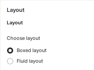
Navigate to Theme Settings: Inside the customizer, you’ll find a list of customization options on the left-hand side. Look for or click on the “Layout” section. Select Layout option.
Choose Container Layout: In the Layout section, you will find an option that specifies the current layout. It might be set to one of the layouts “Box Width Layout” or “Full Width Layout”. Select the desired layout you want to switch to.
Save Changes and Preview: Once you’re satisfied with the theme layout setup, click the “Save” button to save your changes and preview.
– Typography :
Navigate to Theme Settings: Inside the customizer, you’ll find a list of customization options on the left-hand side. Look for or click on the “Typography” section. Select Typography option.
Headings Font Family: Within the “Typography” section, find the ‘Heading’ section for customizing the font family used for headings. Choose Font Family according to your preferences by selecting a font family from a list of available fonts.
Below the font family selection, you’ll likely find separate options for adjusting the font sizes of page title, section title etc. . This allows you to control the relative font sizes for different levels of headings. Adjust the font size using the provided input field to set the desired font sizes for your headings.
Body Font Family: Within the “Typography” section, find the ‘Body’ section for customizing the font family used for body text. Choose Font Family according to your preferences by selecting a font family from a list of available fonts.
Below the font family selection, you’ll likely find separate options for adjusting the font sizes of body text and caption text etc. This allows you to control the font size for body text. Adjust the font size using the provided input field to set the desired font size.
Save Changes and Preview: Once you’re satisfied with the font settings applied to the theme, click the “Save” button to save your changes and preview.
– Colors :
Navigate to Theme Settings: Inside the customizer, you’ll find a list of customization options on the left-hand side. Look for or click on the “Colors” section. Select Colors option.
Choose a Color Scheme: In the “Colors” section, you’ll see a list of predefined color schemes. The theme allows customization of individual color elements.
Browse through the available color schemes to see how they change the appearance of different elements on the website.The theme allows for more granular customization, to change specific color elements. These could include background colors, text colors, link colors, button colors, and more. Click on the relevant option to make adjustments. The theme offers a color picker, click on it to open the color selection tool. Use the color wheel, sliders, or input fields to choose your preferred colors. You can also enter specific color codes (hex, RGB, etc.) if you have a particular color in mind.
Save Changes and Preview: Once you’re satisfied with the color scheme applied to the theme, click the “Save” button to save your changes and preview.
-Buttons :
Navigate to Theme Settings: Inside the customizer, you’ll find a list of customization options on the left-hand side. Look for or click on the “Buttons” section. Select Buttons option.
Locate Secondary Button Style: Inside the customization interface, look for the section labeled “Secondary Button Style”. Open the Dropdown: In the “Secondary Button Style” section, you’ll find a dropdown menu labeled “Style 1” and “Style 2”. Choose a style, select either “Style 1” or “Style 2” based on your preference. The chosen button style will be applied throughout your theme.
Also, there are other CSS customization available for border thickness, corner radius, button opacity and button shadow properties.
Save Changes and Preview: Once you’re satisfied with the button styles, click the “Save” button to save your changes and preview.
– Search :
Navigate to Theme Settings: Inside the customizer, you’ll find a list of customization options on the left-hand side. Look for or click on the “Search” section. Select Search option.
Search Results Customization: Inside the customization interface, look for the section labeled “Search only“. This section is where you’ll be able to configure how search results are displayed.
Within the “Search only” section, you’ll come across a dropdown menu. This dropdown menu offers various options for refining search results. The options are as follows:
- “Product”
- “Product and Pages”
- “Product and Articles”
- “Product, Articles and Pages”
Click on the dropdown to reveal the available options. Select the option that best matches what you’re searching for. The options provided in the dropdown determine the scope of search results you’ll see.
Understanding Dropdown Options:
Product: Selecting this option will narrow down search results to show only product-related content.
Product and Pages: This option will display search results that include product-related content as well as pages on your website.
Product and Articles: Choosing this option will show search results containing product-related content and articles.
Product, Articles and Pages: This option provides the broadest search scope, including product-related content, articles, and regular pages.
Save Changes and Preview: Once you’re satisfied with the results, click the “Save” button to save your changes and preview.
Perform a search to see how the chosen scope of results affects what is displayed in the search results page.
– Navigation :
Menu Type:
Choose between “Normal Menu” and “Mega Menu” for the type of menu you want to use in your store.
Breadcrumb:
Enable or disable breadcrumbs by checking or unchecking the “Enable Breadcrumbs” checkbox.
– Product Slider Customization:
Show Slider Arrows:
Enable or disable slider arrows by checking or unchecking the “Show Slider Arrows” checkbox.
Enable Color Swatches:
Enable or disable color swatches by checking or unchecking the “Enable Color Swatches” checkbox.
Add to Cart Button:
Choose between two options for displaying the “Add to Cart” button on product sliders:
“Show on Hover” and “Always Show”
Loader Style:
Choose between “Style 1” and “Style 2” for the loader style used when loading products in the slider.
– Checkout Page Customization:
Banner:
Upload a background image for the banner section. Recommended dimensions are 1000 x 400 pixels.
Logo:
Upload a custom image for the logo.
Position:
Choose between “Left,” “Center,” or “Right” for the position of the logo.
Logo Size:
Select between “Small,” “Medium,” or “Large” for the size of the logo.
Main Content Area:
Customize the main content area of the checkout page.
Background Image:
Upload a background image.
Background Color:
Set a background color.
Form Fields:
Toggle between “White” or “Transparent” for the form field background.
Order Summary:
Customize the order summary section of the checkout page.
Background Image:
Upload a background image.
Background Color:
Set a background color.
Colors:
Define three different color options:
Accents: Set the color for accents like highlights, links, and checkmarks.
Buttons: Define the color for buttons like gift card/discount and next step buttons.
Errors: Specify the color for error messages and invalid fields.
– Cart Settings:
On Add to Cart Button Click:
Choose between two options for what happens when a customer clicks the “Add to Cart” button:
Show Cart Drawer:
This option displays a cart drawer or popup on the same page, showing the items added to the cart.
Redirect to Cart Page:
This option redirects the customer to the dedicated cart page after adding an item to the cart.
Choose the option that best suits your preferences for the cart behavior on your Shopify store.
– Collection Page Customization:
Page Banner:
Show on Collection Page:
Enable or disable the display of the page banner on the collection page by checking or unchecking the checkbox.
Image Alignment:
Choose from different alignment options available for the page banner image.
Image Height:
Select from various height size options available for the page banner image.
Page Banner Overlay:
Customize the overlay settings for the page banner.
Overlay Color:
Set the color of the overlay.
Overlay Opacity:
Adjust the opacity level of the overlay.
Product Display Settings:
Enable Sorting:
Enable or disable the option to sort products on the collection page.
Products per Row:
Toggle between displaying 2 or 3 products per row.
Products per Page:
Define the number of products to display on a single page.
Pagination:
Choose between “Simple Pagination” or “Infinite Load” for how products are displayed on the collection page.
Product Overlay Color:
Set the color of the overlay for individual product images.
Product Overlay Opacity:
Adjust the opacity level of the overlay for individual product images.
Sidebar:
Enable Sidebar:
Enable or disable the sidebar on the collection page.
Filter Block Height:
Set the height of the filter block within the sidebar.
Sidebar Content Color:
Customize the color of the content within the sidebar.