Fashionwear Theme Settings
- Logo :
Uploading a Logo for Header from Theme Settings:
(Logo must be .svg file)
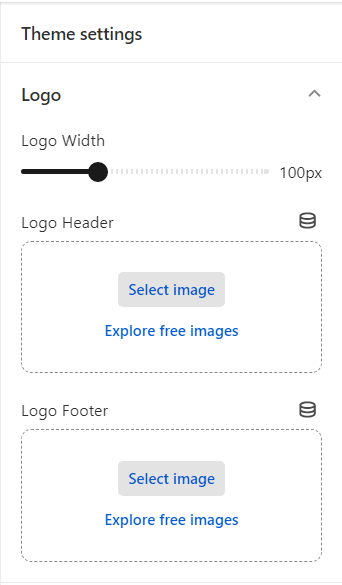
Navigate to Theme Settings: Inside the customizer, you’ll find a list of customization options on the left-hand side. Look for or click on the “Logo” section. Select Logo option.
Upload Logo for Header: Under the logo settings, you’ll likely find an option for the header logo. Click on the “Logo Header” to upload the logo for header.
Save Changes and Preview: Once you’re satisfied with the header logo setup, click the “Save” button to save your changes and preview.
- Layout :
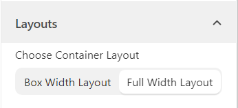
Navigate to Theme Settings: Inside the customizer, you’ll find a list of customization options on the left-hand side. Look for or click on the “Layout” section. Select Layout option.
Choose Container Layout: In the Layout section, you will find an option that specifies the current layout. It might be set to one of the layouts “Box Width Layout” or “Full Width Layout”. Select the desired layout you want to switch to.
Save Changes and Preview: Once you’re satisfied with the theme layout setup, click the “Save” button to save your changes and preview.
– Typography :
Navigate to Theme Settings: Inside the customizer, you’ll find a list of customization options on the left-hand side. Look for or click on the “Typography” section. Select Typography option.
Headings Font Family: Within the “Typography” section, find the ‘Heading’ section for customizing the font family used for headings. Choose Font Family according to your preferences by selecting a font family from a list of available fonts.
Below the font family selection, you’ll likely find separate options for adjusting the font sizes of page title, section title etc. . This allows you to control the relative font sizes for different levels of headings. Adjust the font size using the provided input field to set the desired font sizes for your headings.
Body Font Family: Within the “Typography” section, find the ‘Body’ section for customizing the font family used for body text. Choose Font Family according to your preferences by selecting a font family from a list of available fonts.
Below the font family selection, you’ll likely find separate options for adjusting the font sizes of body text and caption text etc. This allows you to control the font size for body text. Adjust the font size using the provided input field to set the desired font size.
Save Changes and Preview: Once you’re satisfied with the font settings applied to the theme, click the “Save” button to save your changes and preview.
– Colors :
Navigate to Theme Settings: Inside the customizer, you’ll find a list of customization options on the left-hand side. Look for or click on the “Colors” section. Select Colors option.
Choose a Color Scheme: In the “Colors” section, you’ll see a list of predefined color schemes. The theme allows customization of individual color elements.
Browse through the available color schemes to see how they change the appearance of different elements on the website.The theme allows for more granular customization, to change specific color elements. These could include background colors, text colors, link colors, button colors, and more. Click on the relevant option to make adjustments. The theme offers a color picker, click on it to open the color selection tool. Use the color wheel, sliders, or input fields to choose your preferred colors. You can also enter specific color codes (hex, RGB, etc.) if you have a particular color in mind.
Save Changes and Preview: Once you’re satisfied with the color scheme applied to the theme, click the “Save” button to save your changes and preview.
Search :
Navigate to Theme Settings: Inside the customizer, you’ll find a list of customization options on the left-hand side. Look for or click on the “Search” section. Select Search option.
Search Results Customization: Inside the customization interface, look for the section labeled “Search only“. This section is where you’ll be able to configure how search results are displayed.
Within the “Search only” section, you’ll come across a dropdown menu. This dropdown menu offers various options for refining search results. The options are as follows:
- “Product”
- “Product and Pages”
- “Product and Articles”
- “Product, Articles and Pages”
Click on the dropdown to reveal the available options. Select the option that best matches what you’re searching for. The options provided in the dropdown determine the scope of search results you’ll see.
Understanding Dropdown Options:
Product: Selecting this option will narrow down search results to show only product-related content.
Product and Pages: This option will display search results that include product-related content as well as pages on your website.
Product and Articles: Choosing this option will show search results containing product-related content and articles.
Product, Articles and Pages: This option provides the broadest search scope, including product-related content, articles, and regular pages.
Save Changes and Preview: Once you’re satisfied with the results, click the “Save” button to save your changes and preview.
Perform a search to see how the chosen scope of results affects what is displayed in the search results page.
– Favicon :
Navigate to Theme Settings: Inside the customizer, you’ll find a list of customization options on the left-hand side. Look for or click on the “Favicon” section. Select Favicon option.
Choose Favicon Image: This option controls the image that appears as the site’s favicon, typically displayed in browser tabs and bookmarks. Click on the “Favicon” option to open the settings. You’ll likely see a space for uploading a favicon image. Upload or Select Image (usually a square image of a small size, often 16×16 pixels or 32×32 pixels).
Save Changes and Preview: Once you’re satisfied with the favicon setup, click the “Save” button to save your changes and preview.
– Buttons :
Navigate to Theme Settings: Inside the customizer, you’ll find a list of customization options on the left-hand side. Look for or click on the “Buttons” section. Select Buttons option.
Button Customization: Inside the customization interface, there is CSS customization available for border thickness, corner radius, button opacity and button shadow properties.
Save Changes and Preview: Once you’re satisfied with the button styles, click the “Save” button to save your changes and preview.
– Social Media :
Navigate to Theme Settings: Inside the customizer, you’ll find a list of customization options on the left-hand side. Look for or click on the “Social Media” section. Select Social Media option. This is where you can configure the links to your various social media accounts.
Add URLs: There you’ll find a list of input fields or designated areas where you can paste the URL of your corresponding social media profile. Make sure you’re copying the URLs of your official social media accounts.
Save Changes and Preview: Click the “Save” button to save your changes and preview.
Badges :
Locate the Badges Section: Inside the customizer, search for the “Badges” section. This is where you can customize the appearance of badges on your product images.
Badge Customization Options: Within the “Badges” section, you’ll find options to adjust the badge color and the badge text color. Badges are typically used to highlight sale items, new arrivals, or other special promotions on product images.
Badge Color / Badge Text Color : Look for the option labeled “Sale Badge Color” or “Sale Badge Text Color” . Click on this option to open the color picker or color selection tool. Use the color picker – to select the desired color for the badge itself (this color will be applied to the background of the badge that appears on top left or top right corners of product images) or to choose the color for the text displayed within the badge (this color will be applied to the text displayed within the badge).
Preview on Product Cards: Navigate to your product card sections to see how the customized badges appear on the product images. If you find that the badge colors clash with your overall design or are hard to read, you can return to the customizer to make further adjustments.
Save Changes and Preview: Click the “Save” button to save your changes and preview.
– Product Cards :
Locate Product Card Settings: Inside the customizer, look for the “Product Card” section. This is where you can adjust how your product cards appear on your website.
Product Card Style: Continue within the “Product Card” settings to find the “Product Card Style” option. Click on this option to choose any of the available styles: “Slider,” “Hover Effect,” or “Default.” This will determine how your product cards are displayed on your website.
Enable Swatches: Check for an option labeled “Enable Swatches”. If you want to display color swatches on your product cards, make sure this option is enabled.
Enable Product Description: Look for the “Enable Product Description” option. If you want to show product descriptions on the product cards, enable this option.
Enable Product Price Range: If you wish to display price ranges for products with variable prices, find the “Enable Product Price Range” option and enable this option.
Text Alignment: Continue to the “Text Alignment” option. Choose how you want the text (such as title and price) within the product cards to be aligned—left, center, or right.
Also, there are other CSS customization available for border thickness, corner radius, shadow properties.
Save Changes and Preview: Click the “Save” button to save your changes and preview.
Blog Cards :
Locate Blog Card Settings: Inside the customizer, search for the “Blog Card” section. This is where you can adjust how your blog cards are presented on your website.
Text Alignment: Continue within the “Blog Card” settings to locate the “Text Alignment” option. From the available alignment options—left, center, or right—choose how you want the text content within the blog cards to be aligned.
Also, there are other CSS customization available for border thickness, corner radius, shadow properties.
Save Changes and Preview: Click the “Save” button to save your changes and preview.
– Collection Cards :
Locate Collection Card Settings: Inside the customizer, look for the “Collection Card” or “Collection Display” section. This is where you can adjust how your collection cards are presented on your website.
Text Alignment: Continue within the “Collection Card” settings to locate the “Text Alignment” option. Click on this option to reveal alignment choices. From the available alignment options—left, center, or right—choose how you want the text content within the collection cards to be aligned.
Also, there are other CSS customization available for content & border, shadow properties etc.
View Collection Cards: To see how the customized collection card settings impact your website, navigate to a collection card section or collection page where collection listings are displayed.
Save Changes and Preview: Click the “Save” button to save your changes and preview.
– Cart:
Locate Cart Settings: Inside the customizer, find the “Cart” section. This is where you can adjust how your cart is displayed and configured.
Cart Type: Within the “Cart” settings, look for the option labeled “Cart Type.” Click on this option to reveal a dropdown menu. Open the dropdown menu and select either “Drawer” or “Page” based on your preference. This will determine how the cart is displayed to users—either as a drawer that slides out or as a separate cart page.
Enable Cart Note: Continue within the “Cart” settings to locate the “Enable Cart Note” option. If you want to allow customers to include a note with their order, enable this option.
Free Shipping Amount: Look for the “Free Shipping Amount” setting. If you offer free shipping for orders above a certain amount, enter that threshold here.
Save Changes and Preview: Click the “Save” button to save your changes and preview.